Crisp, clean, feminine logo for wedding industry company
Wollen Sie auch einen Job wie diesen gewinnen?
Dieser Kunde bekam 79 Logo-Designs von 30 Designern. Dabei wurde dieses Logo-Design Design von Winged_Graphics als Gewinner ausgewählt.
Kostenlos anmelden Design Jobs finden- Garantiert
-
 US$160
-
 79 Designs
-
 30 Designer
Logo-Design Kurzbeschreibung
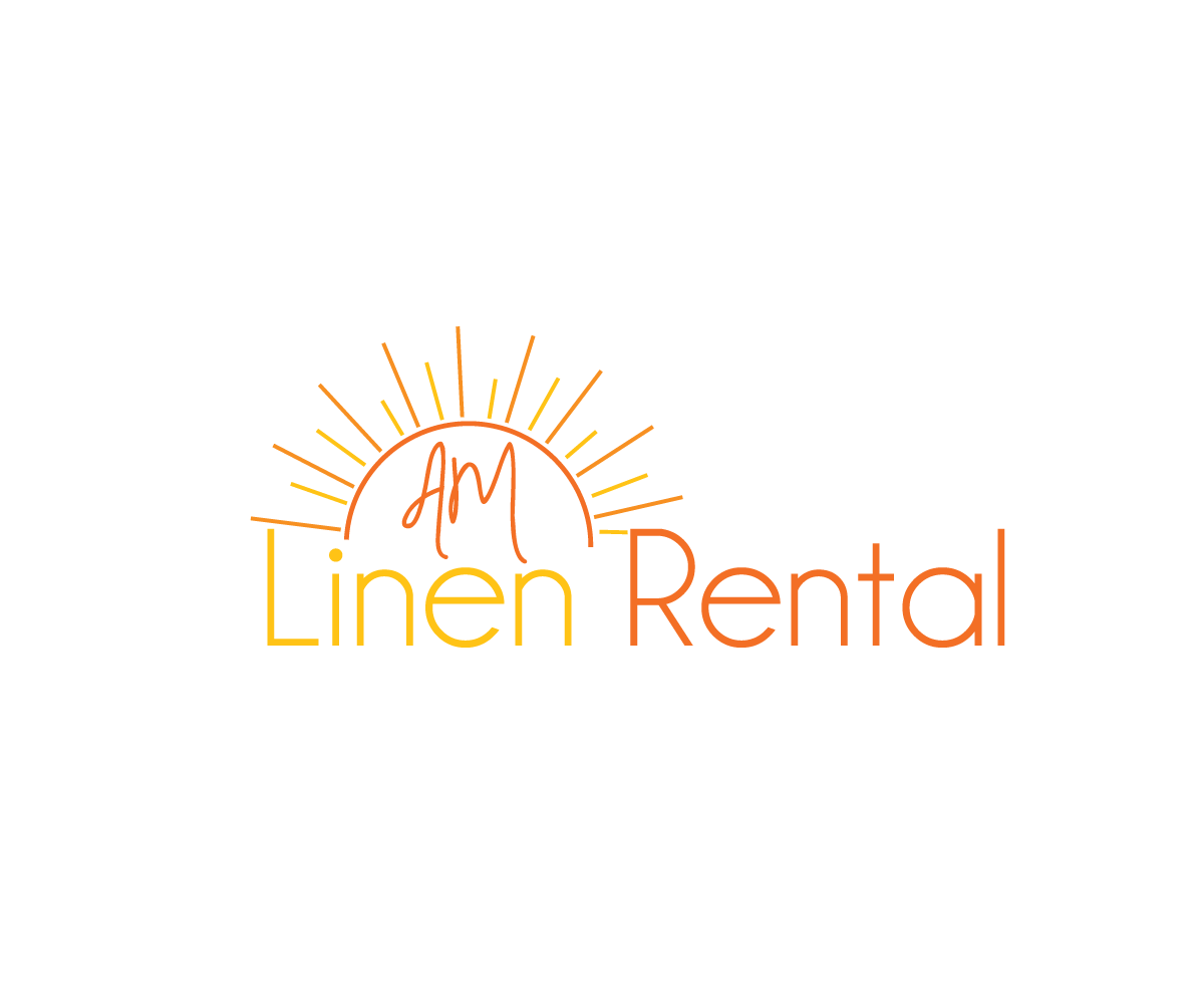
I'm looking for a logo that fits in with other feminine logos. The company name is AM Linen Rental. I would like to use muted versions the colors orange and yellow and the logo must have a sunrise component. Our current logo has a very busy and masculine look to it, and we are looking to freshen up our brand as we launch nationwide. Our current logo is attached. I do not like this logo when it is next to a bunch of feminine logos in various industry publications. It sticks out and doesn't look right. I want something very clean and pretty, but that still utilizes a sunrise (for the AM).
Zielmarkt/( -märkte)
21-45 engaged females; also professionals in the event/wedding industry (caterers, banquet managers, wedding planners, country club managers, etc.)
Industrie/Einheitstyp
Events
Logo Text
AM Linen Rental
Logo Stile, die Sie interessieren können
Pictorial / Combination-Logo
Ein reales Objekt (Text optional)
Abstraktes Logo
Begrifflich / symbolisch (Text optional)
Zu verwendende Schriftarten
Farben
Vom Kunden ausgewählte Farben für das Logo Design:
Sehen und fühlen
Jeder Schieber zeichnet eine der Charakteristiken der Marke des Kunden aus sowie den Stil, den euer Logo widerspiegeln sollte.
Elegant
Fett
Spielerisch
Ernst
Traditionel
Modern
Sympatisch
Professionell
Feminin
Männlich
Bunt
Konservativ
Wirtschaftlich
Gehobenes
Anforderungen
Muss haben
- -Muted, darker shades of orange and/or yellow
- -A Sunrise
- -A white background on the logo
- -MUST be able to be embroidered on a BLACK shirt
- -Be feminine looking
- -All capital letters, preferably with AM L and R a bit larger than the rest of the letters, but still all capital letters.
Schön zu haben
- Something that looks elegant, expensive
- I've attached a logo on this page with the orange basic sunrise. This is one I was playing with and like where it's going. I absolutely do not like my old one, with the shading of the orange and yellow. It's too masculine and busy.
Sollte nicht haben
- unknown