Quick Logo Update: KSA Logo Update
Wollen Sie auch einen Job wie diesen gewinnen?
Dieser Kunde bekam 29 Logo-Designs von 3 Designern. Dabei wurde dieses Logo-Design Design von White sky als Gewinner ausgewählt.
Kostenlos anmelden Design Jobs finden-
 US$150
-
 29 Designs
-
 3 Designer
Logo-Design Kurzbeschreibung
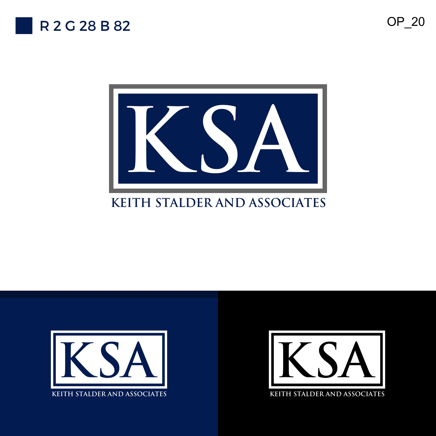
We are doing a refresh to our logo, because we have had some difficulty with printing and business cards.
1. We like the dual border around the rectangle: grey, white, and navy are strong, clean colors. Our previous color scheme would print as purple, so we need a blue/navy that will print as blue/navy.
2. We prefer a font with serif, but not so much that the letters bleed together. The letters must be distinct from one another, in this instance. Palatino Linotype or Goudy Old Style translated well when we tried them.
3. No recognizable fonts, like Calibri or Comic.
4. It should be clean, refined. We aren't looking for edginess, we are consulting professionals so it should reflect this.
5. We need one version in Black and White (or Grayscale), one in color with a white background, one in color with a black background, and one with "Keith Stalder and Associates" printed clearly beneath the logo.
6. We need high resolution JPG files for each.
Industrie/Einheitstyp
Government
Logo Text
KSA
Logo Stile, die Sie interessieren können
Wortmarke-Logo
Word oder namensbasiertes Logo (nur Text)
Lettermark-Logo
Kurzwort oder Buchstaben-Logo (nur Text)
Zu verwendende Schriftarten
Sehen und fühlen
Jeder Schieber zeichnet eine der Charakteristiken der Marke des Kunden aus sowie den Stil, den euer Logo widerspiegeln sollte.
Elegant
Fett
Spielerisch
Ernst
Traditionel
Modern
Sympatisch
Professionell
Feminin
Männlich
Bunt
Konservativ
Wirtschaftlich
Gehobenes
Anforderungen
Muss haben
- We are doing a refresh to our logo, because we have had some difficulty with printing and business cards.
- 1. We like the dual border around the rectangle: grey, white, and navy are strong, clean colors. Our previous color scheme would print as purple, so we need a blue/navy that will print as blue/navy.
- 2. We prefer a font with serif, but not so much that the letters bleed together. The letters must be distinct from one another, in this instance. Palatino Linotype or Goudy Old Style translated well when we tried them.
- 3. No recognizable fonts, like Calibri or Comic.
- 4. It should be clean, refined. We aren't looking for edginess, we are consulting professionals so it should reflect this.
- 5. We need one version in Black and White (or Grayscale), one in color with a white background, one in color with a black background, and one with "Keith Stalder and Associates" printed clearly beneath the logo.
- 6. We need high resolution JPG files for each.
Schön zu haben
- We are doing a refresh to our logo, because we have had some difficulty with printing and business cards.
- 1. We like the dual border around the rectangle: grey, white, and navy are strong, clean colors. Our previous color scheme would print as purple, so we need a blue/navy that will print as blue/navy.
- 2. We prefer a font with serif, but not so much that the letters bleed together. The letters must be distinct from one another, in this instance. Palatino Linotype or Goudy Old Style translated well when we tried them.
- 3. No recognizable fonts, like Calibri or Comic.
- 4. It should be clean, refined. We aren't looking for edginess, we are consulting professionals so it should reflect this.
- 5. We need one version in Black and White (or Grayscale), one in color with a white background, one in color with a black background, and one with "Keith Stalder and Associates" printed clearly beneath the logo.
- 6. We need high resolution JPG files for each.
Sollte nicht haben
- We are doing a refresh to our logo, because we have had some difficulty with printing and business cards.
- 1. We like the dual border around the rectangle: grey, white, and navy are strong, clean colors. Our previous color scheme would print as purple, so we need a blue/navy that will print as blue/navy.
- 2. We prefer a font with serif, but not so much that the letters bleed together. The letters must be distinct from one another, in this instance. Palatino Linotype or Goudy Old Style translated well when we tried them.
- 3. No recognizable fonts, like Calibri or Comic.
- 4. It should be clean, refined. We aren't looking for edginess, we are consulting professionals so it should reflect this.
- 5. We need one version in Black and White (or Grayscale), one in color with a white background, one in color with a black background, and one with "Keith Stalder and Associates" printed clearly beneath the logo.
- 6. We need high resolution JPG files for each.