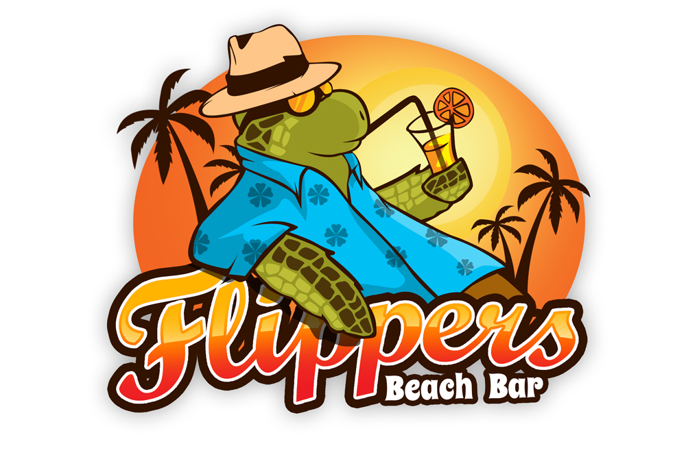
Flippers Beach Bar Logo Design

Wollen Sie auch einen Job wie diesen gewinnen?
Dieser Kunde bekam 83 Logo-Designs von 30 Designern. Dabei wurde dieses Logo-Design Design von R.Bello als Gewinner ausgewählt.
Kostenlos anmelden Design Jobs finden- Garantiert
Logo-Design Kurzbeschreibung
We are looking to create a new logo for a small beach bar at a high-end luxury resort on Great Abaco island in The Bahamas called The Abaco Club. The beach bar and restaurant sits on the ocean's edge overlooking Winding Bay where many green sea turtles live. The name FLIPPERS is in reference to the many friendly turtles and their flippers.
People that visit Abaco and the beach bar are there to relax, to have fun, to feel like kids again. Despite being a luxury resort the feel of the resort is very laid back and come as you are which we call Barefoot Luxury. The logo should fit this vibe while not going too far into the Senor Frogs realm of drunken beach bars. The resort is very much a family-friendly destination.
I've included two pictures of the beach bar along with a picture of one of the friendly sea turtles. I also included two initial logo concepts that both utilize stock artwork, which we'd like to avoid so the logo is something totally unique to our property.
Zielmarkt/( -märkte)
Upper to upper-middle class families and individuals primarily from US and Europe
Industrie/Einheitstyp
Restaurant
Logo Text
Flippers Beach Bar
Logo Stile, die Sie interessieren können
Pictorial / Combination-Logo
Ein reales Objekt (Text optional)
Figuren-Logo
Logo mit Abbildung oder Zeichen
Wortmarke-Logo
Word oder namensbasiertes Logo (nur Text)
Lettermark-Logo
Kurzwort oder Buchstaben-Logo (nur Text)
Sehen und fühlen
Jeder Schieber zeichnet eine der Charakteristiken der Marke des Kunden aus sowie den Stil, den euer Logo widerspiegeln sollte.
Elegant
Fett
Spielerisch
Ernst
Traditionel
Modern
Sympatisch
Professionell
Feminin
Männlich
Bunt
Konservativ
Wirtschaftlich
Gehobenes
Anforderungen
Schön zu haben
- We're open to the logo going in a few different directions as you can see in those two initial concepts. It could be that we actually have one more "sophisticated" logo that is used for menus and signage and a second more "cartoon/fun" logo used for merchandise, kids menus, etc.