super clean and modern easy to read. Scandinavian type design.
Wollen Sie auch einen Job wie diesen gewinnen?
Dieser Kunde bekam 20 Menu-Designs von 3 Designern. Dabei wurde dieses Menu-Design Design von dsbgraphics als Gewinner ausgewählt.
Kostenlos anmelden Design Jobs finden- Garantiert
-
 US$120
-
 20 Designs
-
 3 Designer
Menü-Design Kurzbeschreibung
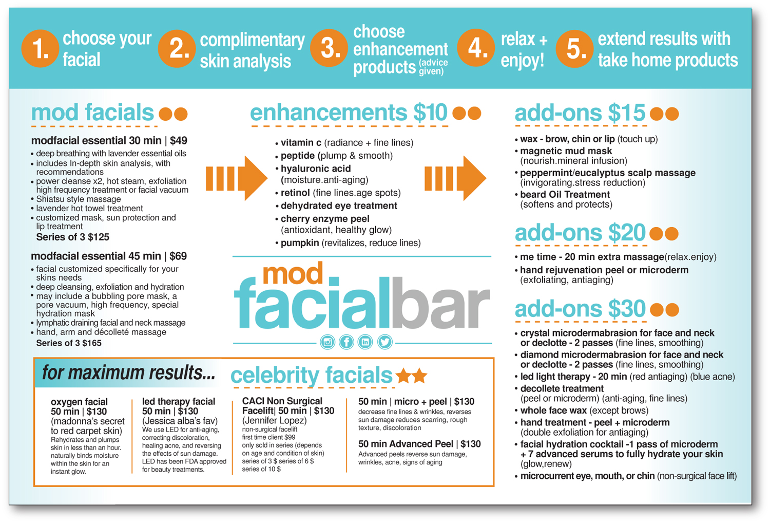
Hi everyone, we need a wall menu for our retail space. We'd like something that goes along with the style of our website and is also editable (in case we change prices later on). The dimensions for the menu will be about 72 inches wide and about 48 inches high and it will be attached to the wall in our business. Please pull menu wording from this link: http://www.modfacialbar.com/services
Feel free to shorten the descriptions.
The main sections of the menu are:
mod facials
enhancements
add-ons ($15, $20, and $30)
celebrity facials
Please include the picture of the woman on our homepage in the menu. I'll attach an image.
We would like to start with our process to simplify the steps we take.
1.)Complimentary skin analysis
2.) Choose your service
3.) Choose your products (recommendations are given)
4.) Enjoy!
5.) Further your results with take home products
Last little note, we can email you a larger Logo...Design Crowd would not let us upload the largest file that we have for the logo.
Zielmarkt/( -märkte)
young, fun, hip, suburban women and men.
Industrie/Einheitstyp
Retail
Zu verwendende Schriftarten
Sehen und fühlen
Jeder Schieber zeichnet eine der Charakteristiken der Marke des Kunden aus sowie den Stil, den euer Logo widerspiegeln sollte.
Elegant
Fett
Spielerisch
Ernst
Traditionel
Modern
Sympatisch
Professionell
Feminin
Männlich
Bunt
Konservativ
Wirtschaftlich
Gehobenes
Anforderungen
Muss haben
- Not too much orange. Keep it clean and not too busy.
- the menu should make it super easy for someone to walk into the store and figure out the process.
- the 5 steps should be listed out first
- the 2 basic facials
- the add ons
- the enhancements (by price)
- the celebrity facials
- Advanced peels
- colors should be mainly blue and white (website) some orange used for framing categories or black. I like clean and not too busy. no cheesy.
Schön zu haben
- see colors on website. see style.
Sollte nicht haben
- no clip art! no cursive formal writing.