company logo for online mobile payment service and groupon like coupons
Wollen Sie auch einen Job wie diesen gewinnen?
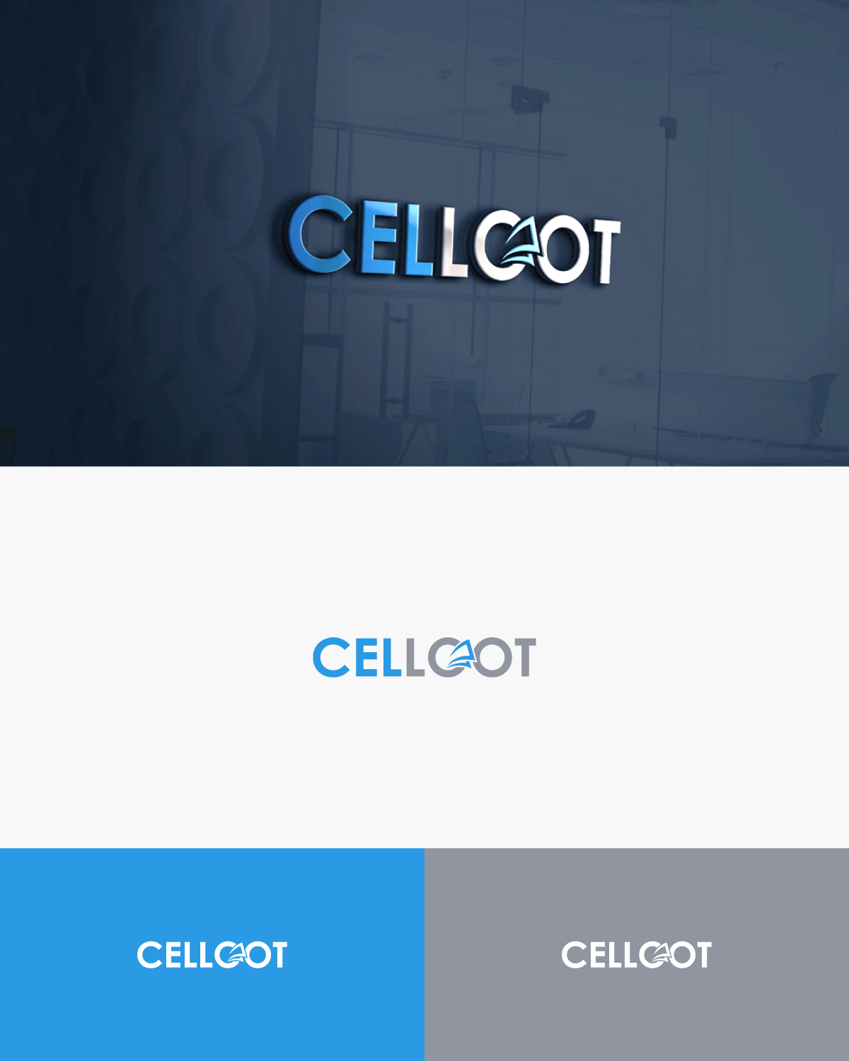
Dieser Kunde bekam 26 Logo-Designs von 4 Designern. Dabei wurde dieses Logo-Design Design von Ineffable GFX als Gewinner ausgewählt.
Kostenlos anmelden Design Jobs finden-
 C$150
C$150
-
 26 Designs
-
 4 Designer
Logo-Design Kurzbeschreibung
We need a simple yet brilliant branding for our online mobile payment service. The logo is our main branding tool and how we will be recognized. so it is very important we get this right. simple, bold and catchy.
Our younger consumer is very mobile phone driven and our CELLOOT app and website will allow them to pay mobile bills on our sites plus offer them coupons, money back and discounts.
so our project will be both web and mobile driven .
Zielmarkt/( -märkte)
MOBILE USERS BETWEEN THE AGES OF 15 TO 35 YEARS...MORE OF THE YOUNGER DEMOGRAPHIC GROUP.....CELL PHONE USERS THAT ARE LOOKING FOR GREAT DEALS (LOOT) WHEN PAYING THEIR MONTHLY CELL PHONE BILL.
Industrie/Einheitstyp
It Company
Logo Text
CELLOOT
Logo Stile, die Sie interessieren können
Abstraktes Logo
Begrifflich / symbolisch (Text optional)
Wortmarke-Logo
Word oder namensbasiertes Logo (nur Text)
Sehen und fühlen
Jeder Schieber zeichnet eine der Charakteristiken der Marke des Kunden aus sowie den Stil, den euer Logo widerspiegeln sollte.
Elegant
Fett
Spielerisch
Ernst
Traditionel
Modern
Sympatisch
Professionell
Feminin
Männlich
Bunt
Konservativ
Wirtschaftlich
Gehobenes
Anforderungen
Muss haben
- a company logo with a strong font driven graphic that helps with our branding. Limit to two colours to keep it bold yet simple.
- Remember we need a strong icon mark that goes with our corporate name. this app icon must stand out and be smart, yet simple.
- Please remember we have two words as part of our corporate name;
- CELL.............so our customers are cell phone users that are at our site to pay their cell bill ...and.... LOOT.......we offer great deals, coupons and discounts as a reward for paying their cell bills with us. Our customers are getting a 'steal of a deal' when using us. To loot is to plunder to steal and get a great deal.
Schön zu haben
- Clear,simple, smart and very catchy. Outside of the strength of youe font driven logo the graphic artist might add a "mark" of some type ...like the checkmark swoosh of Nike as an example of a 'mark' . this might be a nice touch? the logo must have a 'mark ' that will work for icon buttons on ones phone.
- For example Facebook just has a 'f' in white with a blue background as their icon mark.....
- so our awarded designer must make all this work together with simplicity and brilliance
Sollte nicht haben
- too much, too busy, too many colours, too hard to read......KISS