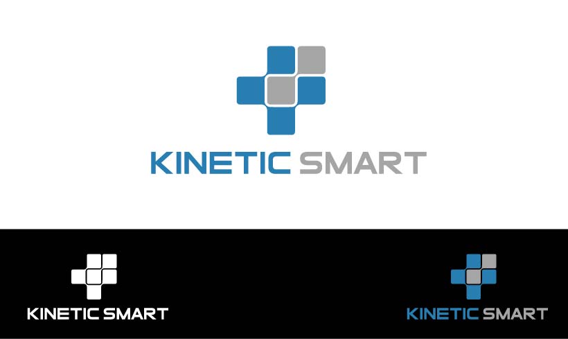
Design our new Kinetic Smart payment tech company logo

Wollen Sie auch einen Job wie diesen gewinnen?
Dieser Kunde bekam 149 Logo-Designs von 48 Designern. Dabei wurde dieses Logo-Design Design von gutsdudi als Gewinner ausgewählt.
Kostenlos anmelden Design Jobs finden- Garantiert
Logo-Design Kurzbeschreibung
Backstory: Our Atlanta-based startup has been around for a year and a half and now it's starting to take off. We're moving quickly to being a larger, fast growing company.
Accepting card payments is hard, awkward and big legacy companies treat customers like numbers. Kinetic Smart is different.
We are design-centric (big Design Thinking practitioners), always start from the human being and work out toward solutions and we love what we do.
The Kinetic Smart team are your "phone-a-friend" in the payments industry.
Logo: we have a logo today. We like it a lot but do feel like we need a badge that conveys better that we know what we're doing and can be trusted, but something that's also a little more exciting and captures the attention on first sight.
We are bringing something new and sensible and the team care deeply about solving the right problems for merchants and businesses in the best possible way. How can we spark a good feeling in the prospect or client who sees the logo? How might we ignite them to want to find out more or engage? How can we portray a sense that we're familiar and care a lot about their success?
Zielmarkt/( -märkte)
Small to mid-sized businesses that have physical premises and need to accept payments by credit and debit cards. Also customers of those merchants/businesses need to be able to recognize the badge.
If you've ever been in to a local store or shop, that's the person we're hoping to appeal to the most.
Industrie/Einheitstyp
Financial Service
Logo Text
Kinetic Smart
Logo Stile, die Sie interessieren können
Emblem-Logo
Logo eingeschlossen in einer Form
Abstraktes Logo
Begrifflich / symbolisch (Text optional)
Zu verwendende Schriftarten
Farben
Vom Kunden ausgewählte Farben für das Logo Design:
Sehen und fühlen
Jeder Schieber zeichnet eine der Charakteristiken der Marke des Kunden aus sowie den Stil, den euer Logo widerspiegeln sollte.
Elegant
Fett
Spielerisch
Ernst
Traditionel
Modern
Sympatisch
Professionell
Feminin
Männlich
Bunt
Konservativ
Wirtschaftlich
Gehobenes
Anforderungen
Muss haben
- A unique and striking badge. Trusting colors, approachable, opinionated.
Schön zu haben
- You do not have to use the letters K and S to make up the badge! Icon creativity is strongly encouraged.
- The words Kinetic Smart alongside the badge would be nice, but not essential as our branding emphasis will be on the badge itself.
- As some of the devices we design for only have Windows 256 color palettes, less or no gradients would be helpful.
- Simplicity is more interesting than complex designs.
- Less sharp angles, more curves.
Sollte nicht haben
- The current logo has an S that's similar to the styling of a bad WW2 badge. We don't want that.
- If your design has to include text, please avoid all UPPERCASE TEXT.
- The visual concepts of a stylized letter "K" can lead to a prominent back arrow "first glance" visual. Please avoid this if you can.
- The letter "K" is used is many prominent retailer logos, just as Kellogs, K-Mart. Please avoid similarities to these mainstream logos.