Improve the design of my app's home screen
Wollen Sie auch einen Job wie diesen gewinnen?
Dieser Kunde bekam 44 App-Designs von 12 Designern. Dabei wurde dieses App-Design Design von eMango als Gewinner ausgewählt.
Kostenlos anmelden Design Jobs finden- Garantiert
-
 US$150
-
 44 Designs
-
 12 Designer
App-Design Kurzbeschreibung
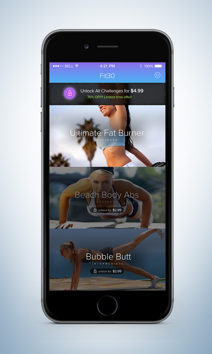
The design should be the same basic layout as the current home screen, with the following improvements:
- Top bar should be a better color (see app logo for app colors), with font and icons/title that better reflect the app icon and look more professional
- Fonts should be consistent and improved
- Should be more clear that only the first workout challenge is unlocked. (should be obvious the user has access to 1st challenge, and also obvious that the others are locked/must be paid for)
- Show price of locked workouts ($2.99 each)
- Re-do button on the bottom to "unlock all challenges for $4.99". Make it attractive, colorful, noticeable, that the user sees it and understands the value they get from it and wants to buy it.
App is available here if you want to try and/or get more screenshots: https://itunes.apple.com/us/app/fit30-at-home-workouts-30/id986580178?mt=8
Winner of the contest will also be hired to re-design 2 other screens on the app if you are interested :)
Zu verwendende Schriftarten
Sehen und fühlen
Jeder Schieber zeichnet eine der Charakteristiken der Marke des Kunden aus sowie den Stil, den euer Logo widerspiegeln sollte.