

 Aktualisieren
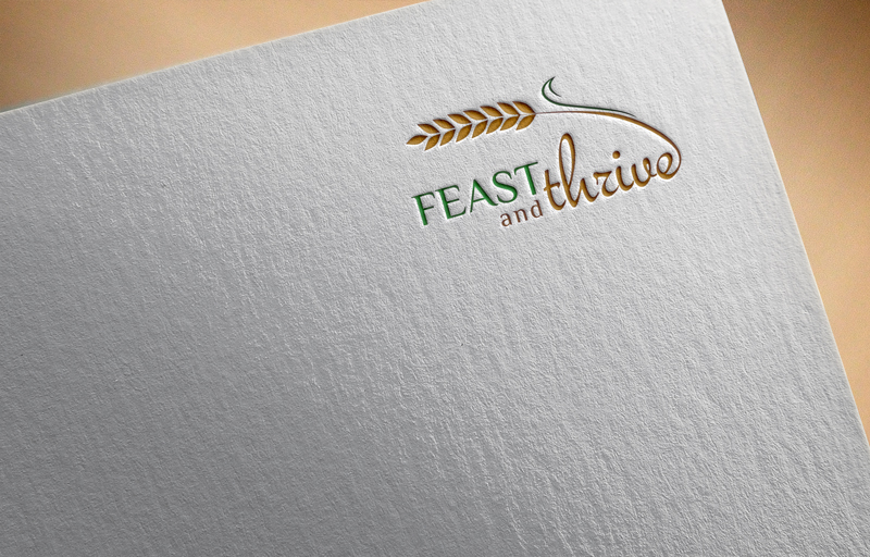
Feast and Thrive - Not for profit company logo
Wollen Sie auch einen Job wie diesen gewinnen?
Dieser Kunde bekam 138 Logo-Designs von 60 Designern. Dabei wurde dieses Logo-Design Design von abid 1996 als Gewinner ausgewählt.
Kostenlos anmelden Design Jobs finden
-
 A$150
A$150
-
 138 Designs
-
 60 Designer
Logo-Design Kurzbeschreibung
I need a sketched logo converted into a graphic design logo jpeg which will be used in promotional material and communication.
THis is for a not for profit charity organisation focused on delivering food to children in rural areas of western australia.
I have the design that i want so dont need a concept built, just a conversion into a professional image.
I would like the 'fern' to be an image of wheat to signify the rural aspect and then the contrast between fonts.
also along the bottom in very small print
"For every addition someone thrives"
Zielmarkt/( -märkte)
Not a selling company. So the target is just for community and professionals to encourage them to look into what the organisation is about and donate items.
Industrie/Einheitstyp
Community
Logo Text
Feast and thrive (main text)
Logo Stile, die Sie interessieren können
Pictorial / Combination-Logo
Ein reales Objekt (Text optional)



Zu verwendende Schriftarten

Sehen und fühlen
Jeder Schieber zeichnet eine der Charakteristiken der Marke des Kunden aus sowie den Stil, den euer Logo widerspiegeln sollte.
Elegant
Fett
Spielerisch
Ernst
Traditionel
Modern
Sympatisch
Professionell
Feminin
Männlich
Bunt
Konservativ
Wirtschaftlich
Gehobenes
Anforderungen
Muss haben
- I would like the basis of the design to be the one that I sent through on this project
- Two different contrasting fonts (Bold - "Feast" italic - "thrive"
- "Thrive" to be connected to the stalk of wheat - to symbolise growth and rural
Schön zu haben
- Colours - I am open to colour suggestions but something quite rustic and rural would be nice and consistent with the theme of the company
- Would be nice to have the stalks of wheat look like they are coming off the page slightly to give depth to the image
- Along the bottom in very fine print : "For every addition someone thrives" (FEAST accronym)
- the "and" is just meant to be subtle and not part of the main text
Sollte nicht haben
- Any additional graphics or images


