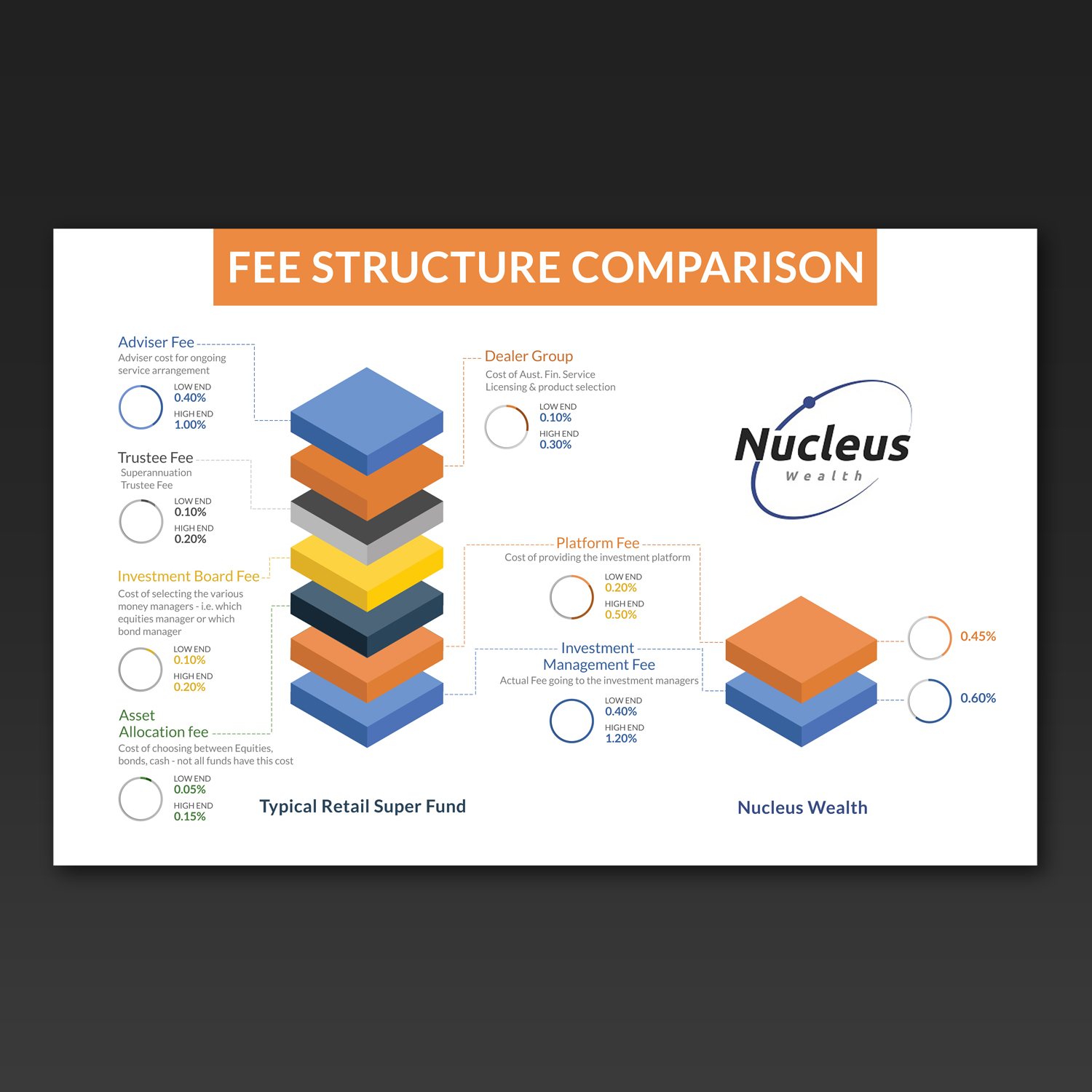
Info graphic to explain a fee hierarchy
Wollen Sie auch einen Job wie diesen gewinnen?
Dieser Kunde bekam 17 Grafik-Designs von 5 Designern. Dabei wurde dieses Grafik-Design Design von Kishaloy_D als Gewinner ausgewählt.
Kostenlos anmelden Design Jobs finden- Garantiert
-
 A$140
A$140
-
 17 Designs
-
 5 Designer
Grafik-Design Kurzbeschreibung
We need a clean and current feeling graphical representation of what a typical fee structure looks like from our competitors, with an accompanying one highlighting the simplicity and transparency of ours.
We will be using this online on our web page and in blog posts. Solutions that can be animated would be looked upon favourably.
however, ideally would like to avoid any Flash based solutions.
I have provided the fee structure comparison and some notes for each component of a typical fee in both excel and a jpg of the excel file. Not fussed with the graph design however a 'stacked' fee graph could get the point across nicely. Up to you.
I have provided a low and high estimate for our competitors. You don't have to include the figures however the proportions in the graph could be a way around cluttering the design with numbers.
I have also included our logo to give you an idea of colours.
Zielmarkt/( -märkte)
Gen X and Gen y, internet savvy, financially competent
Industrie/Einheitstyp
Financial Service
Zu verwendende Schriftarten
Sehen und fühlen
Jeder Schieber zeichnet eine der Charakteristiken der Marke des Kunden aus sowie den Stil, den euer Logo widerspiegeln sollte.
Elegant
Fett
Spielerisch
Ernst
Traditionel
Modern
Sympatisch
Professionell
Feminin
Männlich
Bunt
Konservativ
Wirtschaftlich
Gehobenes
Anforderungen
Muss haben
- Graphical based solution - easy to read and understand
Schön zu haben
- Potential to be animated, PSD (or similar) with layering so that it is easy to implement for use with HTML 5 or JQuery web pages
Sollte nicht haben
- Flash solutions