Real Estate Company Logo / Yard sign design
Wollen Sie auch einen Job wie diesen gewinnen?
Dieser Kunde bekam 351 Logo-Designs von 107 Designern. Dabei wurde dieses Logo-Design Design von bookjerry22 als Gewinner ausgewählt.
Kostenlos anmelden Design Jobs finden- Garantiert
-
 US$150
-
 351 Designs
-
 107 Designer
Logo-Design Kurzbeschreibung
We need a simple Logo for our Real Estate Yard Signs, business cards Etc. Please keep in mind the signs are typically 18" tall x 24" wide. ( 18x24 ) The signs ABSOLUTLY MUST readable while driving by and eye catching. I have attached a couple VERY Rough ideals I have.
COLORS: I want it to stand out. lots of yellow and red white and blue on my competitions signs. I personally like the GREEN on the Regions Bank signs as background. Colors for lettering I am thinking, WHITE, BLACK or White with black outlines. also BOLD Capital Lettering.
please feel free to do your own thing, above are just some ideals. I am not very creative.
Thanks , Brian
ATTACHED is a photo of my old sign just as a visual of what I have been using. I am Changing company names and want a NEW eye catching sign.
Zielmarkt/( -märkte)
Home owners and home buyers
Industrie/Einheitstyp
Real Estate
Logo Text
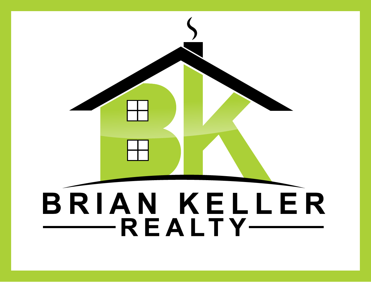
BK BRIAN KELLER REALTY
Logo Stile, die Sie interessieren können
Emblem-Logo
Logo eingeschlossen in einer Form
Wortmarke-Logo
Word oder namensbasiertes Logo (nur Text)
Zu verwendende Schriftarten
Andere Schriftarten erwünscht:
- ARIAL BOLD
Farben
Vom Kunden ausgewählte Farben für das Logo Design:
Sehen und fühlen
Jeder Schieber zeichnet eine der Charakteristiken der Marke des Kunden aus sowie den Stil, den euer Logo widerspiegeln sollte.
Elegant
Fett
Spielerisch
Ernst
Traditionel
Modern
Sympatisch
Professionell
Feminin
Männlich
Bunt
Konservativ
Wirtschaftlich
Gehobenes
Anforderungen
Muss haben
- BOLD and readable from driving. 18x24 or 24x24 yard signs
- BRIAN KELLER REALTY
- Call 865-548-7860 Close to Bottom
- www.BrianKellerRealty.com At very Bottom
- you can look at my old sign to get an ideal where phone number and web site address goes.
Schön zu haben
- colors are suggestions.
- Locally several companies already use Yellow and red white and blue on their signs. I want to look different.
Sollte nicht haben
- NOT a busy sign.. Basic easy to read from driving buy.