Japan Insider Needs Remarkable Logo Design for Tokyo Spark
Wollen Sie auch einen Job wie diesen gewinnen?
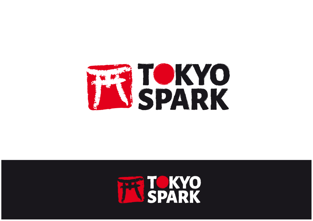
Dieser Kunde bekam 181 Logo-Designs von 40 Designern. Dabei wurde dieses Logo-Design Design von Nigel B als Gewinner ausgewählt.
Kostenlos anmelden Design Jobs finden- Garantiert
-
 US$250
-
 181 Designs
-
 40 Designer
Logo-Design Kurzbeschreibung
I need a logo design for a membership site I'm launching soon ( https://www.tokyospark.com ) where I'll help English speaking visitors enjoy Japan...
I'll be using the logo in the top header menu.
It should be designed with a hanko stamp like icon on the left -- making use of some kind of iconic thing from Japan: torii gate, sakura, etc... use your creativity here.
Here's a Google search for "Japanese hanko stamp" images to see a variety of ways the Japanese design their hanko stamps: http://bit.ly/2iMV2ro
I'd like it to appear as if it were stamped on paper... that slight texturing/fading, uneven-ness, and maybe a teeny tiny bit of ink splatter.
Here's a search for icons of Japan that might help: http://bit.ly/2iXQMmW
Then the words "Tokyo Spark" to the right of the hanko stamp.
For the words Tokyo Spark -- a font something Alegreya Sans Black (https://fonts.google.com/specimen/Alegreya+Sans)... replace the first "o" with a red circle (like a Japanese flag circle), but make it hanko stamp-like as well. Then give the "T" a tiny bit of a torii gate look (where the top of the T will end in slight angles).
I chose a font like that because the O's are very circular, it's heavy, and the T isn't too thin/tall for the rest of the characters. Space them close-ish together, but be careful with the KY as they tend to be closer together by default.
A transparent background is a must as I'll be using it over photos and video as well.
A beautiful, minimal logo that incorporates the hanko and shodo Japanese cultural references that meets the above spec would be amazing.
Be creative, but don't go overboard with the oriental theme.
If you want some Japanese themed illustrations for inspiration, here's a nice collection: http://shutr.bz/2iTc4op
I've also attached screenshots of the google search results.
Thank you for considering this project!
**** PLEASE do not submit multiples of the same design from different angles and backgrounds -- only needed on a white BG -- duplicate designs will be eliminated ****
Aktualisierungen
I thoroughly revised the brief today, adding much more detail and an image that might help understand more what I'm looking for. Thank you for all your hard work on this and I'll continue to refine things are more designs come in and my ideas sharpen on this project.Thanks!-- Chad Added Monday, January 9, 2017
Hello, I have come to realize that the Japanese shodo brush style for the word "Spark" in this logo is turning out to be more difficult to produce than I first imagined. Also, a couple other designs came in that look very nice without the shodo style "Spark" and they led me to change the brief.I've scrapped the shodo style requirement in the new brief. Instead I'll now be looking for creative uses of a font similar to Alegreya Sans Black for the words "Tokyo Spark"The square(ish) hanko stamp icon to the left of the words "Tokyo Spark" is still a requirement... and I want to reiterate that it should look like it was stamped on paper (slight fading, texture, splotching, etc...)I look forward to seeing what you come up with now that the crazy hard to produce shodo calligraphy isn't a requirement anymore.Thank you! Added Tuesday, January 10, 2017
Thank you for the awesome designs. I'll be making my picks soon. I really appreciate the hard work you put toward my project.
Added Monday, January 23, 2017
Zielmarkt/( -märkte)
English speakers visiting, or living in Japan, who want to discover amazing local places to enjoy and learn a bit of Japanese to overcome the language barrier.
Industrie/Einheitstyp
Tourism
Logo Text
Tokyo Spark
Logo Stile, die Sie interessieren können
Abstraktes Logo
Begrifflich / symbolisch (Text optional)
Zu verwendende Schriftarten
Farben
Vom Kunden ausgewählte Farben für das Logo Design:
Sehen und fühlen
Jeder Schieber zeichnet eine der Charakteristiken der Marke des Kunden aus sowie den Stil, den euer Logo widerspiegeln sollte.
Elegant
Fett
Spielerisch
Ernst
Traditionel
Modern
Sympatisch
Professionell
Feminin
Männlich
Bunt
Konservativ
Wirtschaftlich
Gehobenes
Anforderungen
Muss haben
- - The logo must be short enough to use in the header of the site.
- - A "hanko stamp" like icon using an iconic Japanese "thing" and a "stamped on paper" look -- with words "Tokyo Spark" to the right of the stamp
- - Use a font like Alegreya Sans Black for the word "Tokyo" () -- however, the top of the "T" in Tokyo should have a hint of torii gate inspiration
- *** The entire logo must be vector scalable so I can use it across different portions of the project without resizing issues (text and shapes in PSD is fine) ***
Schön zu haben
- - Maybe an iconic Japanese thing such as sakura blossoms, Mt. Fuji, Tokyo Tower, Sky Tree... inside the red circle within the word "Tokyo".
- - Maybe even multiple things that could be swapped out during various seasons (or randomly).
Sollte nicht haben
- - Don't overuse of the oriental theme -- some use is great, but not overuse.
- *** No blurry design, no overuse of gradients/shadows. No aliased "stair-stepping" angled lines. And no hard stroke/borders ***