Perk-y Superfood Food Logo Design
Wollen Sie auch einen Job wie diesen gewinnen?
Dieser Kunde bekam 176 Logo-Designs von 36 Designern. Dabei wurde dieses Logo-Design Design von zebronicgraphic als Gewinner ausgewählt.
Kostenlos anmelden Design Jobs finden- Garantiert
-
 US$150
-
 176 Designs
-
 36 Designer
Logo-Design Kurzbeschreibung
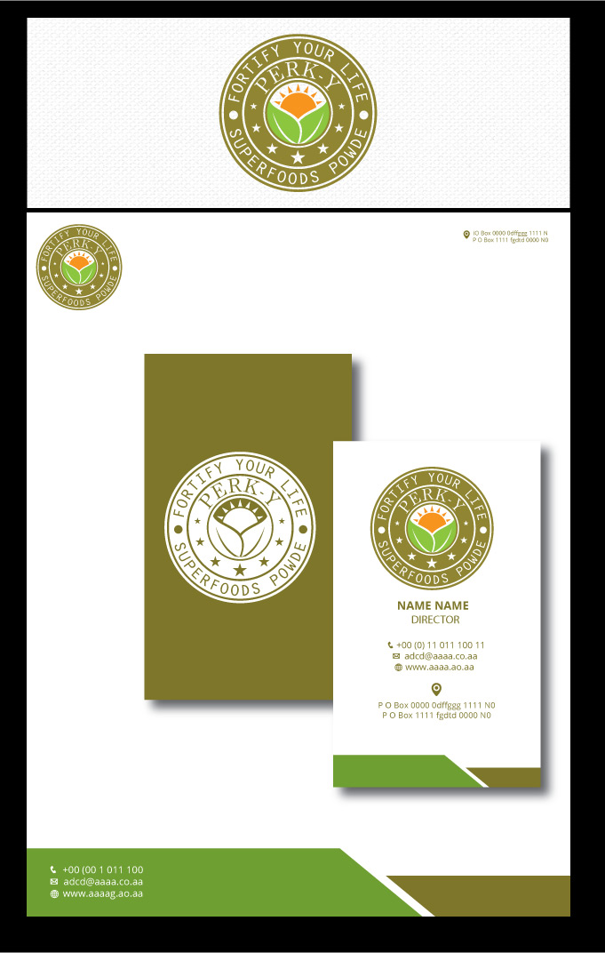
Perk-y is a new food concept currently being tested in a small US market. The current Perk-y logo is a simple type treatment, which has been used only for initial product testing. The need is to create a logo for Perk-y that embodies the nature and essence of the product. The logo should include a type treatment with an icon or unique design flourish. Please review the creative brief for more detail and the most recent label designs.
Zielmarkt/( -märkte)
Women and men, ranging in ages 30 – 60 who care about a healthy lifestyle. They’re conscious about the products they use and consume. They seek products that are organically and ethically sourced, but it’s not the end-all-be-all. This audience loves artisanship. They fall in the middle to upper income bracket.
Logo Text
Perk-y | Fortify Your Life.
Logo Stile, die Sie interessieren können
Emblem-Logo
Logo eingeschlossen in einer Form
Wortmarke-Logo
Word oder namensbasiertes Logo (nur Text)
Zu verwendende Schriftarten
Sehen und fühlen
Jeder Schieber zeichnet eine der Charakteristiken der Marke des Kunden aus sowie den Stil, den euer Logo widerspiegeln sollte.
Elegant
Fett
Spielerisch
Ernst
Traditionel
Modern
Sympatisch
Professionell
Feminin
Männlich
Bunt
Konservativ
Wirtschaftlich
Gehobenes
Anforderungen
Muss haben
- The exact wording for the logo:
- Name: Perk-y (must have a space with glyph between the k and y)
- Tagline: Fortify Your Life
- Sub-tag: Superfoods Powder
Schön zu haben
- Symbols:
- Horizon, sun, light, brightness
- Color considerations:
- Food friendly color scheme
- Type Treatments:
- Unique fonts, hand-drawn or manipulated in photoshop.
Sollte nicht haben
- Stay away from red, purples and pinks.
- Stay away from overly feminine font selections, especially script fonts.
- Nothing "tech looking". Stay away from the use of food icons.