"Rhodium", a VoIP application needs a logo design
Wollen Sie auch einen Job wie diesen gewinnen?
Dieser Kunde bekam 317 Logo-Designs von 108 Designern. Dabei wurde dieses Logo-Design Design von Joe Seph als Gewinner ausgewählt.
Kostenlos anmelden Design Jobs finden- Garantiert
-
 US$300
-
 317 Designs
-
 108 Designer
Logo-Design Kurzbeschreibung
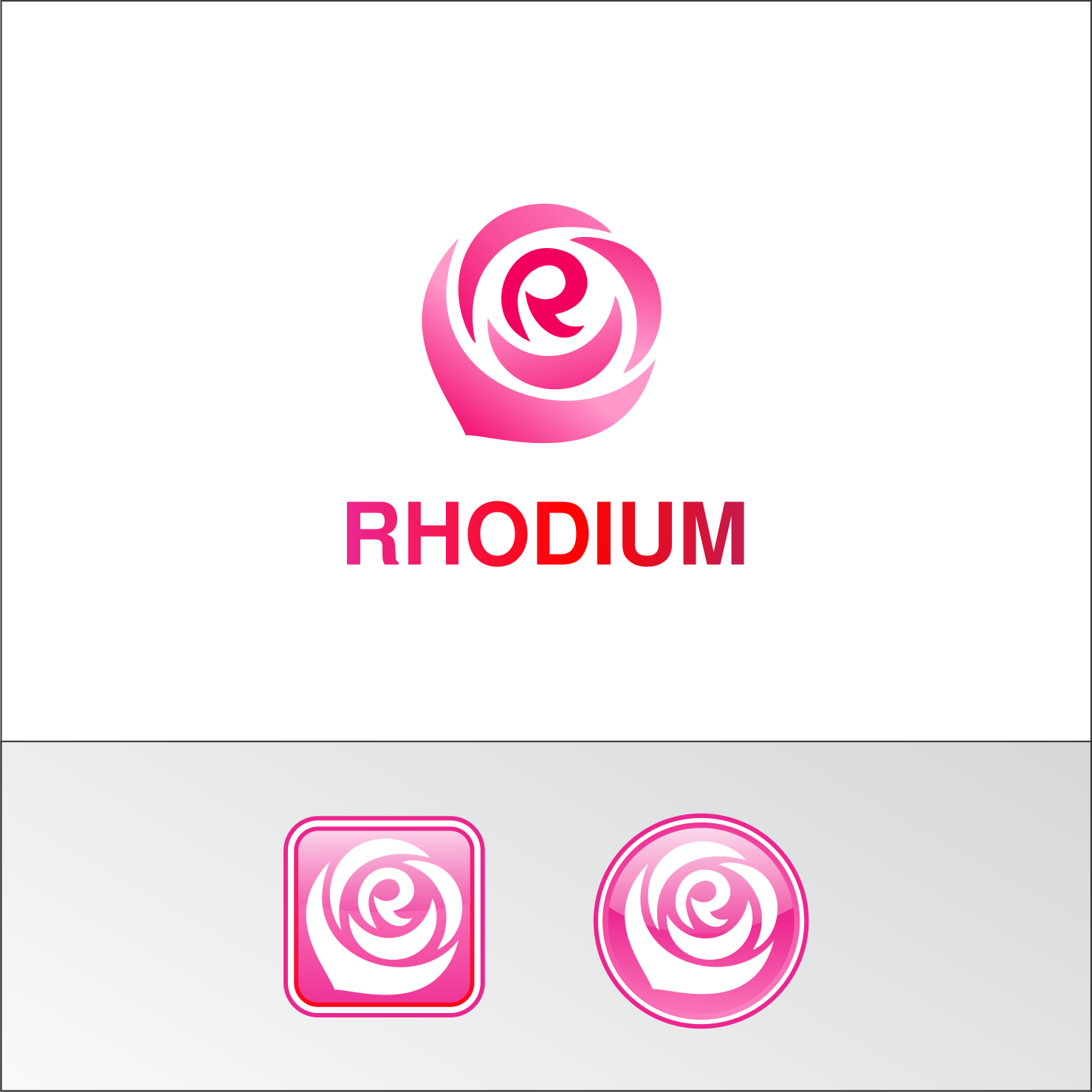
We need a logo design for a VoIP application named "Rhodium". Rhodium works as a combination of appliance and smartphone application and it is targeted to small to medium businesses. While the logo will be put both on appliance and on smartphone application, some emphasis is put on that the logo mark being an application icon. Rhodium is a chemical element with atomic number 45. It's named Rhodium because one of its chlorine compounds shows rosy color. Thus we want the logo color to be "rosy-red"-ish. The logo may include some image to suggest rose flower but not mandatory. Messages we want to deliver with the logo are; "friendly", "ease of use", "reliable".
Aktualisierungen
Initially, we thought the rose is "nice to have". However, now we have so many good designs with rose, thus it is now "must have". We don't think we end up choosing a design without rose.
Added Sunday, February 5, 2017
Zielmarkt/( -märkte)
Small to Medium Businesses. The industry is a little bit conservative and the average age a bit higher thus prefer "friendly" than "super-cool".
Industrie/Einheitstyp
Telecommunications
Logo Text
Rhodium
Logo Stile, die Sie interessieren können
Abstraktes Logo
Begrifflich / symbolisch (Text optional)
Wortmarke-Logo
Word oder namensbasiertes Logo (nur Text)
Zu verwendende Schriftarten
Farben
Vom Kunden ausgewählte Farben für das Logo Design:
Sehen und fühlen
Jeder Schieber zeichnet eine der Charakteristiken der Marke des Kunden aus sowie den Stil, den euer Logo widerspiegeln sollte.
Elegant
Fett
Spielerisch
Ernst
Traditionel
Modern
Sympatisch
Professionell
Feminin
Männlich
Bunt
Konservativ
Wirtschaftlich
Gehobenes
Anforderungen
Muss haben
- "Rhodium" wordmark logo and logo mark which is usable for smartphone icon.
Schön zu haben
- The logo that reminds "rose", or even explicitly showing "rose" somewhere may be nice but just a non-designer idea and you can completely ignore this.
- Many people relate rose with the letter "O" of "rhOdium", however, I'd want to see more idea relating the rose with "R", the initial letter. It is particularly nice when used as a smartphone icon.
- You can also ignore the color I chose below.