Matching Service Needs a Logo Design
Wollen Sie auch einen Job wie diesen gewinnen?
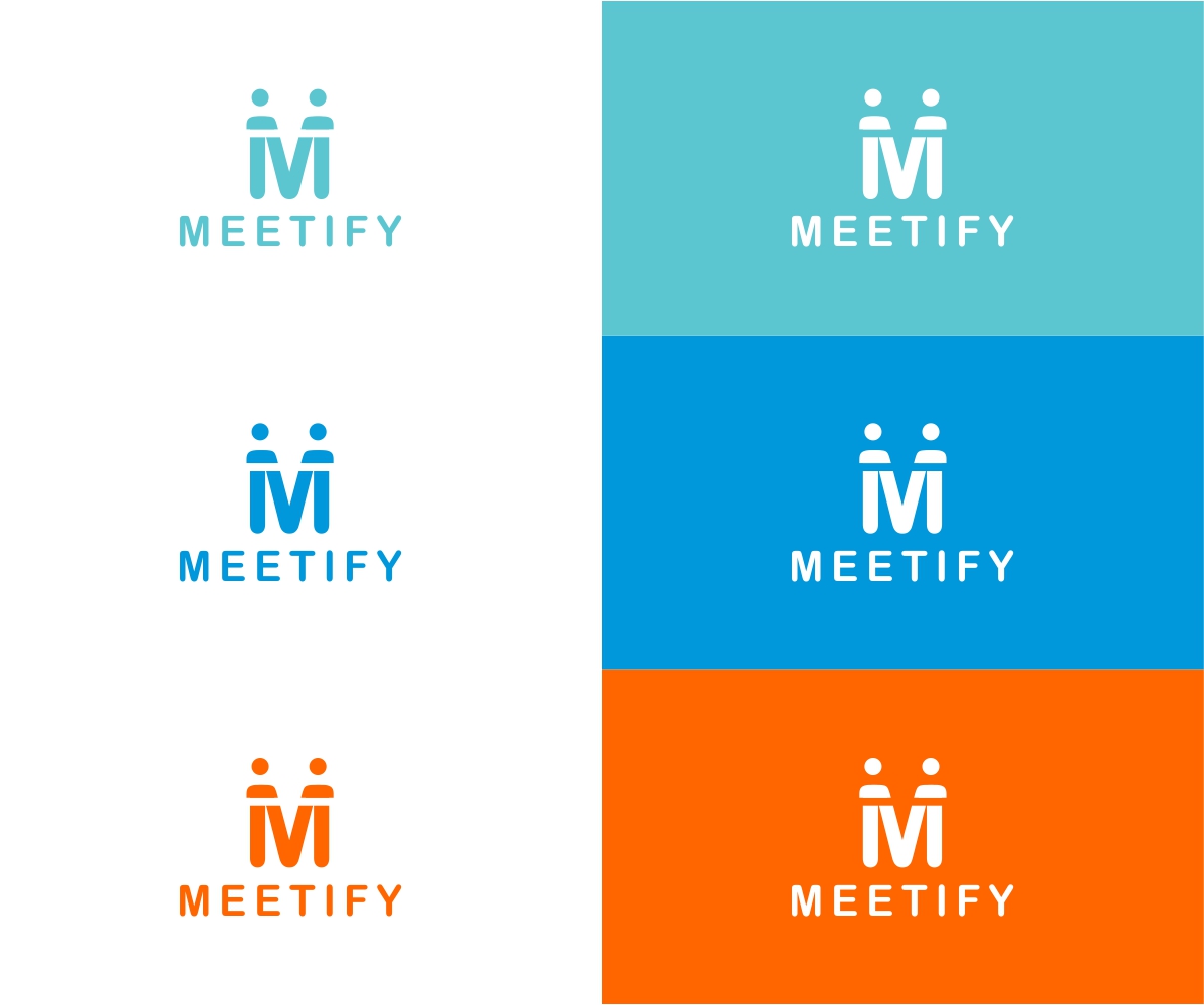
Dieser Kunde bekam 185 Logo-Designs von 59 Designern. Dabei wurde dieses Logo-Design Design von Rakesh Mohan als Gewinner ausgewählt.
Kostenlos anmelden Design Jobs finden-
 US$150
-
 185 Designs
-
 59 Designer
Logo-Design Kurzbeschreibung
We need a logo design for our new matching site based in Tokyo. Our app helps multiple males and females get matched on the platform and guides them to meet in a real restaurant.
We want to make this service to be casually shared like Tinder and talked among friends instead of traditional matching apps which are privately used by a user.
Our target user is male and female between the age of 20 to 25, primarily undergrads and grads. The main focus is a woman who is inexperienced to dating app and a little shy to express their desire to meet the opposite sex. Initial target is aggressive open-minded men and women, but eventually, we want to reach out to the shy and give them excuses like "I use this because my friend set up a meeting with guys and need somebody", assuming they do have the desire to meet deep down in their mind.
Targeted users look for a casual meeting rather than a potential partner.
Zielmarkt/( -märkte)
dating, matching industry
Industrie/Einheitstyp
Dating
Logo Text
Meetify
Logo Stile, die Sie interessieren können
Wortmarke-Logo
Word oder namensbasiertes Logo (nur Text)
Lettermark-Logo
Kurzwort oder Buchstaben-Logo (nur Text)
Zu verwendende Schriftarten
Sehen und fühlen
Jeder Schieber zeichnet eine der Charakteristiken der Marke des Kunden aus sowie den Stil, den euer Logo widerspiegeln sollte.
Elegant
Fett
Spielerisch
Ernst
Traditionel
Modern
Sympatisch
Professionell
Feminin
Männlich
Bunt
Konservativ
Wirtschaftlich
Gehobenes
Anforderungen
Muss haben
- ・simple, clean
- ・safeness
Schön zu haben
- ・users can visually understand that this is an app they use with friends
- ・when my friends somehow open my iPhone, I don't want them to easily notice I have downloaded matching site. I want the design somewhere between not obvious and little obvious.(sorry I don't know how to describe differently)
- Not Obvious → Tinder:https://www.gotinder.com/
- Little Obvious → Pairs:https://www.pairs.lv/
- Very Obvious → https://itunes.apple.com/jp/app/hekonmoranchimogochi!ogorin/id437770354?mt=8
- ・It might be a good idea to take advantage of symmetricity of "M" to implicate man and woman(just idea)
Sollte nicht haben
- super cuteness
- pink color