Deluxe Marketing Agency Packaging Research logo
Wollen Sie auch einen Job wie diesen gewinnen?
Dieser Kunde bekam 95 Logo-Designs von 32 Designern. Dabei wurde dieses Logo-Design Design von graphics creative design93™ als Gewinner ausgewählt.
Kostenlos anmelden Design Jobs finden- Garantiert
-
 €230
€230
-
 95 Designs
-
 32 Designer
Logo-Design Kurzbeschreibung
We are looking for a LOGO for a new marketing agency in luxury packaging area LOGO PROJECT Company Name: LUIDO Know-How: - Promotional objects, unique establishment for events & trade shows - Mock-up design and pre-industrial projects (labels, coverings, accessories for fragrance, spirits & cosmetics segments) - Web communication (event website, emailing ...) - Print communication (brochure, templates, ...) Market sectors: Packaging & industry (cosmetics, fragrance, spirits) LOGO DESIGN: Tones : elegance, simplicity with a detail That express the Preferred single side color "black" (max 2 colors) Note: what is significant is the single and recognizable shape as the color of the logo and textures can change. Why: because printing When we want to be ble to show textures in the logo, so it must be thick enough to get shares On Some tactile textured effects (tactile sensations). We need a logo for the creation of a new agency named LUIDO. We work in the luxury packaging and industry. See attachment for details of the project. Company name: LUIDO Trades: - Communication by the object, object creation and unique concepts for exhibitions - Design: designs, models (skins, accessories, labels for packaging perfumes, liquor and cosmetics) - Web Communication (eventful websites, corporate websites, e-mailing) - Communication print (brochures, media, ...) Markets: Packaging and industry (cosmetics, perfumes, spirits) 2 possible axes. 1. A logo using typography track => LUIDO I use the example. (Or use an out letters to the pictogram elegant, refined, varying shapes and volumes, pure and simple 2. A logo outside typography Examples axis. 2: Tones: elegance, simplicity with a detail that expresses the uniqueness . favorite color "black" (max 2 colors) Note: what is important is the unique and recognizable form as the logo color and texture may change. Why: because when printing we want to show the textures in the logo, so it must be thick enough to allow certain parts when printing to obtain textured tactile effects (tactile sensations).
Zielmarkt/( -märkte)
Packagning & Cosmetics industry, perfumery and spirits Packaging & industry (cosmetics, fragrance, spirits)
Industrie/Einheitstyp
It Company
Logo Text
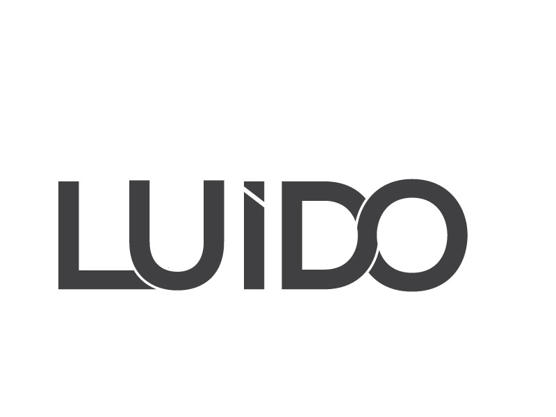
LUIDO
Logo Stile, die Sie interessieren können
Emblem-Logo
Logo eingeschlossen in einer Form
Lettermark-Logo
Kurzwort oder Buchstaben-Logo (nur Text)
Zu verwendende Schriftarten
Andere Schriftarten erwünscht:
- Choix designer
Farben
Vom Kunden ausgewählte Farben für das Logo Design:
Sehen und fühlen
Jeder Schieber zeichnet eine der Charakteristiken der Marke des Kunden aus sowie den Stil, den euer Logo widerspiegeln sollte.
Elegant
Fett
Spielerisch
Ernst
Traditionel
Modern
Sympatisch
Professionell
Feminin
Männlich
Bunt
Konservativ
Wirtschaftlich
Gehobenes
Anforderungen
Muss haben
- LOGO DESIGN: Tones: elegance, simplicity with a single detail express que la Preferred side color "black" (max 2 colors) Note: what is significant is the single and recognizable shape as the color of the logo and textures can change. Why: because printing When we want to be ble to show textures in the logo, so it must be thick enough to get shares On Some tactile textured effects (tactile sensations). 2 possible axes. 1. A logo using typography track => LUIDO I use the example. (Or use an out letters to the pictogram elegant, refined, varying shapes and volumes, pure and simple 2. A logo outside typography Examples axis. 2: Tones: elegance, simplicity with a detail that expresses the uniqueness . favorite color "black" (max 2 colors) Note: what is important is the unique and recognizable form as the logo color and texture may change. Why: because when printing we want to show the textures in the logo, so it must be thick enough to allow certain parts when printing to obtain textured tactile effects (tactile sensations).
Schön zu haben
- see attached file tones: elegance, simplicity with a detail that expresses the uniqueness. favorite color "black" (max 2 colors) Note: what is important is the unique and recognizable form as the logo color and texture may change. Why: because when printing we want to show the textures in the logo, so it must be thick enough to allow certain parts when printing to obtain textured tactile effects (tactile sensations).
Sollte nicht haben
- see attached file tones: elegance, simplicity with a detail that expresses the uniqueness. favorite color "black" (max 2 colors) Note: what is important is the unique and recognizable form as the logo color and texture may change. Why: because when printing we want to show the textures in the logo, so it must be thick enough to allow certain parts when printing to obtain textured tactile effects (tactile sensations).