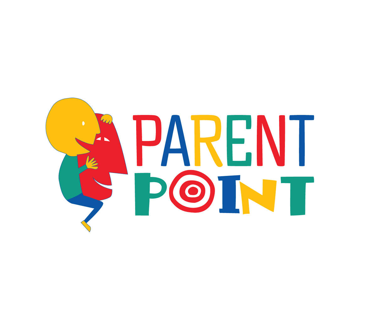
Parent Point logo - answering the how/why/what of parenting kids Stationery, Business Card design(s)
Wollen Sie auch einen Job wie diesen gewinnen?
Dieser Kunde bekam 142 Logo-Designs von 41 Designern. Dabei wurde dieses Logo-Design Design von elpisk als Gewinner ausgewählt.
Kostenlos anmelden Design Jobs finden- Garantiert
- Gebündeltes Projekt 2
-
 US$150
-
 142 Designs
-
 41 Designer
Logo-Design Kurzbeschreibung
Require a logo for a new company aimed at parents of kids 7 years and below.
Our company will be selling 4 product lines:
1- Parenting workshops and support groups
2 - Activity kits parents can enjoy with their kids,
3 - Recipe cards for kid-friendly lunch boxes
4 - Laminated How To cards to handle basic parenting scenarios
We like the idea of a logo that is all 3 primary colors + green + white. Like the idea of using a target as the background (like a bullseye to convey the "point", but am open to ideas.
Ideally, the logo would convey that is related to young kids, but is educational. Should inspire confidence and "trustability".
Aktualisierungen
Project Deadline Extended
Reason: I have still not found the ideal design. Want to give more chance for someone to perfect their design
Thanks for all your work
Added Monday, March 13, 2017
Zielmarkt/( -märkte)
Parents of kids 7 and under
Industrie/Einheitstyp
Childcare
Kontaktinformationen für Visitenkarte
Dana Al-Sarraj
Founder
Tel: +971 50 743-2679
Email: dsarraj@gmail.com
Logo Text
Parent Point
Logo Stile, die Sie interessieren können
Emblem-Logo
Logo eingeschlossen in einer Form
Pictorial / Combination-Logo
Ein reales Objekt (Text optional)
Zu verwendende Schriftarten
Farben
Vom Kunden ausgewählte Farben für das Logo Design:
Sehen und fühlen
Jeder Schieber zeichnet eine der Charakteristiken der Marke des Kunden aus sowie den Stil, den euer Logo widerspiegeln sollte.
Elegant
Fett
Spielerisch
Ernst
Traditionel
Modern
Sympatisch
Professionell
Feminin
Männlich
Bunt
Konservativ
Wirtschaftlich
Gehobenes
Anforderungen
Muss haben
- Bold color. Be clean. Be childish but appeal to parents, so not cartoonish.
Schön zu haben
- That the logo be standalone. Like Target having the red and white bullseye.
Sollte nicht haben
- Hands. I hate the banality of using hands.
- Dot figures to represent the parents and kids. Don't be too literal please.
Dateien
Zahlungen
Gesamt
US$150
Projekt-Deadline
16 Mrz 2017 22:45:27 UTCProjekt Upgrades
Gebündelte(s) Projekt(e)
- übergebe US$49 Briefpapier-Design an den Sieger
- übergebe US$39 Visitenkarten-Design an den Sieger