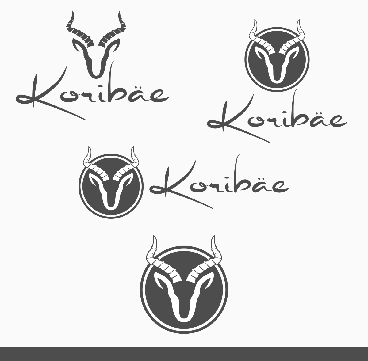
Project Antelope - logo for clothing brand
Wollen Sie auch einen Job wie diesen gewinnen?
Dieser Kunde bekam 250 Logo-Designs von 52 Designern. Dabei wurde dieses Logo-Design Design von B8 als Gewinner ausgewählt.
Kostenlos anmelden Design Jobs finden- Garantiert
-
 A$150
A$150
-
 250 Designs
-
 52 Designer
Logo-Design Kurzbeschreibung
§ We are looking for a logo to be designed for our clothing company that specialises in high-end active wear
§ The logo will be used on all our branding from tags on clothes to the logo on our website so it needs to be scalable
§ Our initial thoughts are something that is unique, abstract, fun but with a funky yet sophisticated edge
§ When we think of our brand and how we want to be seen the following words would describe us and these could be used in emulating the final design: Quality, Sophistication, Happiness, Positive energy, Individuality, Fun, Confidence, Adventure, Limitless, Dreams
§ We would also love to have an antelope incorporated in the design in some way
Zielmarkt/( -märkte)
Consumers of all ages that lead a happy and active life
Industrie/Einheitstyp
Clothing
Logo Text
Koribäe
Logo Stile, die Sie interessieren können
Emblem-Logo
Logo eingeschlossen in einer Form
Pictorial / Combination-Logo
Ein reales Objekt (Text optional)
Abstraktes Logo
Begrifflich / symbolisch (Text optional)
Sehen und fühlen
Jeder Schieber zeichnet eine der Charakteristiken der Marke des Kunden aus sowie den Stil, den euer Logo widerspiegeln sollte.
Elegant
Fett
Spielerisch
Ernst
Traditionel
Modern
Sympatisch
Professionell
Feminin
Männlich
Bunt
Konservativ
Wirtschaftlich
Gehobenes
Anforderungen
Muss haben
- The two dots on top of the 'a'
- An antelope incorporated into the design in some way. We are open to how you do this (head, full body etc.) but would prefer it to be abstract
- Font type: signature font - Stephen type - logo
Schön zu haben
- The antelope incorporated or in replacement of the first ‘A’ of our word
- Wouldn't mind the first letter not being to scale with the rest of the letters
- We envisage the letters not to be joined and the b to be smaller than the last I
Sollte nicht haben
- Anything too childish or gimmicky, this is a high-end brand
- No harsh colours e.g. red
- No decorative fonts