Extreme Performance Program
Add your question or comments below
Hello everybody !
Hi there Sir,
I would like to understand your company name and your tag line,
Thanks in advance,
Pablo
Hello Pablo (Can we call each other with the first name ?),
This logo is not for a company. For now, it is just a project. You can call it "New Year resolution".
I attend to commit my self in rigorous training and this logo will keep me focus day by day.
As I am a Image coach, it could become one of my service.
That's why, a business card could follow, just to present my self and my services.
So, if it will become a service in my coaching practice, the name of the company could be : SD Coaching and the tag line "High Performance. Delivered" this actually is the tag line of accenture, so I have to find something else.
I hope this is helpful for you.
Don't hesitate to ask me as much question as you want.
Sébastien Debrulle
General comment :
Sebastien,
I've just submitted 2 designs, you will understand both and all logo concept.
I would like to understand if this is the right logo direction you looking for, so I'm looking for your comments ok?
You can also send the design feedback directly/personally to our design accounts,
Hope to hear from you,
Kind Regards,
Pablo
First, thanks to all of your for the work already done !
As it takes a lot of time to reply to each of you separately, I will do it in general, so everyone could beneficiate from advices.
Of course, you can take comments aimed for other designer for you, but most of the time, try to stay in your ideas :-)
So,
Craiger64 (551966 & 552078), the XP to the power 2 could be a good idea, the second seems too flat for me, the first one with the P on the X was good. You can also try to make something purely abstract.
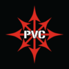
Pablo (554045, 552082, 552462), I really like the abstract logo you have made. I don''t want to have SD coaching in the logo and you have corrected in the last essay, it is very good. The choice of the colors are relevant to me and the fact that you have presented the logo with a business card talks to me a lot ! To further improve this logo, try to put P2 or 2P somewhere. Put 2P at the end of the word "program" may not be a good idea (in my opinion). Even if the logo is pretty good to me, I have shown it to friends and they found it maybe a bit too aggressive. Do you think it could be a way to have it just slightly less aggressive ? (but slightly ! :-) )
Design09 (552687, 552701 & 552891) thanks for the work you have done. what you propose to me is not exactly what I am looking for. Maybe you could try something more futuristic and maybe more abstract; using a X2P is a good idea, but you can also try something more abstract, in which, I could guess the X2P ? I eliminate for now your design to keep clear the best one. It is a fairly good first proposition, but need improvement. 552891 is better than the two other (in my opinion) but still need something more.
Omee (552791) thanks for the job, there are ideas. I don''t request talking about consultancy, strategy and so on, so it is not compulsory to put it on the logo (I prefer not having this words in my logo). Maybe look to other logo I have selected to know what I am really looking for ? Anyway, thanks for your help
Ficius flavius (552053) you have taken my comments into account about titanium and I thank you for that. but your logo is still too smooth to my eyes. The one of Pablo may be a bit too aggressive, you could find a balance between both ideas ?
Giovanni (552168) it is also one of my preferred. simple, futuristic. Unfortunately, I can''t say to you what you can improve :-s maybe find a figurative logo to add on it ? I consider your design, but a little something is missing in my opinion.
Subhadip (552231), same comment that for Giovanni. I like what you have done. it is simple yet impactful. The X is a pretty great idea !! Maybe the "2P" looks too simple or unfinished besides ? could work on the 2P to make more strong, a bit more aggressive ? thanks a lot, please made some change and submit new ideas !!
Logo craft production (552794 & 552796), thanks for your work ! the 552794 makes me thinking at indians !! funny but not what I am looking for :-). 552796 is a better one in my opinion maybe you could try to make a more abstract logo ? without imitating, look at the other selected, there are on the way on what I like.

Hi Sir,
Thanks for the invite. I am going to submit two logo. Hope that you will like it.
Regards
Jack
-
 Previous page
- You're on page 1
- Seite 1 von 1
-
 Next page
1 - 7 von 7 Kommentare