I'm marketing myself and need some quirky creativity to create a logo and matching stationary set to

Wollen Sie auch einen Job wie diesen gewinnen?
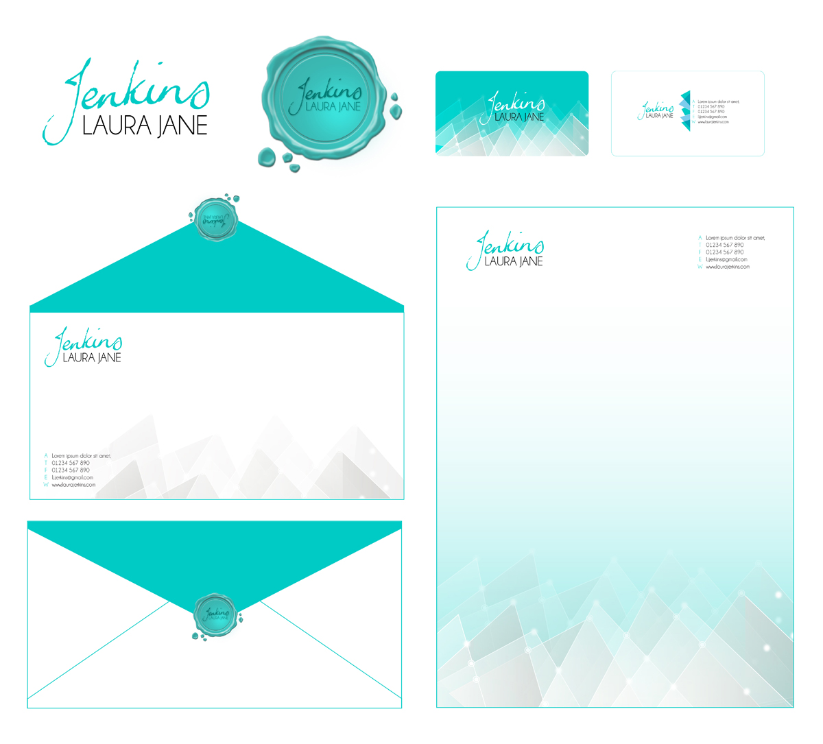
Dieser Kunde bekam 38 Briefpapier-Designs von 5 Designern. Dabei wurde dieses Briefpapier-Design Design von Pinky als Gewinner ausgewählt.
Kostenlos anmelden Design Jobs findenSchreibwaren-Design Kurzbeschreibung
My name is Laura Jenkins and I’m designing a matching set of branded stationary to promote my own brand - me. I need
a logo (this need to be in a file format that I can use the logo for future applications in a variety of electronic senarios such as blogs, websites, powerpoint presentations)
a letterhead design or page border/background (I need to be able to write on this in Pages and Word)
a business card design
an envelope design (I need to be able to write on this in Pages and Word)
I want the logo and designs to represent me and who I am professionally.
Who am I? I’m a student who is currently starting marketing and am keen to follow the path of brand management, communications or electronic marketing. I want to be able to use the stationary for all forms of communication, resumes, letters, proposals, business reports etc and it won’t always be directly related to my ambitions to be a marketer so it must be about me, not marketing. I’ve had a think about myself as a professional and between my friends, family and I, we have summed it up in three words, in no particular order; Ambitious, Personable, Versatile. I’m also a fairly creative personality and like to trust a hunch, take a risk and be a little unique. I want something that represents luxury, and exquisite, simplicity, open space and delicate detail is how i imagine this. This doesn’t all have to be incorporated, I just want to help you get into the head space of being me and at the end of the day, it is for use in professional environments so it can’t be too girly, immature, bizarre etc.
Aktualisierungen
Project Deadline Extended
Reason: I've extended the deadline because I'm getting some really great submissions and want the time to be able to work with them to produce what I want and am suddenly realising this process takes a little linger than planned.
Added Monday, October 14, 2013
Industrie/Einheitstyp
Marketing
Sehen und fühlen
Jeder Schieber zeichnet eine der Charakteristiken der Marke des Kunden aus sowie den Stil, den euer Logo widerspiegeln sollte.
Elegant
Fett
Spielerisch
Ernst
Traditionel
Modern
Sympatisch
Professionell
Feminin
Männlich
Bunt
Konservativ
Wirtschaftlich
Gehobenes
Anforderungen
Muss haben
- The logo MUST haves...
- The colour theme is Turquoise, with any element of black, white, grey that is needed to add texture. I’m not opposed to the use of other colours, however the dominant colour must be Turquoise.
- It must have my name; Laura Jane Jenkins. You can play with my name in anyway you like eg. L Jenkins, LJJenkins, Laura Jenkins Laura J Jenkins, but Jenkins needs to be written complete and represent my own handwriting.
Schön zu haben
- The nice to haves
- I really like the use of texture, depth and shade. I think it would be really cool as well to have a mixture of real imagery (photography) and graphics and this would certainly achieve the texture, depth and shade.
- I would prefer to stick with just shapes and lines, not actual real things like a flower or pen as this give the image that a pen or flower is an extension or representation of myself. However if you feel that a real thing works amazingly well with what you’re doing, then by all means, be creative. I say this because of my previous nice to have being photography, but I have seen some amazing photography that is not actually of anything recognisable.
- I really like the look and idea and symbolism of the old school wax stamps that they used to seal envelopes and was playing around with that initially before I realised I’m not talented enough to do it myself. My original idea incorporated a cross between a wax stamp and a pendant, with my initials and crazing like you see on old porcelain and then a mixture of script and shapes extending. It does not at all have to even close represent this, but I wanted to give you some more insight to me and what I’ve been playing around with
- I have also been pinning some things on Pinterest so it may help you to check out my board called My Brand Design
- http://www.pinterest.com/laurajenkins507/my-brand-design/