Local taco company in Wellington needs new logo design
Wollen Sie auch einen Job wie diesen gewinnen?
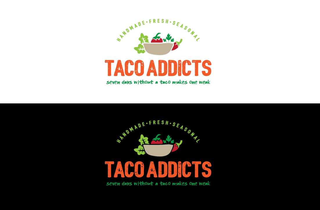
Dieser Kunde bekam 79 Logo-Designs von 24 Designern. Dabei wurde dieses Logo-Design Design von GLDesigns als Gewinner ausgewählt.
Kostenlos anmelden Design Jobs finden-
 NZ$150
-
 79 Designs
-
 24 Designer
Logo-Design Kurzbeschreibung
Looking for a new logo that stands out and tells a story – Taco Addicts. Good tacos that you go to when you need your taco fix. Fresh, delicious and healthy ingredients. Always soft tacos – none of that Americanised crispy taco stuff. I want a logo that is eye catching and colourful – that jumps out and screams delicious, fresh food. Is fun and playful, but not childish.
Amber hails from the most taco obsessed city in the USA, that being Austin, Texas. Amber uses seasonal fruits and veggies from NZ to create handmade and wholesome kai, bringing the flavours of Austin and Mexico to Wellington to share the tacos she grew up eating in Austin. Taco Addicts has been going since September 2016, with taco delivery to offices during the week, and tacos to order at markets and festivals in the weekend. The idea is to grow the business through more local markets as well as catering to offices for events, meetings and shared lunches. Taco Addicts would also like to expand by selling some of the products – the tortillas, salsa, and possibly some of the fillings, in local supermarkets. She needs a logo that will fit all of these endeavours.
Taco Addicts has a small catch phrase – ‘seven days without a taco makes one weak’
Zielmarkt/( -märkte)
People who live in NZ and miss decent Mexican food, or Tex-Mex food. Vegans and vegetarians looking for something different. People who care about ethical eating choices. People who want tasty food that is value for money, made with quality ingredients.
Industrie/Einheitstyp
Caterer
Logo Text
Taco Addicts
Logo Stile, die Sie interessieren können
Pictorial / Combination-Logo
Ein reales Objekt (Text optional)
Wortmarke-Logo
Word oder namensbasiertes Logo (nur Text)
Zu verwendende Schriftarten
Farben
Vom Kunden ausgewählte Farben für das Logo Design:
Sehen und fühlen
Jeder Schieber zeichnet eine der Charakteristiken der Marke des Kunden aus sowie den Stil, den euer Logo widerspiegeln sollte.
Elegant
Fett
Spielerisch
Ernst
Traditionel
Modern
Sympatisch
Professionell
Feminin
Männlich
Bunt
Konservativ
Wirtschaftlich
Gehobenes
Anforderungen
Muss haben
- I want to be colourful, full of life – the food is fresh, delicious, tasty. Everything is handmade, and there’s no crap ingredients used.
- I like reds, greens and yellows – the sort of colours that you find in chili peppers, tomatoes, salsas. My current website is www.easyaskai.nz. I’m happy to rebrand this site with the new logo, but I like the general set up of this site, and don’t have time to do a complete overhaul.
- The logo will be used on business cards, flyers and brochures, food labels, the website, signage, invoices, etc. So it needs to print clearly in colour but also black and white for things like invoices. At the end, I’d like to have the RGB code for each colour so I can use throughout.
Schön zu haben
- I have a current Easy as Kai logo, and I like the colours, but it doesn’t tell a story that says tacos. I have a few drawings of fruits and veggies, especially the chili that I use regularly on flyers and branding. I like the chili – what it stands for in terms of Mexican/Tex-Mex food and how much influence it has on the flavours of my creations
Sollte nicht haben
- There is a Mexican restaurant in Wellington – their logo is teal and orange, so I don’t want to use these colours. There is already a range of taco things in NZ using the Dia de los Muertos skull as their logo. I don’t want to use this, as I’m not selling ‘authentic Mexican food,’ and I think it's overused.
- I'm not interested in a version of a logo that says 'TA.' I'm not selling tits and ass, I'm selling tacos. Interested in less 'corporate' and more fun, vivid, bold designs that also look professional.