

 Aktualisieren
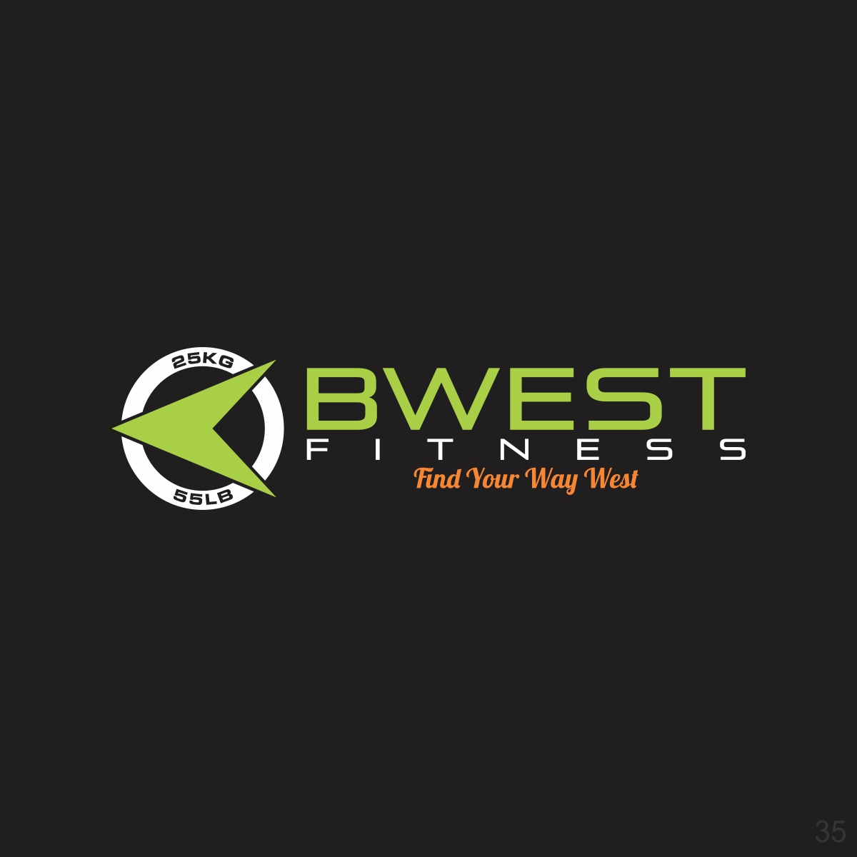
BWest Fitness, Find Your Way West
Wollen Sie auch einen Job wie diesen gewinnen?
Dieser Kunde bekam 331 Logo-Designs von 32 Designern. Dabei wurde dieses Logo-Design Design von papamnoguera als Gewinner ausgewählt.
Kostenlos anmelden Design Jobs finden
-
 US$150
-
 331 Designs
-
 32 Designer
Logo-Design Kurzbeschreibung
I'm an independent personal trainer who needs a logo that pops and catches the attention of viewers while relating to the product. Just recently opened my own business and would like to incorporate a symbol or depiction of West if possible (like a compass or direction indicator). Something that communicates breakthroughs and personal growth on a mental, physical, and spiritual level. I'd like to put this logo on my website, t-shirts, and other merchandise. Would like to see the logo in white/ black, lime green/ black, or any pop type colors.

Aktualisierungen
Project Deadline Extended
Reason: Would like to see a stand alone logo for my business. In this logo I'd like it to represent fitness/ weight lifting (without showing letters).
Added Wednesday, April 12, 2017
Zielmarkt/( -märkte)
Ages 30+, Career professionals, Men/ women looking for growth and breakthroughs in their mind, body, and spirit.
Industrie/Einheitstyp
Life Coaching
Logo Text
BWest Fitness
Logo Stile, die Sie interessieren können
Emblem-Logo
Logo eingeschlossen in einer Form



Pictorial / Combination-Logo
Ein reales Objekt (Text optional)



Figuren-Logo
Logo mit Abbildung oder Zeichen

Lettermark-Logo
Kurzwort oder Buchstaben-Logo (nur Text)



Farben
Vom Kunden ausgewählte Farben für das Logo Design:
Sehen und fühlen
Jeder Schieber zeichnet eine der Charakteristiken der Marke des Kunden aus sowie den Stil, den euer Logo widerspiegeln sollte.
Elegant
Fett
Spielerisch
Ernst
Traditionel
Modern
Sympatisch
Professionell
Feminin
Männlich
Bunt
Konservativ
Wirtschaftlich
Gehobenes
Anforderungen
Muss haben
- Logo must relate to product/ service (growth/ change in mind, body, and spirit). Signify breakthroughs, overcoming limiting beliefs, and destroying barriers to success. A design that is clearly visible and has a lasting impression.
Schön zu haben
- Colors that pop to grab attention, but still relates to product/ service. Would like to see white/ black and plays with shadows, lime green/ black, and any other combos that stand out. One that is welcoming, but has an artistic feel.
Sollte nicht haben
- Dull colors that don't stand out. Basic imagery that's not memorable.


