Webdesign for recipe site
Wollen Sie auch einen Job wie diesen gewinnen?
Dieser Kunde bekam 16 Web-Designs von 6 Designern. Dabei wurde dieses Web-Design Design von pb als Gewinner ausgewählt.
Kostenlos anmelden Design Jobs finden- Garantiert
-
 €270
€270
-
 16 Designs
-
 6 Designer
Web-Design Kurzbeschreibung
Please take a look at www.kochmeister.com. KM is a community site with around 60000 user recipes. It is a one-man-project and needs a redesign.
The new design shall meet these facts
high usability
1st focus on content
2nd focus on search and registration-elements
flat menü ? much content above the fold
well contured font type, size and color
coherent button, box and element design
useful design guide for the whole site
flexible font-sizes (changable css)
flexible color set for day and night mode (changable css)
And these facts shall not change
Keeping the „soul“ of kochmeister. KM is an independent and free recipe source. No media corporation. Everyone can participate.
This means, that KM is seen as a very personal, even private website and the design shall transport this. The design shall not be cold or heartless. It shall work and leave a cheerful impression as well. The design shall keep the atmosphere of a one-man-project, where everyone is welcomed and the personal touch is warm and heartly.
Since 8 years, the major color is red. The tone must be kept while the intensitity shall be lowered. A decent background and a warm and welltought color set are wanted in a way, that the tone of the website is still seen as red. Probably the links shall remain red, that way the rest can be set less intense.
And these facts are open
The design elements are the cook and the red tomato. While it would be nice to keep the cook (not required at any means), the tomato could be dropped. If they fit into a new design – great, if not, it's ok.
Example Pages
Recipe: http://www.kochmeister.com/r/68765-panini-vereinfachte-variation.html
Category: http://www.kochmeister.com/kb/0k0/Backrezept/rezepte.html
Homepage: http://www.kochmeister.com
Aktualisierungen
A nice color set: http://www.designcrowd.com/design/463831
A well structured design: http://www.designcrowd.com/design/452858
Added Saturday, January 07, 2012
Project Deadline Extended
Reason: Just 3 days left and no submission yet.
We will guarantee the project payment (thanks for hinting, Rohit) and extend the deadline by 7 days.
Added Thursday, January 12, 2012
Thank you for your submissions.
The brown/red/beige color-sets are good, they lead the way. The layout though is mostly too playful. It shall be clean and simple and likely to fit for all the content, for the single recipe as well as the recipe lists, the profile page and the homepage.
I got inspired by you color sets and set up a testpage that pretty much goes in to the direction I want. Very flat header, peaceful and warm colors, no distraction, focus on the content. What's still missing is the breadcrumb section and an idea to fill the homepage and the recipe lists. And probably the colors (especially the light background-color, is it beige?) can also be better choosen.
Please see http://www.kochmeister.com/test-543677423/r_v01.html
Kind regards, Peter
Added Wednesday, January 18, 2012
Project Deadline Extended
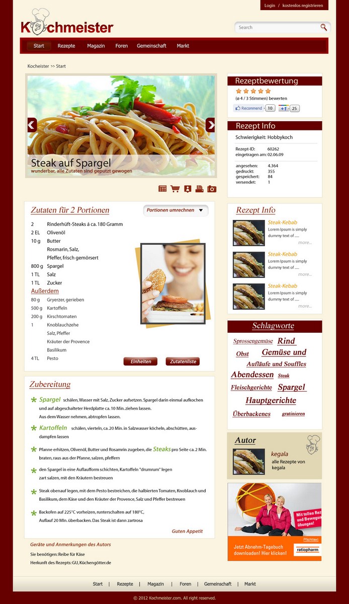
Reason: I extend the deadline once more to give Hetz Designs the opportunity to participate. It would be nice to see drafts that go more into the clean and simple direction as I updated in the brief. Here is the current status: http://www.kochmeister.com/r/60262-steak-auf-spargel.html (is on test now). Maybe the beige-colors can be choosen more cleaner and suggestions for the homepage and recipe lists and the footer are very welcome also. Looking forward for your designs!
Added Saturday, January 21, 2012
I'll put the Feedback on the latest design of perfectblue in the brief, so you all find it.
http://www.designcrowd.com/design/587249/web-design-by-perfectblue
-
Dont't know man, this still doesn't look as clean as I need it. There are 100s of recipe sites online and it is urgent to design the page with clear focus on the content. As little distraction as possible, there will be ads for that.
Mainly, you did too much. There are too many design elements and the round bites with the squares. The header shall be as small as in the mentioned page: http://www.kochmeister.com/r/60262-steak-auf-spargel.html
I show you an example of a clean page as I see it: http://www.seomoz.org/q/ips-and-domains
These are not the colors I want but they all fit together. I also need the font larger and the basic color scheme must be warmer. But maybe you can understand where I'm going or where I want to go.
Please do it very simple, with no corners, as flat and clean as possible, with a genuine feeling on first site of where the content is, what the focus of the site is (content).
Thank's.
Added Friday, January 27, 2012
Zielmarkt/( -märkte)
age 35-55, majority is female, interested in recipes, cooking, baking
Industrie/Einheitstyp
Media
Sehen und fühlen
Jeder Schieber zeichnet eine der Charakteristiken der Marke des Kunden aus sowie den Stil, den euer Logo widerspiegeln sollte.