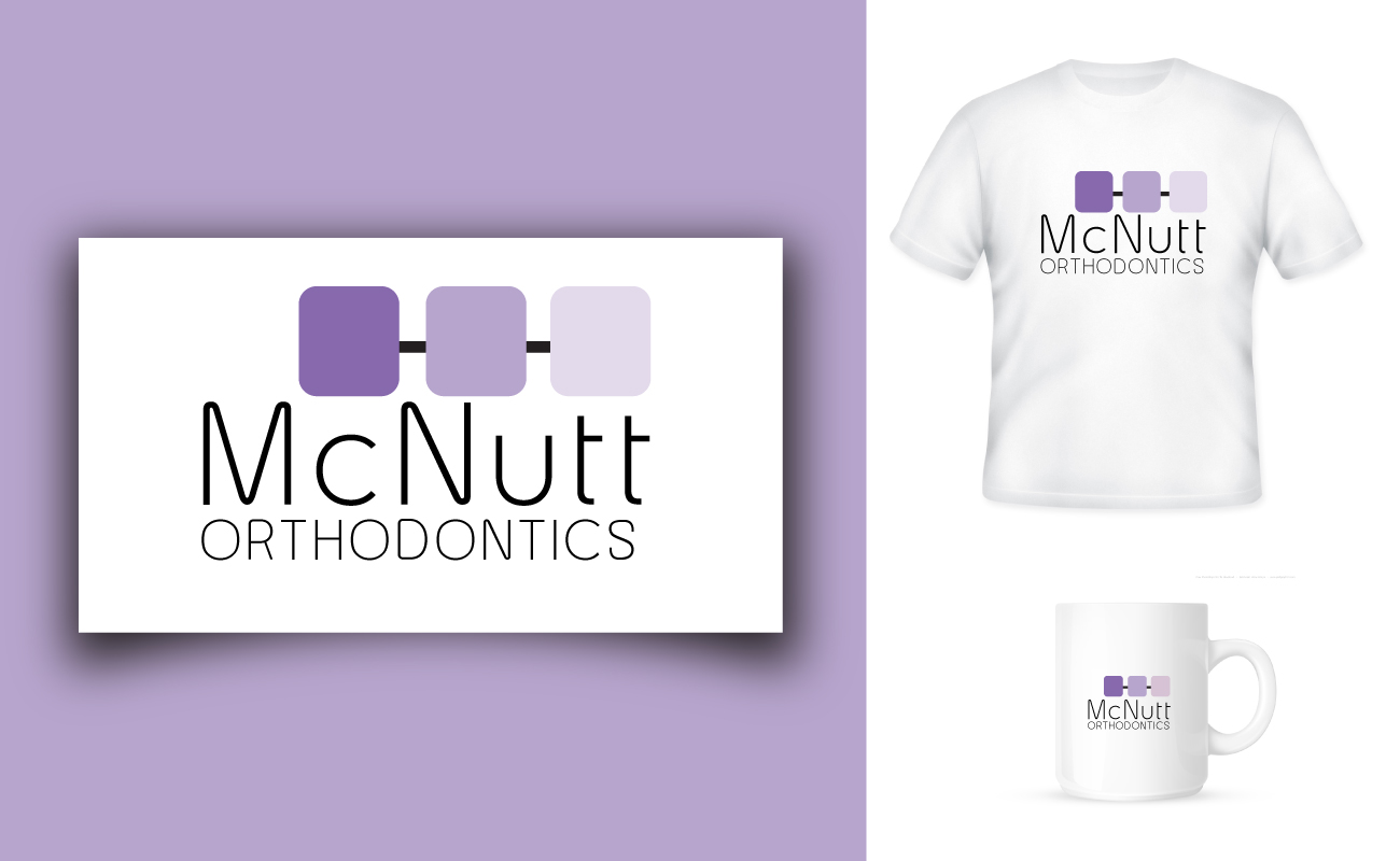
McNutt Orthodontics
Wollen Sie auch einen Job wie diesen gewinnen?
Dieser Kunde bekam 89 Logo-Designs von 29 Designern. Dabei wurde dieses Logo-Design Design von Ideaist Designs als Gewinner ausgewählt.
Kostenlos anmelden Design Jobs finden-
 US$400
-
 89 Designs
-
 29 Designer
Logo-Design Kurzbeschreibung
Update to brief on 1-26-13: I have eliminated many designs and wanted to update the brief to better communicate what we want. I do not want any designs that actually have a
cartoon teeth, or symbols that look like teeth, or smiley faces. Designs with shadows and gradients are not desired. Modern crisp fonts are preferable (Times New Roman designs will be eliminated). We have also received designs with a symbol off to the left of the name that appear to look like generic corporate stamp. Hopefully this helps.
We are looking to re-brand our orthodontic practice with a new logo and keep within a color palette that will compliment our existing website. If you go to our site, www.thetoothmover.com you will see some a range of purple color, silver and black. That is our main marketing color palette. The logo needs to be be easily converted for other uses, such as t-shirt, water-bottles for our patients, banners, etc. That being said, using shadowing and gradients will likely make it harder for us to use. We provide braces and invisalign to straighten teeth and create beautiful smiles.
Zielmarkt/( -märkte)
We serve children, teens and adults.
Industrie/Einheitstyp
Marketing
Logo Text
McNutt Orthodontics
Logo Stile, die Sie interessieren können
Emblem-Logo
Logo eingeschlossen in einer Form
Pictorial / Combination-Logo
Ein reales Objekt (Text optional)
Farben
Vom Kunden ausgewählte Farben für das Logo Design:
Sehen und fühlen
Jeder Schieber zeichnet eine der Charakteristiken der Marke des Kunden aus sowie den Stil, den euer Logo widerspiegeln sollte.