Children's nonprofit golf tournament logo
Wollen Sie auch einen Job wie diesen gewinnen?
Dieser Kunde bekam 65 Logo-Designs von 23 Designern. Dabei wurde dieses Logo-Design Design von Jay Design als Gewinner ausgewählt.
Kostenlos anmelden Design Jobs finden-
 US$150
-
 65 Designs
-
 23 Designer
Logo-Design Kurzbeschreibung
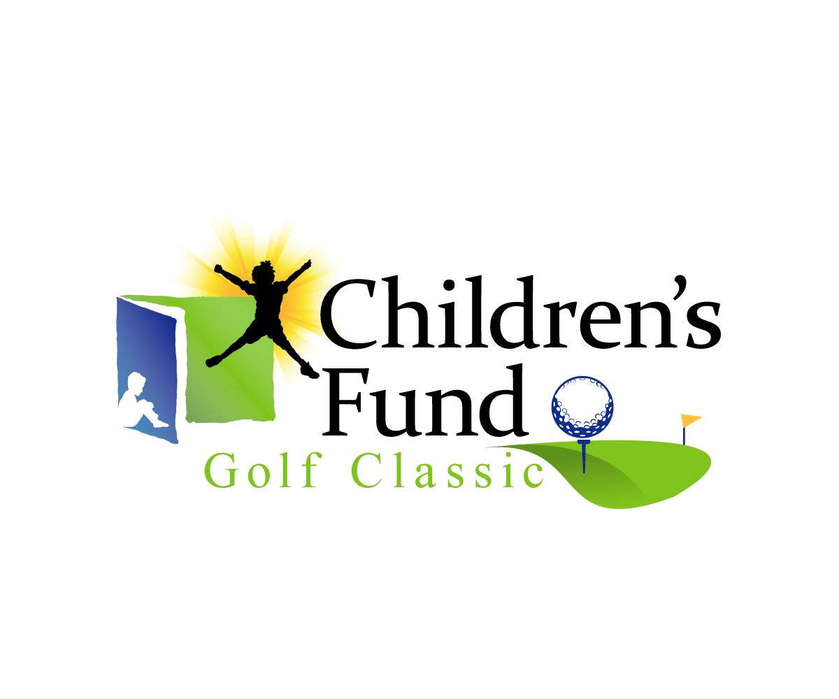
This project requires the creation of a logo for a golf tournament for Children's Fund, a 30 year old nonprofit in San Bernardino, CA. We would like the new golf classic logo to be a hybrid of our Children's Fund logo. If you look at the logo we designed for our 30th anniversary, you can see how the original nonprofit logo is still entact but we've added a special element (the 30) in the bottom right side of the logo. We want to stick to this methodology and use the original nonprofit logo for our golf classic logo, but place something like a golf ball in the bottom right hand side of the logo. We want to keep the original nonprofit logo in place, but remove the tagline and insert "Golf Classic" in there with some graphic element in the bottom right of the logo.
Zielmarkt/( -märkte)
high income, golfers, people who want to support children.
Industrie/Einheitstyp
Non Profit
Logo Text
Children's Fund Golf Classic
Zu verwendende Schriftarten
Sehen und fühlen
Jeder Schieber zeichnet eine der Charakteristiken der Marke des Kunden aus sowie den Stil, den euer Logo widerspiegeln sollte.
Elegant
Fett
Spielerisch
Ernst
Traditionel
Modern
Sympatisch
Professionell
Feminin
Männlich
Bunt
Konservativ
Wirtschaftlich
Gehobenes
Anforderungen
Muss haben
- Must have the original nonprofit logo in it (Children's fund with the blue and green boxes, the yellow starburst and the two kid shadows.) Do not use the tagline. Must have some graphic element in the bottom right side of the logo (like we did in the provided sample 30th anniversary logo.)
Schön zu haben
- golf ball, tee, golf flag
- Colors of our logo. Do not add any additional colors.
- Blue: CMYK: 100/68/0/12
- Yellow: 0/24/94/0
- Green: 50/0/100/0
Sollte nicht haben
- too much...want to keep it pretty simple and not stray too much from the original feel and tone of the nonprofit logo.