Clean, unique logo for mapping service
Wollen Sie auch einen Job wie diesen gewinnen?
Dieser Kunde bekam 184 Logo-Designs von 62 Designern. Dabei wurde dieses Logo-Design Design von beisone1 als Gewinner ausgewählt.
Kostenlos anmelden Design Jobs finden-
 US$150
-
 184 Designs
-
 62 Designer
Logo-Design Kurzbeschreibung
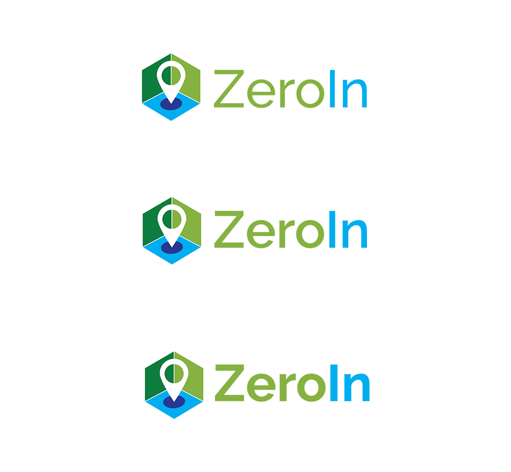
We are looking for logo ideas for a new mapping service we are developing. The name of the service is ZeroIn. The meaning of the name, which needs to be visually conveyed in the logo itself, comes from "Zeroed in" and points to the highly localized, detailed and simple-to-use, high quality nature of the mapping interface we are developing. We do not want a logo icon or distracting graphical elements incorporated within the text/font of the name itself, for the urpose of good readability. Idelly, Zero" and "In" should be two different colors to differentiate the two words and help avoid reading the "I" as a lower case "L". The logo (icon and text) also needs to read well in small sizes. In short the logo needs to visually convey "getting to a highly localized level on a map". The attached image shows the approximate level of "localization" we are dealing with.
Industrie/Einheitstyp
It Service
Logo Text
ZeroIn
Logo Stile, die Sie interessieren können
Abstraktes Logo
Begrifflich / symbolisch (Text optional)
Zu verwendende Schriftarten
Farben
Der Designer kann die Farben des Designs frei wählen
Sehen und fühlen
Jeder Schieber zeichnet eine der Charakteristiken der Marke des Kunden aus sowie den Stil, den euer Logo widerspiegeln sollte.
Elegant
Fett
Spielerisch
Ernst
Traditionel
Modern
Sympatisch
Professionell
Feminin
Männlich
Bunt
Konservativ
Wirtschaftlich
Gehobenes
Anforderungen
Schön zu haben
- Two different colors used for Zero and In.. differentiate the two words and help avoid reading the "I" as a lower case "L"
Sollte nicht haben
- Should not incorporate the icon into the text