Redo logo design to be more professional
Wollen Sie auch einen Job wie diesen gewinnen?
Dieser Kunde bekam 109 Logo-Designs von 43 Designern. Dabei wurde dieses Logo-Design Design von creativemood438 als Gewinner ausgewählt.
Kostenlos anmelden Design Jobs finden-
 US$150
-
 109 Designs
-
 43 Designer
Logo-Design Kurzbeschreibung
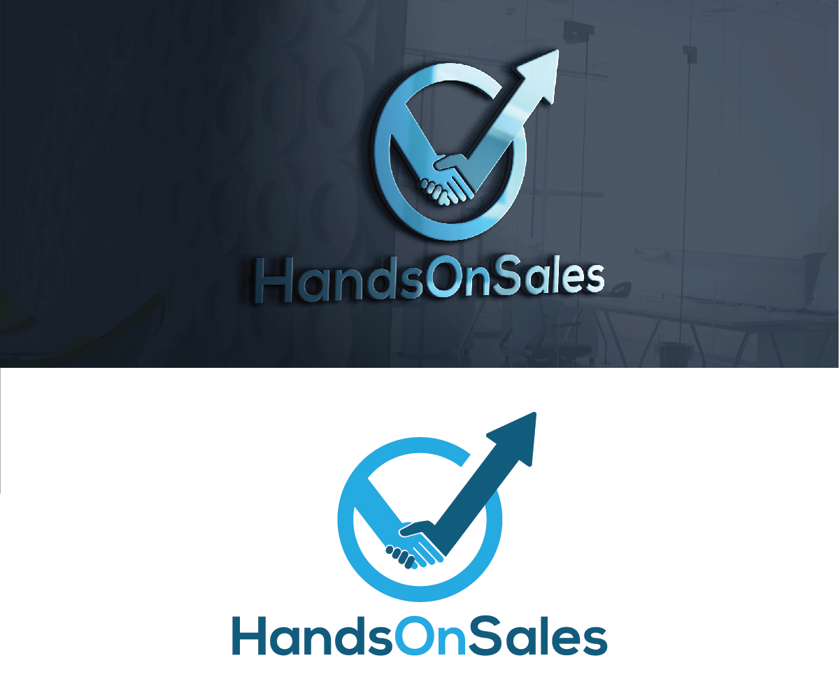
I have had a logo for some years now, but it has to appear more professional. By Professional I mean simpler and more modern, a logo which signals trust. Handsonsales helps B2B companies to improve their results, by working HandsOn the businesss, thats why the original idea with the two hands breaking the curve. I like the logo to show two hands holding a curve, that had a downwards trend and is pushed to new highs by the other. So Improve the graphical quality and make it simpler, perhaps a different frame if any.
Zielmarkt/( -märkte)
Business owners and CEO...so High level business men
Industrie/Einheitstyp
It Professional
Logo Text
HandsOnSales
Logo Stile, die Sie interessieren können
Pictorial / Combination-Logo
Ein reales Objekt (Text optional)
Abstraktes Logo
Begrifflich / symbolisch (Text optional)
Farben
Der Designer kann die Farben des Designs frei wählen
Sehen und fühlen
Jeder Schieber zeichnet eine der Charakteristiken der Marke des Kunden aus sowie den Stil, den euer Logo widerspiegeln sollte.
Elegant
Fett
Spielerisch
Ernst
Traditionel
Modern
Sympatisch
Professionell
Feminin
Männlich
Bunt
Konservativ
Wirtschaftlich
Gehobenes
Anforderungen
Muss haben
- The two hands that change the curve from downwards to going higher that the highest in the past. It needs to be simplistic