Logo design for [re-branding] digital marketing agency.
Wollen Sie auch einen Job wie diesen gewinnen?
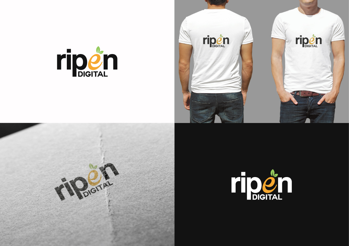
Dieser Kunde bekam 240 Logo-Designs von 86 Designern. Dabei wurde dieses Logo-Design Design von The Marble Peach als Gewinner ausgewählt.
Kostenlos anmelden Design Jobs finden- Garantiert
-
 US$150
-
 240 Designs
-
 86 Designer
Logo-Design Kurzbeschreibung
I need a new logo for my digital marketing agency, currently going through a re-branding.
RIPEN Digital provides inbound marketing services, designed to attract, convert, & close new prospects for our clients ("RIPEN" their sales funnel). I've been contracting for 5-6 years as a side hustle under another LLC and now that I've taken the plunge to work full-time on the agency I'd like to rebrand/add some legitimacy to my brand. Definitely want to play on the "ripening your customer base", "fruitful marketing" aspect.
I'm open to your full creativity, but I do have a few preferences/wants:
-I'd prefer to maintain a 16:9 aspect ratio (but don't let this stop you if you have another creative idea in mind).
-I'd like the main colors of the logo to be: #96c95c and #f9a82f (very citrus feel). Again, this is a preference, and if you feel like you'd prefer to use different shades, etc., please feel free to do so.
-I have a preference for flat design
-I had envisioned incorporating a slice of citrus fruit (flat design), or a drop of fresh squeezed juice somewhere into the logo. Definitely not a requirement, but just something I had brainstormed.
As reference, I really like the look/layout of this logo (NewsCred): http://19871-presscdn.pagely.netdna-cdn.com/wp-content/themes/newscred/assets/img/v3/press/newscred-logo-primary-rgb.png
Thanks,
James
Zielmarkt/( -märkte)
Small/mid-sized businesses.
Industrie/Einheitstyp
Marketing
Logo Text
RIPEN Digital
Logo Stile, die Sie interessieren können
Pictorial / Combination-Logo
Ein reales Objekt (Text optional)
Abstraktes Logo
Begrifflich / symbolisch (Text optional)
Wortmarke-Logo
Word oder namensbasiertes Logo (nur Text)
Lettermark-Logo
Kurzwort oder Buchstaben-Logo (nur Text)
Zu verwendende Schriftarten
Farben
Vom Kunden ausgewählte Farben für das Logo Design:
Sehen und fühlen
Jeder Schieber zeichnet eine der Charakteristiken der Marke des Kunden aus sowie den Stil, den euer Logo widerspiegeln sollte.
Elegant
Fett
Spielerisch
Ernst
Traditionel
Modern
Sympatisch
Professionell
Feminin
Männlich
Bunt
Konservativ
Wirtschaftlich
Gehobenes
Anforderungen
Muss haben
- -I'd like the main colors of the logo to be: #96c95c and #f9a82f (very citrus feel).
Schön zu haben
- -I'd prefer to maintain a 16:9 aspect ratio (but don't let this stop you if you have another creative idea in mind).
- -I have a preference for flat design
- -I had envisioned incorporating a slice of citrus fruit (flat design), or a drop of fresh squeezed juice somewhere into the logo. Definitely not a requirement, but just something I had brainstormed.
- -"RIPEN" should ideally be the main focus of the logo/big & bold. "Digital" can be small/creatively worked in somehow
Sollte nicht haben
- N/A