

 Aktualisieren
Newspaper Ad/ Creative Concept required for Australian Education Provider
Wollen Sie auch einen Job wie diesen gewinnen?
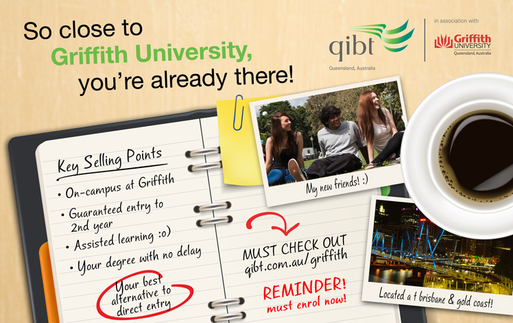
Dieser Kunde bekam 25 Newsletter-Werbung-Designs von 7 Designern. Dabei wurde dieses Newsletter-Werbung-Design Design von Purple Hearts als Gewinner ausgewählt.
Kostenlos anmelden Design Jobs finden
- Garantiert
-
 US$160
-
 25 Designs
-
 7 Designer
Zeitungsanzeige-Design Kurzbeschreibung
QIBT is an Australian education provider, providing pathways to study at Griffith University. For more information, please visit our website - www.qibt.qld.edu.au.
We require a creative concept to be developed that we can apply across various media including press ads, posters, digital, etc.
The concept will leverage a strong, single-minded message: “So close to Griffith University, you’re already there!” This message, we feel, speaks to our key value proposition.
It ultimately aligns QIBT to the Griffith brand and differentiates us away from our competitors. We are now seeking to creatively present this message - to bring it to life in a variety of mediums.
The creative must be simple, striking, and unique/memorable and build intrigue.
BACKGROUND/ TARGET MARKET:
The tertiary student market can be segmented into two groups: those for which Griffith University entry is “attainable” and those for which it is not. QIBT targets those in the latter, referred to as the “Aspirational” segment.
To do this effectively however requires QIBT to coordinate its brand position with that of Griffith University. A coordinated positioning is one in which Griffith University is the desired brand and QIBT is the enabler brand.
POSITIONING:
The creative should seek to position QIBT as the closest alternative (QIBT is directly interchangeable for first year at Griffith University) and therefore the preferred alternative (QIBT is preferred to competitors such as TAFE) to direct Griffith entry.
CREATIVE REQUIREMENTS:
Creative should leverage themes which reinforce our position and empower students to keep sight of their educational goals. The solution must not only be strong, but durable – to enable repeated application of the creative over the longer term – to effectively build awareness and position the QIBT brand.
Headline: So close to Griffith University, you’re already there!
Tagline: Your best alternative to direct entry
Key Selling Points:
• On-campus at Griffith
• Guaranteed entry to 2nd year
• Assisted learning for better results
• Your degree with no delay
Call to Action: qibt.com.au/griffith
Other:
• Design must include campus locations (text only): Brisbane & Gold Coast
• Must include joint QIBT/ Griffith logo – supplied.
Some of our regular corporate fonts have been supplied - ideally, some of these will be incorporated into the design.
SPECIFICATIONS:
Initial concept to be presented as a print ad: 153mm H x 243mm W.
For questions, please email qibt@navitas.com.

Aktualisierungen
Hello Designers, we would just like to extend a big THANK YOU for all submissions and responses to our 'Newspaper Ad/ Creative Concept'. We were presented with some really great ideas and a diverse range of concepts - all of which were very high quality and well-thought designs.
Added Monday, October 28, 2013
Zielmarkt/( -märkte)
17-21 year old/ high school students.
Australian and onshore international students seeking access to university, but don't quiet meet the criteria for direct entry.
Industrie/Einheitstyp
Education
Sehen und fühlen
Jeder Schieber zeichnet eine der Charakteristiken der Marke des Kunden aus sowie den Stil, den euer Logo widerspiegeln sollte.
Elegant
Fett
Spielerisch
Ernst
Traditionel
Modern
Sympatisch
Professionell
Feminin
Männlich
Bunt
Konservativ
Wirtschaftlich
Gehobenes
Anforderungen
Muss haben
- - The QIBT and Griffith joint logo - supplied
- All content, as suggested in the project outline above (i.e.heading, tagline etc.)
- Corporate colours: QIBT green - RGB 0 / 158 / 96, Griffith Red RGB 255 / 0 / 0