Update/Refreshcommercial real estate company logo
Wollen Sie auch einen Job wie diesen gewinnen?
Dieser Kunde bekam 194 Logo-Designs von 69 Designern. Dabei wurde dieses Logo-Design Design von Deziners Zone als Gewinner ausgewählt.
Kostenlos anmelden Design Jobs finden-
 US$300
-
 194 Designs
-
 69 Designer
Logo-Design Kurzbeschreibung
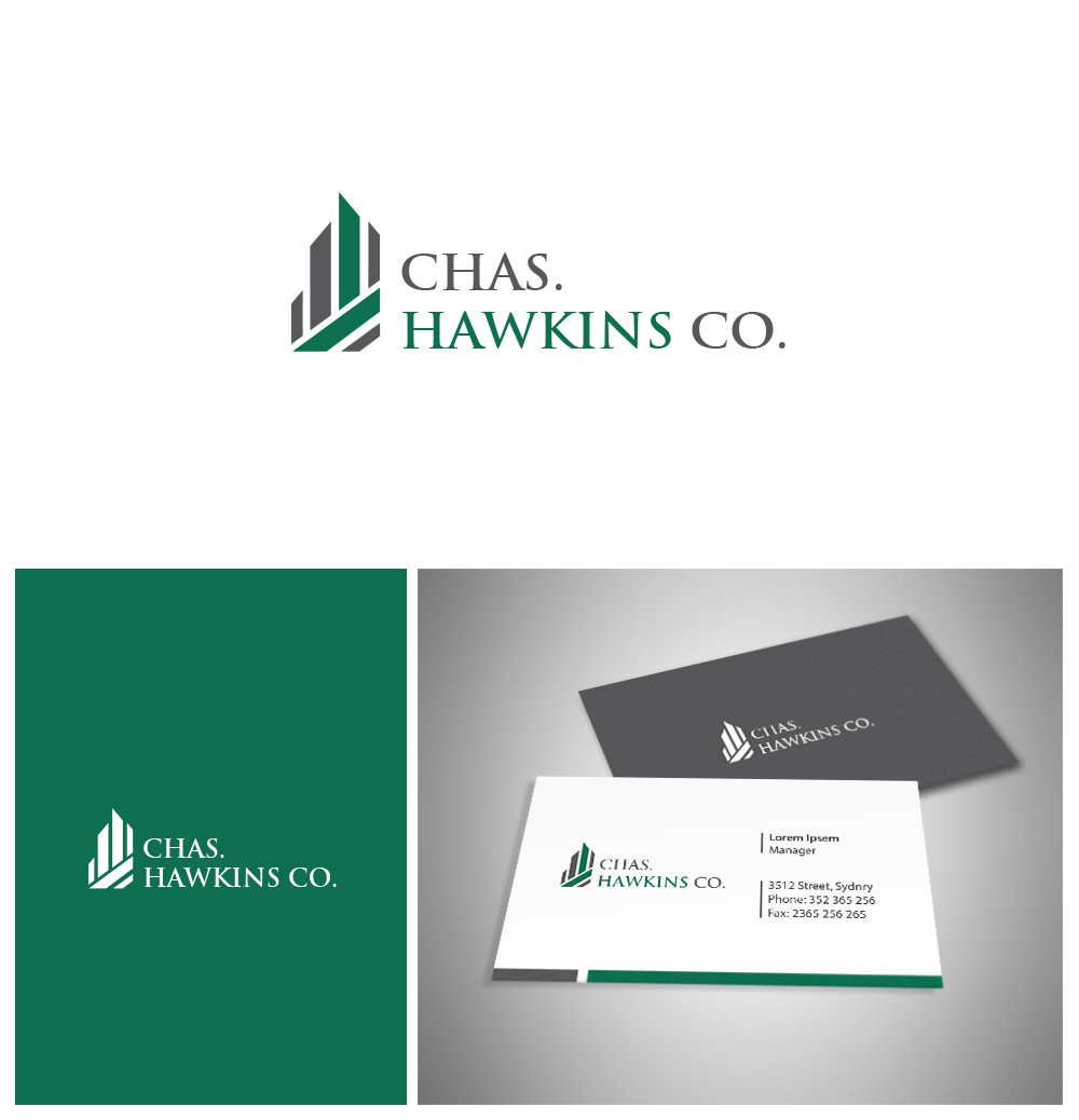
We are a commercial real estate company (Chas .Hawkins Co., Inc.) looking to update/refresh our company logo. We are a commercial real estate company. We are recognized as CHCO for short and we are not opposed to using this in the logo verses our full title: Chas. Hawkins Co. We are open to all color schemes and designs. We want to modernize our logo, but still keep a clean, simple and professional feel. We want the logo to stand-out, but also be easy to read and easily identifiable on our signs and marketing materials.
Aktualisierungen
Project Deadline Extended
Reason: There are several designs that are close to what we are wanting, but we would like to see more submissions. We like having an image in the logo and we like CHCO. We also would like to see a design with and without "commercial real estate" included in the design. Thank you all for your submissions.
Added Tuesday, June 13, 2017
Industrie/Einheitstyp
Real Estate
Logo Text
Either Chas. Hawkins Co. or CHCO. The established in 1962 and Commercial Real Estate on the existing logo do not have to be on the new logo.
Logo Stile, die Sie interessieren können
Wortmarke-Logo
Word oder namensbasiertes Logo (nur Text)
Lettermark-Logo
Kurzwort oder Buchstaben-Logo (nur Text)
Sehen und fühlen
Jeder Schieber zeichnet eine der Charakteristiken der Marke des Kunden aus sowie den Stil, den euer Logo widerspiegeln sollte.
Elegant
Fett
Spielerisch
Ernst
Traditionel
Modern
Sympatisch
Professionell
Feminin
Männlich
Bunt
Konservativ
Wirtschaftlich
Gehobenes
Anforderungen
Sollte nicht haben
- We are a commercial real estate company, not residential. We work with office, retail and industrial space. We would like to possibly add "commercial real estate" to the design. Also, we would like to see some designs with "Co." and "Inc." dropped.