IOS app icon design refresh to improve look and encourage more conversions and usage
Wollen Sie auch einen Job wie diesen gewinnen?
Dieser Kunde bekam 46 App-Designs von 15 Designern. Dabei wurde dieses App-Design Design von Chelsie als Gewinner ausgewählt.
Kostenlos anmelden Design Jobs finden- Garantiert
-
 £110
£110
-
 46 Designs
-
 15 Designer
App-Design Kurzbeschreibung
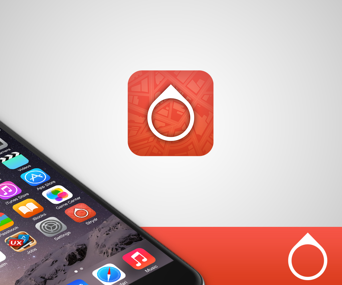
Strydr is a pedestrian navigation app which requires a refreshed icon. The general format of the icon needs to be similar to the current icon with a pointer depicted in a similar design to the actual pointer within the app and the colour to be the same as the overall colour scheme of the app. However, the icon needs to stand out more and look more professional. Strydr is an app designed solely for the pedestrian and uniquely provides a pointer aligned with the person's destination ensuring they always know where they are heading. The initial thought is that the pointer on the current icon should be slightly reduced in size, simplified and the background of the icon should give the impression of birds-eye view of a city - think of the AirBNB style icon with a very subtle grid in the background that could depict city streets. Existing icon template is included.
Zielmarkt/( -märkte)
Apple App Store
Sehen und fühlen
Jeder Schieber zeichnet eine der Charakteristiken der Marke des Kunden aus sowie den Stil, den euer Logo widerspiegeln sollte.
Elegant
Fett
Spielerisch
Ernst
Traditionel
Modern
Sympatisch
Professionell
Feminin
Männlich
Bunt
Konservativ
Wirtschaftlich
Gehobenes
Anforderungen
Muss haben
- All the assets required for an IOS app and adhere to the latest Apple design principles for IOS, meaning simple, flat design. Should also stay within the existing colour scheme of the app as indicated with the current icon.
Schön zu haben
- When the pointer is aligned to the destination it turn bright green and we may consider making it this colour as part of the icon.