Branding for a Diabetic Coaching Program that is going to going to help Diabetic's with Insulin res
Wollen Sie auch einen Job wie diesen gewinnen?
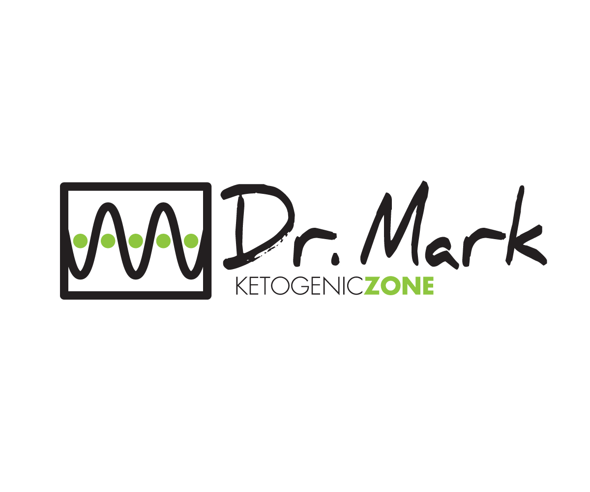
Dieser Kunde bekam 80 Logo-Designs von 28 Designern. Dabei wurde dieses Logo-Design Design von 808Miles als Gewinner ausgewählt.
Kostenlos anmelden Design Jobs finden- Garantiert
-
 US$170
-
 80 Designs
-
 28 Designer
Logo-Design Kurzbeschreibung
I am looking for a CATCHY look to get people to understand that there IS a ZONE that all diabetics can get to that will help them not be dependent on SO much insulin. I am looking for a look that will be branded on books and newsletters, emails, and click funnels.
we will be using 4 primary ways to target people, and all of them will be ZONE specific. So the word Zone is a big deal
Zielmarkt/( -märkte)
Type 1 and Type 2 diabetics, people who are seeking to get better with their health and are diabetic.
Industrie/Einheitstyp
Health Product
Logo Text
Dr. Mark with Ketogenic Zone incorporated into it.
Logo Stile, die Sie interessieren können
Abstraktes Logo
Begrifflich / symbolisch (Text optional)
Zu verwendende Schriftarten
Farben
Vom Kunden ausgewählte Farben für das Logo Design:
Sehen und fühlen
Jeder Schieber zeichnet eine der Charakteristiken der Marke des Kunden aus sowie den Stil, den euer Logo widerspiegeln sollte.
Elegant
Fett
Spielerisch
Ernst
Traditionel
Modern
Sympatisch
Professionell
Feminin
Männlich
Bunt
Konservativ
Wirtschaftlich
Gehobenes
Anforderungen
Muss haben
- I want Dr. Mark to stick out different than the website name.
- A catchy look...one that is bold in concept.
- I am not sure if I want to add the .com to the end of the words: Ketogenic Zone.
- Or let the word Ketogenic Zone stand on it's own.
Schön zu haben
- look at how i laid out the words ketogenic zone on the image i sent over and where a cool graphic could fit. i would like to have something like a target or arrow to be used for the graphic....a good graphic is what we will use in all of the emails we use.
- I have sent over a font that i thought looked good...and not so "normal like others"
- it's called Nexa Rust Slab Black Shadow 01 Free
- it has some dimension to it....
Sollte nicht haben
- I don't want this to be flimsy looking.
- I don't want this to look like a cookie-cutter thing.
- I have sent over a font that i thought looked good...and not so "normal like others"
- I am not sure if I want a typewriter looking font for Dr. Mark or a handwritten font.