"Best Way To Go" - the accommodation megastore
Wollen Sie auch einen Job wie diesen gewinnen?
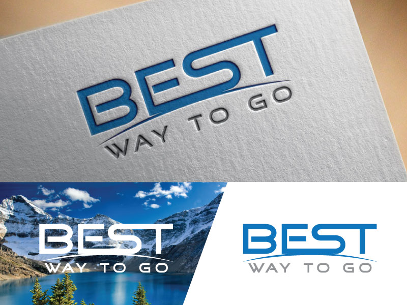
Dieser Kunde bekam 179 Logo-Designs von 70 Designern. Dabei wurde dieses Logo-Design Design von DESIGN Services JK als Gewinner ausgewählt.
Kostenlos anmelden Design Jobs finden- Garantiert
-
 A$270
A$270
-
 179 Designs
-
 70 Designer
Logo-Design Kurzbeschreibung
Need a logo for an App and Website. The logo must include an "icon" suitable for Android and Apple mobile devices. The "icon" can be part of the logo or 'standalone' for use on the App stores.
I visualise the icon as including elements that are unique to the brand and convey the message of the words "Best Way To Go". (obviously you can't fit the words on the icon). Although the icon is square, please consider a background where the square is rotated 45 degrees, or no background at all, with elements that will stand out on light or dark backgrounds.
I also think that the letters need to be very bold so that they are easily read on say a 'billboard'.
I am looking for a “fun but professional” appearance. I like the colours of navy blue and deeper reds, but I will leave it to your expertise, although I think the colours need to be bold, not pastille. Something that does not appear to be 'cheap' but should be “middle of the road” in terms of “brand persona”.
In other words, a ‘brand persona” that’s a little bit upmarket but not too upmarket!
Above all I don't want plain letters that are boring, but nor do I want some mixture of letters that cannot be read from a distance. I don't mind if the letters are custom designed or modified from other fonts
So, something that is unique, smart and conveys the message of being fast and easy to use, to go and stay anywhere in the world (please do not use an image of a globe!)
If you need to clarify anything, then please ask.
Zielmarkt/( -märkte)
"Best Way To Go" is for use on an accommodation booking and travel app and website. It is aimed at people across wide demographics (families, couples, businesspeople etc), using all types of accommodation
from campsites, to motels, to condos, to international hotels. (a megastore, a "one-stop-shop, that contains all accommodation)
Industrie/Einheitstyp
Travel Industry
Logo Text
Best Way To Go
Zu verwendende Schriftarten
Andere Schriftarten erwünscht:
- Any font or custom letters you think appropriate. I am open minded.
Farben
Der Designer kann die Farben des Designs frei wählen
Sehen und fühlen
Jeder Schieber zeichnet eine der Charakteristiken der Marke des Kunden aus sowie den Stil, den euer Logo widerspiegeln sollte.
Elegant
Fett
Spielerisch
Ernst
Traditionel
Modern
Sympatisch
Professionell
Feminin
Männlich
Bunt
Konservativ
Wirtschaftlich
Gehobenes
Anforderungen
Muss haben
- Please note that the primary purpose of the system is to search, find and book accommodation, so please we do not want to have images of planes and birds in the icon. The logo must include an "icon" suitable for Android and Apple mobile devices. The "icon" can be part of the logo or 'standalone' for use on the App stores.
- I visualise the icon as including elements that are unique to the brand and convey the message of the words "Best Way To Go". (obviously you can't fit the words on the icon). Although the icon is square, please consider a background where the square is rotated 45 degrees, or no background at all, with elements that will stand out on light or dark backgrounds.
- I also think that the letters need to be very bold so that they are easily read on say a 'billboard'.
- I also think that the letters need to be very bold so that they are easily read on say a 'billboard'.
- I am looking for a “fun but professional” appearance. I like the colours of navy blue and deeper reds, but I will leave it to your expertise, although I think the colours need to be bold, not pastille. Something that does not appear to be 'cheap' but should be “middle of the road” in terms of “brand persona”.
- In other words, a ‘brand persona” that’s a little bit upmarket but not too upmarket!
- Above all I don't want plain letters that are boring, but nor do I want some mixture of letters that cannot be read from a distance. I don't mind if the letters are custom designed or modified from other fonts
- So, something that is unique, smart and conveys the message of being fast and easy to use, to go and stay anywhere in the world (please do not use an image of a globe!)
Sollte nicht haben
- Please note that the primary purpose of the system is to search, find and book accommodation, so please we do not want to have images of planes and birds in the icon.