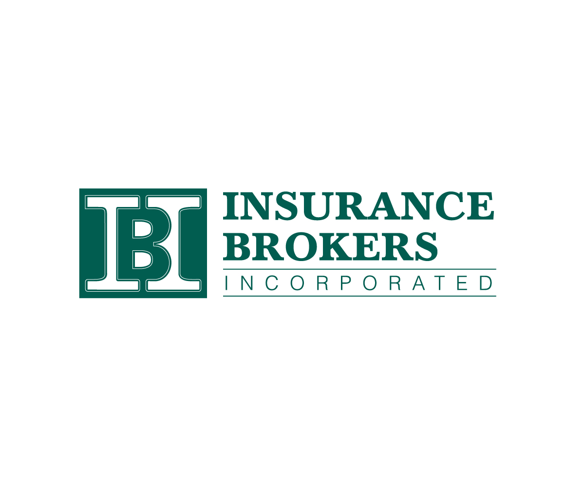
IBI Logo Refresh - Subtle Change to Current Logo The Does Not Affect Brand Recognition
Wollen Sie auch einen Job wie diesen gewinnen?
Dieser Kunde bekam 296 Logo-Designs von 107 Designern. Dabei wurde dieses Logo-Design Design von Boon als Gewinner ausgewählt.
Kostenlos anmelden Design Jobs finden- Garantiert
-
 US$150
-
 296 Designs
-
 107 Designer
Logo-Design Kurzbeschreibung
We are looking to refresh our logo to give it an updated feel. We are not looking to completely redo our logo, as our brand recognition with our current logo is steadily progressing. We want a very subtle change to our logo that is noticeable, but does not stray too far from what we have now. Our qualms with our current logo are that a) the "B" that is between the two "I"'s does not stand out and is difficult to notice at all and b) that our company name (Insurance Brokers Incorporated) is not a part of our logo. We like the subtlety of the "B" being pillared between the two "I"'s in "IBI" and also that our logo is simple and reflects our brand: professional, conservative, and dependable.
Again, we are not looking for a major change, just a subtle update that refreshes our current logo and adds our company name (Insurance Brokers Incorporated).
Zielmarkt/( -märkte)
Insurance Agents and Carriers
Industrie/Einheitstyp
Insurance
Logo Text
"IBI" & "Insurance Brokers Incorporated"
Logo Stile, die Sie interessieren können
Wortmarke-Logo
Word oder namensbasiertes Logo (nur Text)
Lettermark-Logo
Kurzwort oder Buchstaben-Logo (nur Text)
Zu verwendende Schriftarten
Sehen und fühlen
Jeder Schieber zeichnet eine der Charakteristiken der Marke des Kunden aus sowie den Stil, den euer Logo widerspiegeln sollte.
Elegant
Fett
Spielerisch
Ernst
Traditionel
Modern
Sympatisch
Professionell
Feminin
Männlich
Bunt
Konservativ
Wirtschaftlich
Gehobenes
Anforderungen
Muss haben
- An updated version of our current logo and the addition of our company name, Insurance Brokers Incorporated; Same colors used
Schön zu haben
- Same color scheme
Sollte nicht haben
- A completely redesigned logo or anything that strays too far from our current logo for brand recognition purposes