Relaunch of EMENDO Event & Congress' Logo - make it clean, modern, fresh and unique :-)
Wollen Sie auch einen Job wie diesen gewinnen?
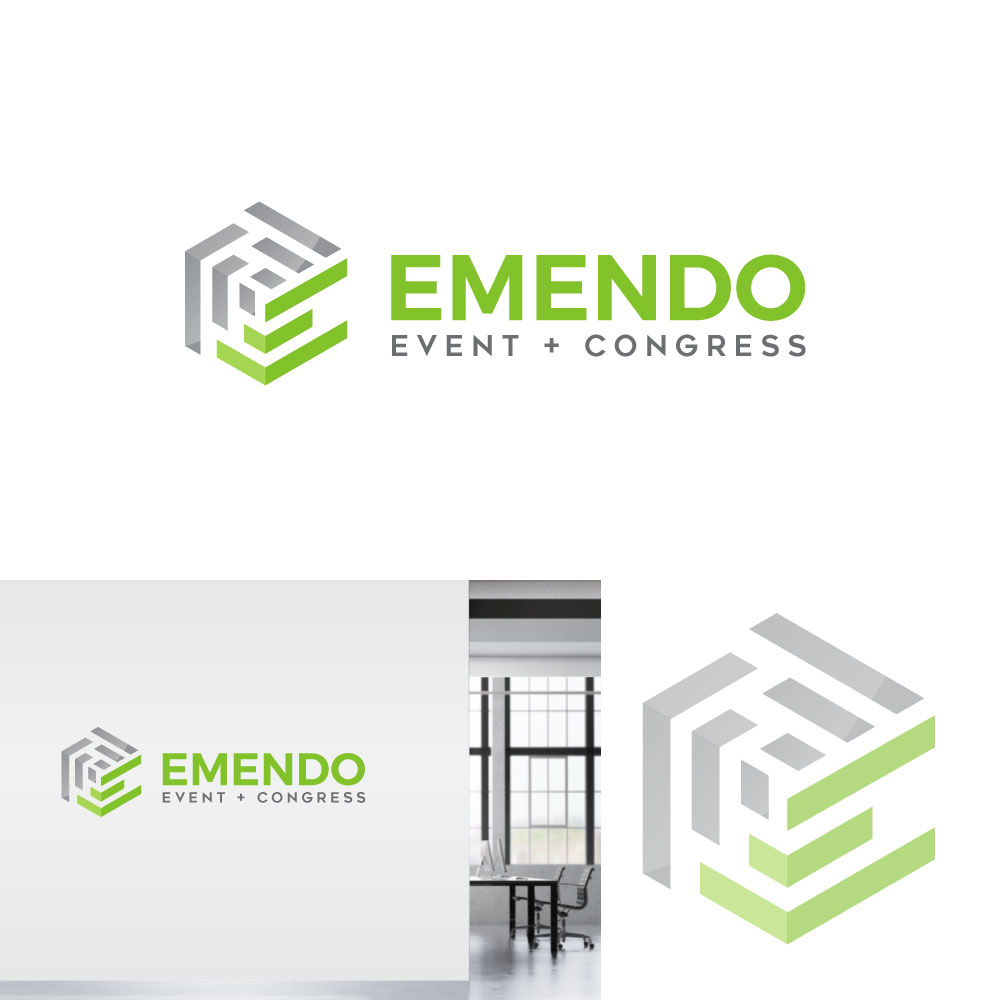
Dieser Kunde bekam 249 Logo-Designs von 71 Designern. Dabei wurde dieses Logo-Design Design von gates_m als Gewinner ausgewählt.
Kostenlos anmelden Design Jobs finden-
 €110
€110
-
 249 Designs
-
 71 Designer
Logo-Design Kurzbeschreibung
Guys,
we need a clean, fresh, modern and unique redesign of our current Logo.
We are an events- and congressmanagement agency located in Germany.
Our daily business is organising events/ conferences / congresses and stuff like that...
Furthermore we are IT developers for the events industy and have created our own software which manages events, attendees, speakers, and so on... our software is easy to handle, intuitive and absoultely customizable to fit all our customers' needs...
The current logo was created back in 2012, main element is a big cube, consisting of several smaller cubes. The idea behind is, that any project in the event industry consists of a lot of single components like catering, location, attendees, speakers, public authority, shuttle service, sound engineers, you get the idea...
Here a 3 things we want to keep in the relaunched logo:
- color combination : grey / green - we simply love it :-)
- the cubic appearance - no rounded corners (we know we have rounded corners in the font used for company's name)
- the idea behind the cube, meaning an understanding that events management consists of several single "items"
The current subline "elements of commuication" can totally be removed :-)
Hopefully some of you guys out there have the extraordinary and stunning idea as what to do with our current logo... we are soooo curious to see what may come...
Zielmarkt/( -märkte)
european event and congress organizers, events management agencies, communication agencies,
Industrie/Einheitstyp
Event Planning
Logo Text
EMENDO Event + Congress
Logo Stile, die Sie interessieren können
Pictorial / Combination-Logo
Ein reales Objekt (Text optional)
Zu verwendende Schriftarten
Farben
Vom Kunden ausgewählte Farben für das Logo Design:
Sehen und fühlen
Jeder Schieber zeichnet eine der Charakteristiken der Marke des Kunden aus sowie den Stil, den euer Logo widerspiegeln sollte.
Elegant
Fett
Spielerisch
Ernst
Traditionel
Modern
Sympatisch
Professionell
Feminin
Männlich
Bunt
Konservativ
Wirtschaftlich
Gehobenes
Anforderungen
Muss haben
- - color combination green / grey as the current logo
- - the cubic appearance
Schön zu haben
- the idea behind the current cube, meaning an understanding that events management consists of several single "items"
Sollte nicht haben
- - rounded corners
- - circles
- - bubbles
- - elements that are rounded