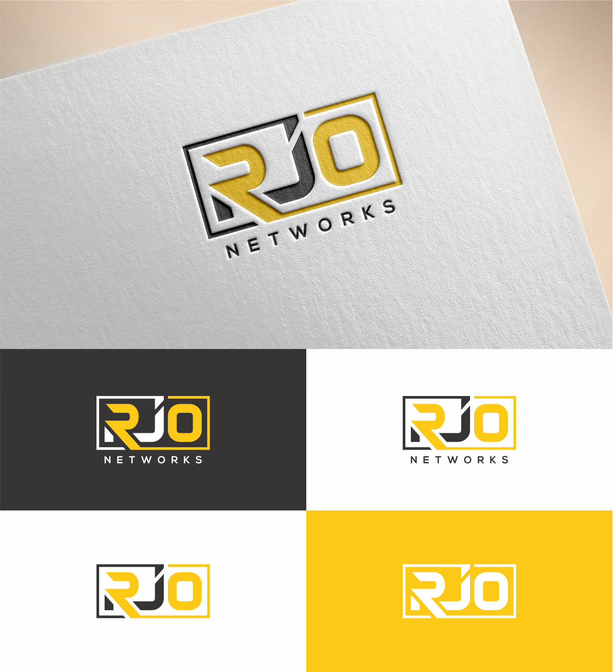
A new logo for our company RJO Networks that utilizes only the 3 letters ‘RJO’
Wollen Sie auch einen Job wie diesen gewinnen?
Dieser Kunde bekam 180 Logo-Designs von 69 Designern. Dabei wurde dieses Logo-Design Design von MKR als Gewinner ausgewählt.
Kostenlos anmelden Design Jobs finden- Garantiert
-
 US$150
-
 180 Designs
-
 69 Designer
Logo-Design Kurzbeschreibung
Our company RJO Networks has been in business since 2005 and has used the same logo for all these years. We now wish to ‘upgrade’ our logo to include only the ‘RJO’ portion of the company name. Since we are a tech company we want to have a logo with a modern/futuristic feel, in the same vein as the HP, Intel or NASA logos.
These logos include graphics in addition to the actual wording. The logos attached are good examples of where the letters are embedded within a larger graphic. The logo should be able to stand on its own, whether on a webpage or business card; but it should also be designed in a way that we could easily add additional wording in close proximity, such as ‘Networks’, ‘Store’, ‘Technology’, etc.
Zielmarkt/( -märkte)
Small and Medium Sized Business
Industrie/Einheitstyp
It Company
Logo Text
RJO
Logo Stile, die Sie interessieren können
Emblem-Logo
Logo eingeschlossen in einer Form
Sehen und fühlen
Jeder Schieber zeichnet eine der Charakteristiken der Marke des Kunden aus sowie den Stil, den euer Logo widerspiegeln sollte.
Elegant
Fett
Spielerisch
Ernst
Traditionel
Modern
Sympatisch
Professionell
Feminin
Männlich
Bunt
Konservativ
Wirtschaftlich
Gehobenes
Anforderungen
Muss haben
- Yellow Gold and Black Colors
Schön zu haben
- modern/futuristic/technology feeling