An eye catching New Workwear shop sign for our store
Wollen Sie auch einen Job wie diesen gewinnen?
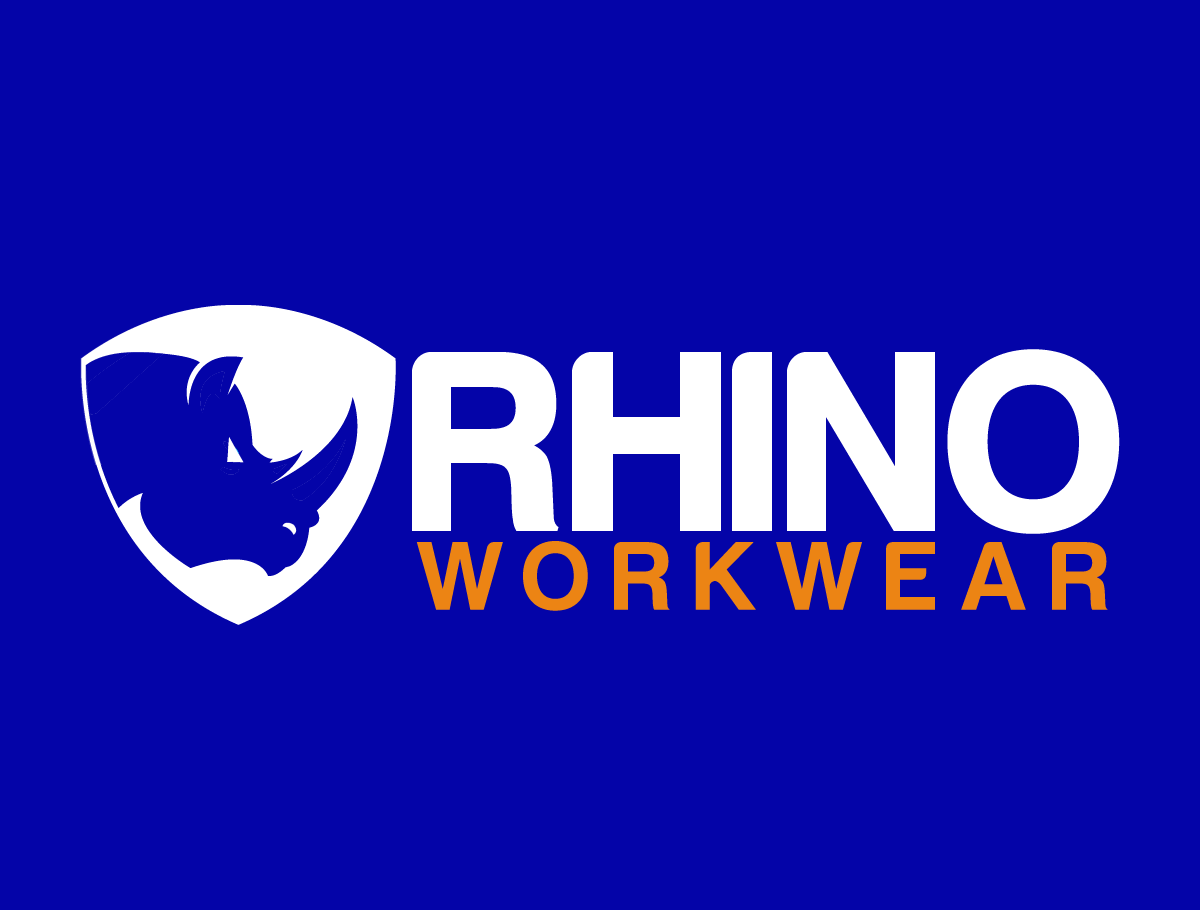
Dieser Kunde bekam 116 Logo-Designs von 36 Designern. Dabei wurde dieses Logo-Design Design von bookjerry22 als Gewinner ausgewählt.
Kostenlos anmelden Design Jobs finden-
 A$150
A$150
-
 116 Designs
-
 36 Designer
Logo-Design Kurzbeschreibung
We need a new sign and logo for our work wear store. The store is called Rhino Workwear and we would like the logo to include a rhino character. It is a new store and we need the sign to really be bold and stand out from the street and attract passing traffic. The sign will be 3.5 meters long and 0.6 meter wide on the awning (facing the road) of the store.
Updates
Project Deadline Extended
Reason: We are really pleased with the results but havent settled on a design yet and our projects deadline is tomorrow.we dont think we will be ready to decide then. Are we able to get an extension to decide winning design ?
Added Friday, August 18, 2017
Thanks to everyone that submitted for our shop sign project. I''m sorry we didn't get to respond to you all.
We felt the one that we selected fitted our brief very well. It was simple, stood out, and fitted on the sign measurements well. Many of the other designs would have been lost on the sign, but looked good as a logo.
Perhaps we can work with you another time.
Added Tuesday, August 22, 2017
Zielmarkt/( -märkte)
Predominantly trades people aged from 20-60 years, but also some corporate workwear
Industrie/Einheitstyp
Shopping
Logo Text
Rhino Workwear
Logo Stile, die Sie interessieren können
Figuren-Logo
Logo mit Abbildung oder Zeichen
Zu verwendende Schriftarten
Farben
Der Designer kann die Farben des Designs frei wählen
Sehen und fühlen
Jeder Schieber zeichnet eine der Charakteristiken der Marke des Kunden aus sowie den Stil, den euer Logo widerspiegeln sollte.
Elegant
Fett
Spielerisch
Ernst
Traditionel
Modern
Sympatisch
Professionell
Feminin
Männlich
Bunt
Konservativ
Wirtschaftlich
Gehobenes
Anforderungen
Muss haben
- Rhino character,
Schön zu haben
- We chose the name Rhino because it gives a sense of durability and tough.
- Are there colors on signs that fade less? If so, that could be a consideration in the color choice.
- Yellow background and black ?? Royal blue with orange?
Sollte nicht haben
- The attached image is really basic we dont have any set idea about the layout thats why we are using multiple designers