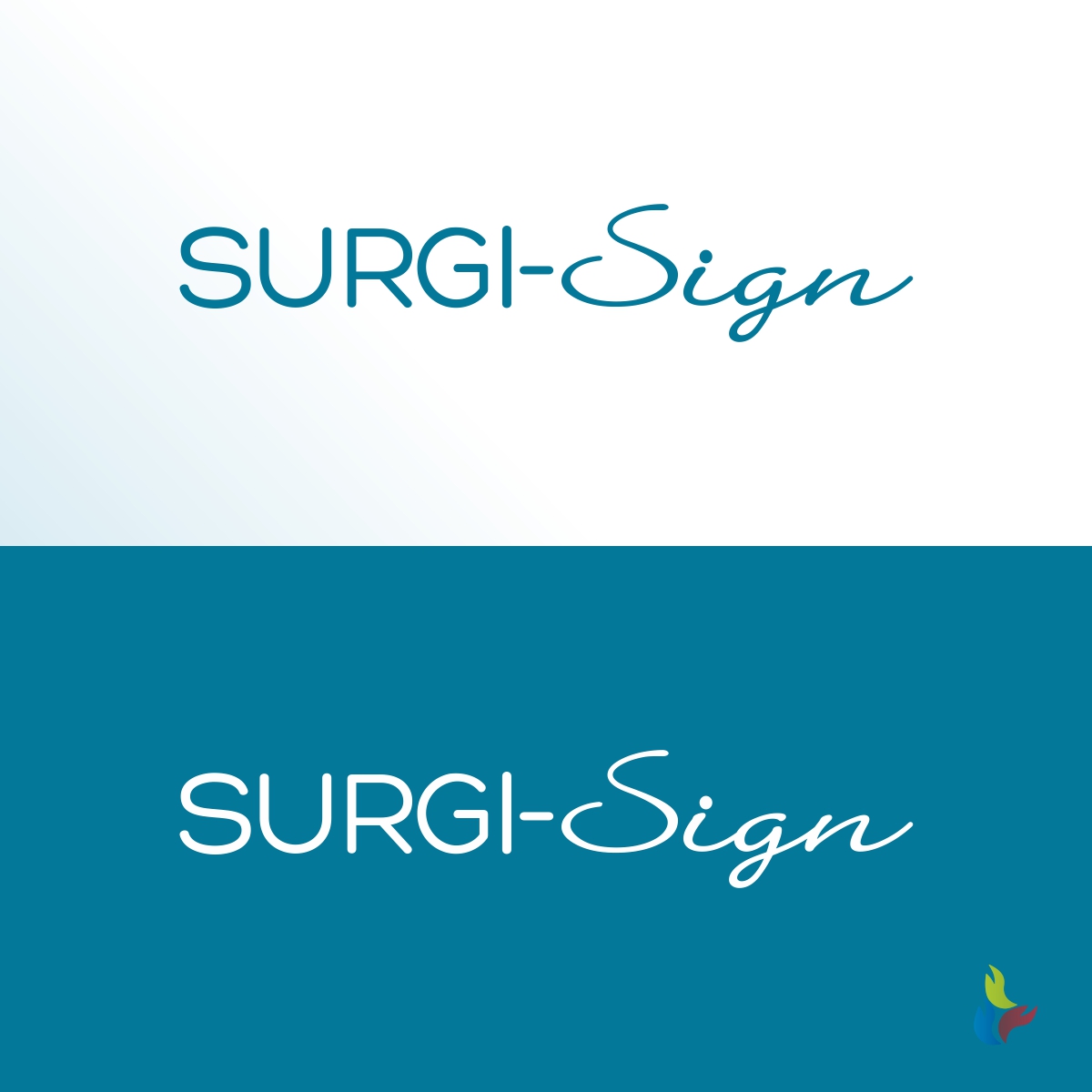
Logo for new product for the hospital
Wollen Sie auch einen Job wie diesen gewinnen?
Dieser Kunde bekam 180 Logo-Designs von 52 Designern. Dabei wurde dieses Logo-Design Design von Kreative Fingers als Gewinner ausgewählt.
Kostenlos anmelden Design Jobs finden- Garantiert
-
 US$150
-
 180 Designs
-
 52 Designer
Logo-Design Kurzbeschreibung
An appropriate logo for a medical device company with one product, a temporary tattoo that is used before an operation. The surgeon puts the tattoo on the patient and signs it. Then the patient, nurse, and anesthesiologist sign it so everyone agrees this is "the spot" where we are going to operate.
The site will be http://surgisign.com and, depending on when you check, it may have a homepage similar to the image I uploaded. If it looks different, it is before we did any real design.
I included a file called "First attempt at page 2" to show you we first considered using the obnoxious yellow and blue colors of the tattoo for the website. We changed our mind because those colors just made the site look cheap and poorly designed.
We would want a logo works against white backgrounds as well as the site we are designing. We would want the background to be transparent and, if you're selected, perhaps you'll give us suggested guidelines about how to treat the logo when we send it out to publications (not stretched, etc.).
Zielmarkt/( -märkte)
hospital surgeons, hospital C-suite
Industrie/Einheitstyp
Hospital
Logo Text
Surgi-Sign
Logo Stile, die Sie interessieren können
Wortmarke-Logo
Word oder namensbasiertes Logo (nur Text)
Lettermark-Logo
Kurzwort oder Buchstaben-Logo (nur Text)
Zu verwendende Schriftarten
Sehen und fühlen
Jeder Schieber zeichnet eine der Charakteristiken der Marke des Kunden aus sowie den Stil, den euer Logo widerspiegeln sollte.
Elegant
Fett
Spielerisch
Ernst
Traditionel
Modern
Sympatisch
Professionell
Feminin
Männlich
Bunt
Konservativ
Wirtschaftlich
Gehobenes
Anforderungen
Muss haben
- the name with hyphen: Surgi-Sign
Sollte nicht haben
- Here are the colors to avoid and why:
- Black = death/dead,
- Green = infection/badness,
- Red = blood, bleeding,
- Brown = "messy..."
- As you can see, we include blue in our new homepage design but my client, an anesthesiologist, told me to avoid "some shades of very light blue that might say cyanosis (not enough oxygen). But he did approve the website use of blue.