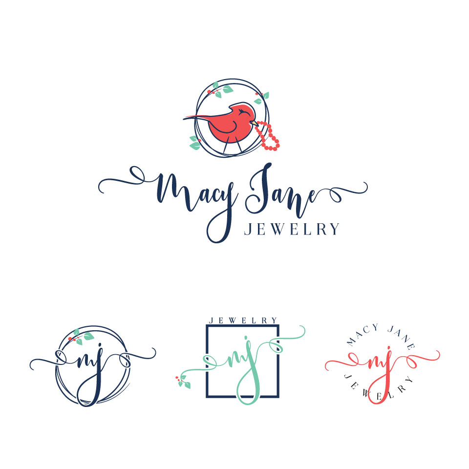
Jewelry Subscription Box Company Logo - Macy Jane "Jewelry for Goodness Sake"
Wollen Sie auch einen Job wie diesen gewinnen?
Dieser Kunde bekam 228 Logo-Designs von 35 Designern. Dabei wurde dieses Logo-Design Design von designstarla als Gewinner ausgewählt.
Kostenlos anmelden Design Jobs finden- Garantiert
-
 US$150
-
 228 Designs
-
 35 Designer
Logo-Design Kurzbeschreibung
We need a logo design for a new jewelry subscription box company. There's no better way for a woman to both express and pamper herself than with accessories that complement her look. But women are busy mothering, working, volunteering... sometimes at the same time. At Macy Jane we put a little kick back in her step by offering on-trend jewelry delivered to her door every month in beautiful, fun packaging.
But we don't stop there... Macy Jane partners with non-profit organizations and individuals to help boost fundraising by giving back a percentage of every box the organization or individual sells... for the entire length of the subscription. We have a goal of supporting hundreds of organizations over the next year.
Logo Specs:
1. Color: Our boxes are craft/corrugated color with navy blue stripes and coral and mint or teal accents, so we're looking for a logo that is navy, coral or mint or teal, charcoal or a combination.
2. Style: Macy Jane (same or mixed typeface), Jewelry for Goodness Sake (different fonts than Macy Jane) We are open to style, but think it should be playful, yet sophisticated.
3. Shape: The logo should fit into a rectangle (of course), but it's important that we have an icon of some kind that can fit inside a square or circle avatar for social media purposes, too.
4. Graphic/Symbol/Icon: We need an icon or something that is memorable. Something that represents some or all of these ideas... women, femininity, subscription jewelry box, delivery to home (perhaps a nest, mailbox, front door with mail slot, etc.), care, fun, philanthropy.
Perhaps, another idea would be that a circle in the logo could represent a ring or two shapes could represent earrings. Maybe two owl eyes are illustrated from rings or earrings. We hesitate to be too specific because we're asking for your creativity.
5. We are open to ideas, so don't feel confined to the ideas above. These are just some initial ideas that we came up with.
Thanks so much for your creativity. We can't wait to see what you come up with!
Zielmarkt/( -märkte)
Women - Age 25-45
Industrie/Einheitstyp
Jewelry
Logo Text
Macy Jane
Logo Stile, die Sie interessieren können
Emblem-Logo
Logo eingeschlossen in einer Form
Pictorial / Combination-Logo
Ein reales Objekt (Text optional)
Figuren-Logo
Logo mit Abbildung oder Zeichen
Zu verwendende Schriftarten
Farben
Vom Kunden ausgewählte Farben für das Logo Design:
Sehen und fühlen
Jeder Schieber zeichnet eine der Charakteristiken der Marke des Kunden aus sowie den Stil, den euer Logo widerspiegeln sollte.
Elegant
Fett
Spielerisch
Ernst
Traditionel
Modern
Sympatisch
Professionell
Feminin
Männlich
Bunt
Konservativ
Wirtschaftlich
Gehobenes
Anforderungen
Muss haben
- Must be able to fit in a rectangle when written out, but also have another icon/pictorial graphic from the full logo in a square or circle presentation for social media avatars.
- Pictorial icon/graphic needs to communicate a who we are... A jewelry subscription box company that delivers joy to womens' front doors every month.
- Think about what represents a home... nest, front door, mailbox... and how a fun package or box could arrive there.
Sollte nicht haben
- IMPORTANT: We do not want a generic font that we can go buy ourselves and type out Macy Jane. We don't mind if a font is used, but we want it to be customized so as to look unique.
- We want more than just a typed out logo and monogram with MJ. We have seen a ton of these already and need something more unique than just a monogram icon.