Health care finance company startup website design
Wollen Sie auch einen Job wie diesen gewinnen?
Dieser Kunde bekam 46 Web-Designs von 11 Designern. Dabei wurde dieses Web-Design Design von pb als Gewinner ausgewählt.
Kostenlos anmelden Design Jobs finden- Garantiert
-
 US$1280
-
 46 Designs
-
 11 Designer
Web-Design Kurzbeschreibung
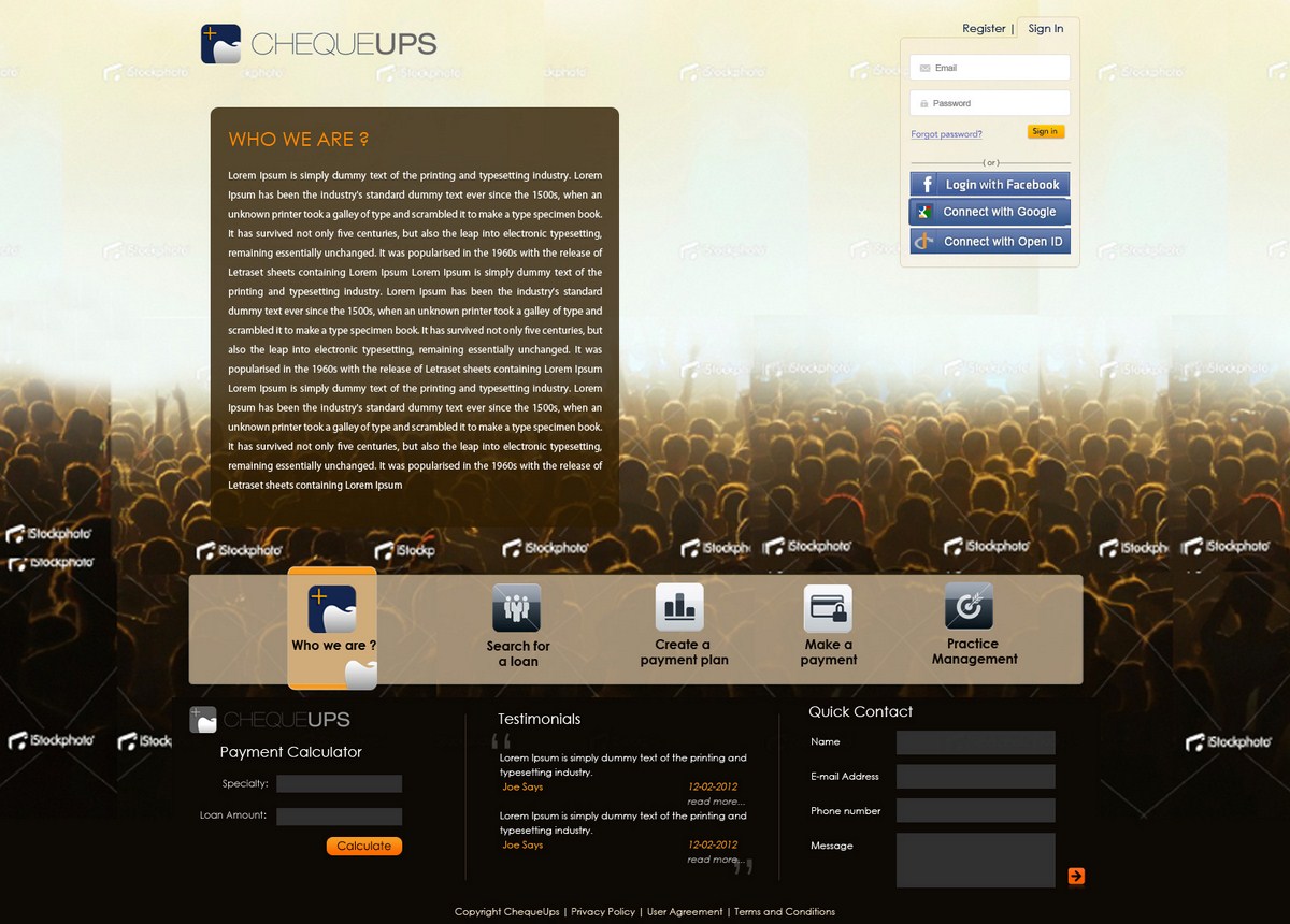
This design brief is for Cheque Ups, a small start-up company dealing with an online health care (initially dental targeted with plans for medical market) financial suite of tools. My business partners and I are looking to have a website developed for our business model.
We have developed a professional logo and would like it incorporated into the site. We are open to modifications on the logo if needed to accomplish the right design.
Our concept is a clean, simple design with a professional polish and very up-to-date web presence. The functionality of the site is simple yet powerful and we would like it’s design to complement that (including anticipated css3/html5 effects for an added dimension of UI polish).
We would like to see a design mockup of the functional elements of our site as our home page. We would also be very interested to see how your design would flow into the other pages such as search for a loan, create a payment plan, make a payment, sign in, registration, contact us and learn more.
Regarding Functional Elements:
-Simplicity is king.
-The three main functions of the site are the focus. They will operate via a series of API’s to webservices on the back-end, making the front end field focused, though we hope to have it feel friendly and simple.
-Search for a loan
-Create a payment plan
-Make a payment
Other functions of the site include:
-Sign in module
-We plan to support Facebook Connect, Google Authentication and OpenAuth so incorporating design for those options is a plus.
-Registration module
-Two service levels clients can register for, loans only or loans & payments
-The registration process should be divided into sections with navigation back and forth until a confirmation final screen with pdf generations and remaining “to-do items” listed.
-The registration information will be saved in our database and also auto-populate fields for PDF’s that will be generated from templates.
-The registration will send a confirmation email and support OpenAuth, Google Authentication and Facebook Connect, so designs should take these programmatic features into account.
-Contact us
-This will emphasize digital forms of communication (email and form submitted contact request).
-Learn more
-Explanations/faqs/tutorials
-This will contain video demonstrations/screencasts of key functions of website features
Regarding Design Elements:
-We want to be “wow’d” and don’t mind a surprise that redefines what we thought we liked regarding design.
-The following examples indicate some of the color schemes we like and design elements we hope to incorporate.
-We also recognize there is no substitute for creativity and originality.
Favorite Website Design Examples:
http://www.runwithchrissie.com/
HD backgrounds are a plus.
These colors are great.
The bright splashes of blue, red and orange combined with black in these shades.
A predominant background of whitesmoke or beige.
https://squareup.com/
The HD backgrounds are sharp.
The look is very clean (though it has a slight Apple computers imitation).
The left to right “scrolling” is preferable to vertical scrolling.
Very pleasing to the eye.
http://www.offroadstudios.com/
Again, use of bright, vibrant HD graphics is exceptional.
The left to right scrolling navigation is slick and likely how we would like our services to flow.
http://trending.seetorontonow.com/
Love the look, feel and concepts in this site’s design
Especially colors and “photography” elements.
Updates
We've seen a few common themes in various designs submitted so far and want to add a few suggestions as we enter the final week of our design contest.
Added Sunday, February 05, 2012
Project Deadline Extended
Added Tuesday, February 14, 2012
Project Deadline Extended
Added Tuesday, February 14, 2012
Industrie/Einheitstyp
Communication
Sehen und fühlen
Jeder Schieber zeichnet eine der Charakteristiken der Marke des Kunden aus sowie den Stil, den euer Logo widerspiegeln sollte.