Logo Design Project - Martin
Wollen Sie auch einen Job wie diesen gewinnen?
Dieser Kunde bekam 46 Logo-Designs von 20 Designern. Dabei wurde dieses Logo-Design Design von Denys / goldengallery.ca als Gewinner ausgewählt.
Kostenlos anmelden Design Jobs finden-
 US$400
-
 46 Designs
-
 20 Designer
Logo-Design Kurzbeschreibung
I have a company that trains doctors in how to do medical aesthetics which inclusdes: Botox, Fillers (Resylane, Juvederm), Laser Hair and spot removal, skin tightening and rejuvenation. We also have a business course - you can see the website
botoxtrainingcanada.com
Our clients are mostly doctors, some nurses. We are located in Barrie, Ontario. We like mauve, purple and white as you see on the website The final message should communicate professional, but fun training. Might want to include some gold because when doctors learn how to do this stuff, they are going to make money
Our advantage is that the training is "hands on" meaning that the training doctor has many opportunities to do the work himself, rather than just watching someone else do it.
Dr. Martin, the main teacher is friendly and teaches in a low key easy to follow way. She approaches medical aesthetics with an artistic flair, but she also is exetremely professional and works as an emergency physician too.
Zielmarkt/( -märkte)
doctors and nurses aged 30-60
Industrie/Einheitstyp
Training
Logo Text
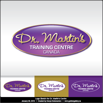
Dr. Martin's Training Centre - Canada
Logo Stile, die Sie interessieren können
Pictorial / Combination-Logo
Ein reales Objekt (Text optional)
Figuren-Logo
Logo mit Abbildung oder Zeichen
Wortmarke-Logo
Word oder namensbasiertes Logo (nur Text)
Lettermark-Logo
Kurzwort oder Buchstaben-Logo (nur Text)
Sehen und fühlen
Jeder Schieber zeichnet eine der Charakteristiken der Marke des Kunden aus sowie den Stil, den euer Logo widerspiegeln sollte.
Elegant
Fett
Spielerisch
Ernst
Traditionel
Modern
Sympatisch
Professionell
Feminin
Männlich
Bunt
Konservativ
Wirtschaftlich
Gehobenes
Anforderungen
Muss haben
- must convey professionalism with a twist of fun
Schön zu haben
- I like the "girl"" and the swirlies that are in the current design, but she is not catchy enough for this part of the site. I would like to stick with the purples though..
Dr. Martin is the best in the business - a mountain with her on top might work...
Sollte nicht haben
- no standard medical symbol - the one with the snake