Business Intelligence Application - Reporting Menu and Report Criteria Design
Wollen Sie auch einen Job wie diesen gewinnen?
Dieser Kunde bekam 69 Web-Designs von 6 Designern. Dabei wurde dieses Web-Design Design von -Marc- als Gewinner ausgewählt.
Kostenlos anmelden Design Jobs finden- Garantiert
-
 €365
€365
-
 69 Designs
-
 6 Designer
Web-Design Kurzbeschreibung
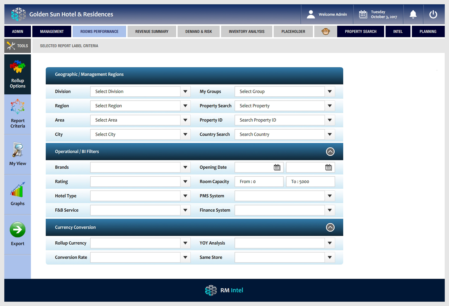
Looking for a fresh, effective and user friendly view for the menu structure and reporting criteria screen format for a business reporting application. Initial format completed, content structure is in place, but we need the 'wow' design.. as its a serious professional report/BI tool it has to fall within certain guidelines for clarity and graphics..but we want it to be slick, friendly, great user experience. There is a large amount of complex content to fit into a small space and we need it to be very inviting, modern and intuitive.. If interested, please review the attachment. We have live screens in operation, but feel these could be improved and looking forward to seeing what great creative suggestions could be made. Please review work done to date in the attached.. We are not looking for a total re-design of everything, all the basic business content/structure is there.. but tell us what we could do to improve this in terms of graphic design... particularly the criteria screens.. thanks!
Aktualisierungen
Project Deadline Extended
Reason: Need a few more days to review designs - thanks for all submissions so far, we will make a selection shortly.
Added Saturday, October 14, 2017
Zielmarkt/( -märkte)
Business analysts, hotel operations teams, finance analysts hospitality industry
Industrie/Einheitstyp
Hospitality
Programmierung
Programmierung - Design und Programmierung werden benötigt
Anzahl benötigter Seiten
4 page
Zu verwendende Schriftarten
Andere Schriftarten erwünscht:
- Candara, please see example in deck
Farben
Vom Kunden ausgewählte Farben für das Logo Design:
Sehen und fühlen
Jeder Schieber zeichnet eine der Charakteristiken der Marke des Kunden aus sowie den Stil, den euer Logo widerspiegeln sollte.
Elegant
Fett
Spielerisch
Ernst
Traditionel
Modern
Sympatisch
Professionell
Feminin
Männlich
Bunt
Konservativ
Wirtschaftlich
Gehobenes
Anforderungen
Muss haben
- sharp clear, logical menu structure, (currently it has 'clicks to sub-menus, we need hover over, slide to sub-menus..) colour, styling.. and most focus on revision of criteria.. right now is somewhat heavy, cumbersome.. keep colour and friendly intuitive process steps.. its heavy analytical stuff.. best of luck!
Sollte nicht haben
- No grey fonts on white or grey screens! many business apps are not readable or sharp.. or fonts are too small.. colourless, so please avoid that.. see our deck - sharp dark (navy) or black fonts on white, or light shading..