Logo Design for Online Course
Wollen Sie auch einen Job wie diesen gewinnen?
Dieser Kunde bekam 109 Logo-Designs von 41 Designern. Dabei wurde dieses Logo-Design Design von :) als Gewinner ausgewählt.
Kostenlos anmelden Design Jobs finden-
 US$150
-
 109 Designs
-
 41 Designer
Logo-Design Kurzbeschreibung
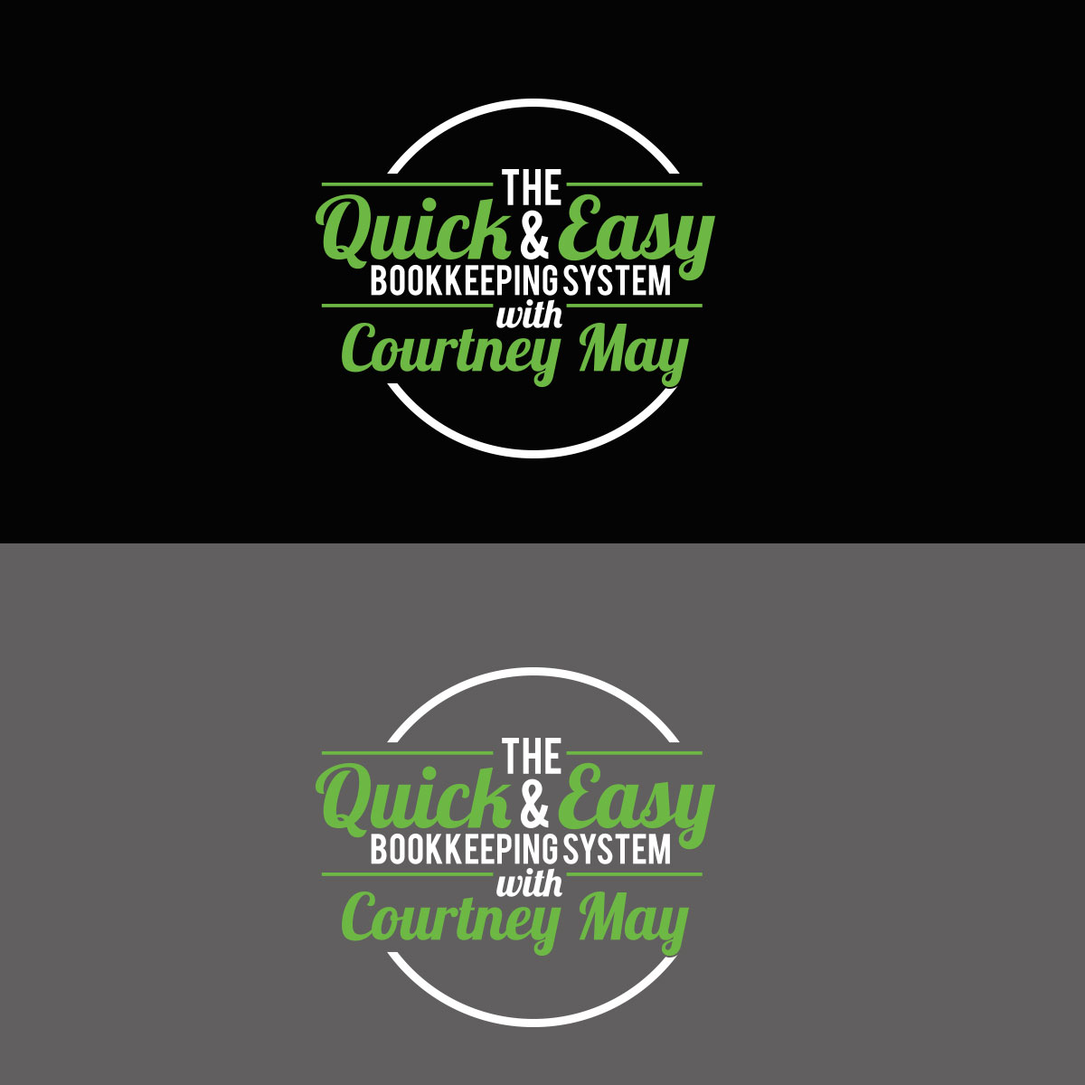
I need a logo for an online course I created. The course is called "The Quick & Easy Bookkeeping System with Courtney May". I have attached a logo that I like from another course that implements the instructor's name. I like this logo a lot and I would like to use the same mixture of fonts that this designer used. Obviously I do not want to copy this logo exactly but I like the way it pops off the page, is very dynamic and strong. Since I am a QuickBooks ProAdvisor I use the QuickBooks green in my logo for my business and I would like to implement this same shade of green where you see red in the other logo I attached. I would like to see the wording as white and also maybe another color that would accent the QuickBooks green (maybe black). Please give me options on the coloring. You can see the QuickBooks logo and color at this website: https://quickbooks.intuit.com/ .
Aktualisierungen
Project Deadline Extended
Reason: I need more time to decide. Thank you for your efforts.
Courtney
Added Thursday, November 2, 2017
Zielmarkt/( -märkte)
Business owners/entrepreneurs looking for an easy to follow bookkeeping system.
Industrie/Einheitstyp
Online
Logo Text
The Quick & Easy Bookkeeping System with Courtney May
Zu verwendende Schriftarten
Andere Schriftarten erwünscht:
- I like the combination of fonts or something similar to the logo I attached for "Courses That Convert"
Farben
Der Designer kann die Farben des Designs frei wählen
Sehen und fühlen
Jeder Schieber zeichnet eine der Charakteristiken der Marke des Kunden aus sowie den Stil, den euer Logo widerspiegeln sollte.
Elegant
Fett
Spielerisch
Ernst
Traditionel
Modern
Sympatisch
Professionell
Feminin
Männlich
Bunt
Konservativ
Wirtschaftlich
Gehobenes
Anforderungen
Muss haben
- All the words in the "Logo Text". The word "The" can be smaller. Please see the logo for "Courses That Convert" that I attached as a great example.
Sollte nicht haben
- I would think with so many words in the logo that it would be better not to have too many graphics. I will let you make that call.