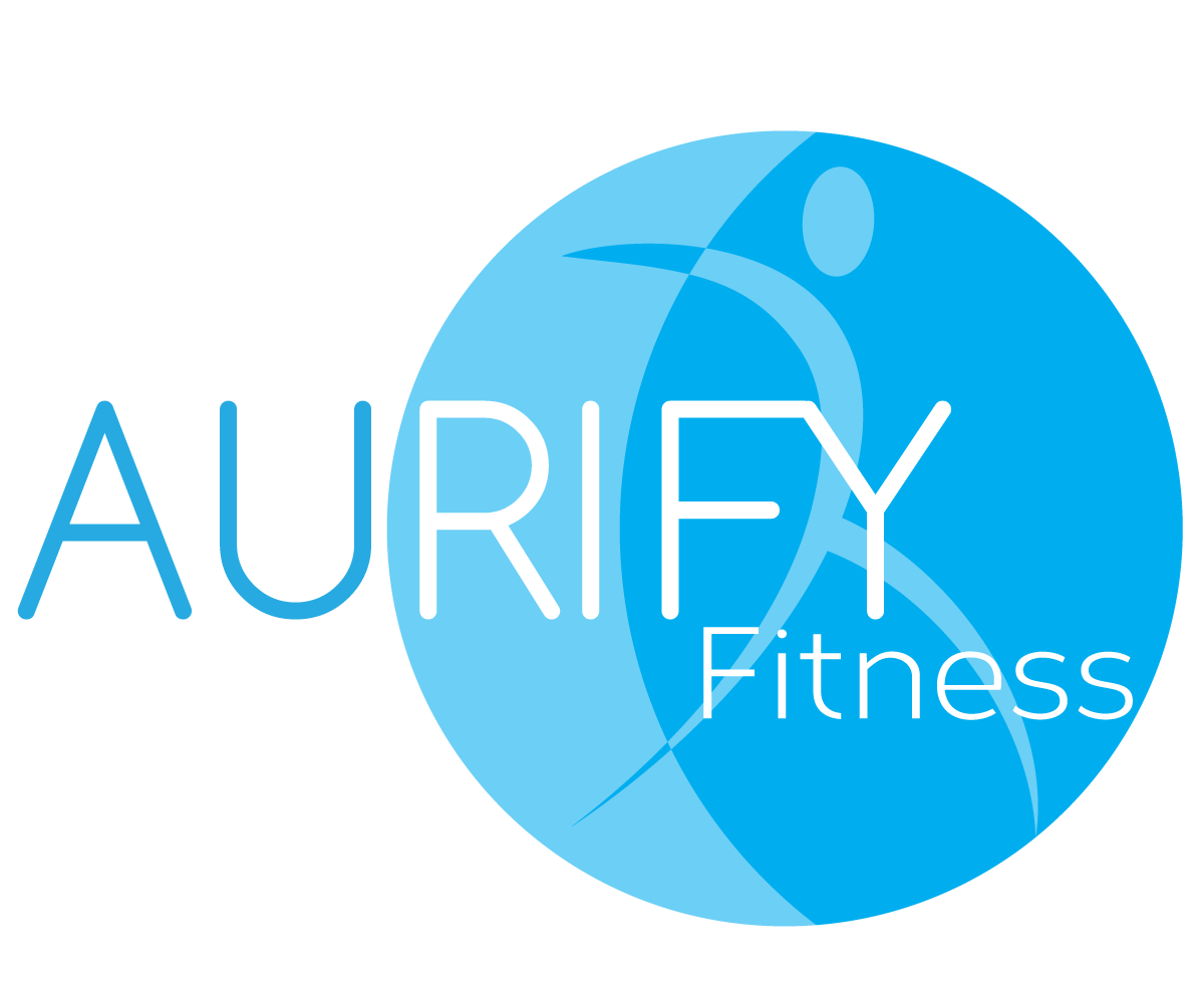
Mobile Personal Training Business

Wollen Sie auch einen Job wie diesen gewinnen?
Dieser Kunde bekam 60 Logo-Designs von 13 Designern. Dabei wurde dieses Logo-Design Design von Hamish als Gewinner ausgewählt.
Kostenlos anmelden Design Jobs finden- Garantiert
Logo-Design Kurzbeschreibung
My business is called AURIFY Fitness - I'm a personal trainer.. and my point of difference is that I go to clients homes or parks to train them. Not necessarily in a gym. AURIFY - means to transform to gold..... AU is the periodic table/symbol for gold. So I would like to reference YELLOW in the business card or in particular the AU. It needs to be something that looks a little boutique without being kitch or too intimidating. Other colours could be navy or turquoise.... could be a shadow figure (something that makes it a little interesting) that changes its shape.. the text could also be AU-rify Fitness... a play on the AU but not married to that idea
Aktualisierungen
The meaning of AURIFY is to transform to gold.... so the logo should have a “concept of transformation”. GOLD as a colour is really difficult to replicate.. so YELLOW is fine. The concept should be based on transformation regardless. The way I will be transforming clients will be with exercise.. how I came up with the name is basically word search...
Added Thursday, November 14, 2013
Project Deadline Extended
Reason: Still try to finalize logo with designer
Added Thursday, November 21, 2013
Zielmarkt/( -märkte)
Stay at home mums/caregivers
Industrie/Einheitstyp
Boutique
Logo Text
AURIFY Fitness
Logo Stile, die Sie interessieren können
Abstraktes Logo
Begrifflich / symbolisch (Text optional)
Lettermark-Logo
Kurzwort oder Buchstaben-Logo (nur Text)
Zu verwendende Schriftarten
Farben
Der Designer kann die Farben des Designs frei wählen
Sehen und fühlen
Jeder Schieber zeichnet eine der Charakteristiken der Marke des Kunden aus sowie den Stil, den euer Logo widerspiegeln sollte.
Elegant
Fett
Spielerisch
Ernst
Traditionel
Modern
Sympatisch
Professionell
Feminin
Männlich
Bunt
Konservativ
Wirtschaftlich
Gehobenes
Anforderungen
Muss haben
- must be simple, clean - appealing to mainly women as the target audience is stay at home mums predominately. Don't mind if the LOGO is conceptual or letter based (NOT EMBLEM) *the logo style box would not let me unmark the WORDMARK OR EMBLEM LOGO...
Sollte nicht haben
- no old style fonts, no pink or feminine references..... would like for someone to pick it up and say - thats cool, yeah I get it! No cheesy human figures in shadow form