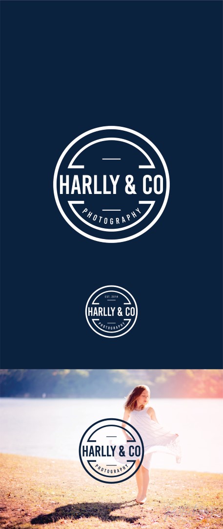
New Logo for Family Portrait Photography business
Wollen Sie auch einen Job wie diesen gewinnen?
Dieser Kunde bekam 327 Logo-Designs von 102 Designern. Dabei wurde dieses Logo-Design Design von alok bhopatkar als Gewinner ausgewählt.
Kostenlos anmelden Design Jobs finden- Gebündeltes Projekt 1
-
 A$170
A$170
-
 327 Designs
-
 102 Designer
Logo-Design Kurzbeschreibung
I am rebranding and changing names from "Reflections by Sarah" to Harlly & Co Photography. (Har from Harry my son and lly from Holly my daughter's names)
I work with people. Maternity, birth, newborns, babies and families... based in Sydney, Australia.
I want to expand my business over time and don't feel confident that "Reflections by Sarah" is a strong enough brand.
I would like to see a range of logo designs, classy and sophisticated. From the soft and feminine to the strong and slightly bold, not TOO corporate. I love some of the vintage style logos.
My website is www.harlly.com the business is Harlly Pty Ltd, I want to refer to my business as Harlly & Co, but have the words photography as an add on to the logo.
I like Harlly & Co on one line, in SCRIPT and Sentence Case, with PHOTOGRAPHY under centre or to the right. I am also open to other suggestions.
My website is being re designed (www.harlly.com) but the current logo is there.
www.reflectionsbysarah.com
I am open to colour, but prefer black, white, grey, with a light cornflower blue (something similar to #c9e4ff)
**Please read Nice to Have sections for more guidelines**
I have a large client base and want to have a strong long lasting logo that doesn't age. thank you for your time and efforts!
Zielmarkt/( -märkte)
People portraits families
Industrie/Einheitstyp
Photographer
Kontaktinformationen für Visitenkarte
Sarah Hulme
Photographer
sarah@harlly.com
www.harlly.com
0499 999 388
instagram : @harllyandco
Facebook : Harlly & Co
Logo Text
Harlly & Co Photography
Logo Stile, die Sie interessieren können
Emblem-Logo
Logo eingeschlossen in einer Form
Wortmarke-Logo
Word oder namensbasiertes Logo (nur Text)
Zu verwendende Schriftarten
Farben
Vom Kunden ausgewählte Farben für das Logo Design:
Sehen und fühlen
Jeder Schieber zeichnet eine der Charakteristiken der Marke des Kunden aus sowie den Stil, den euer Logo widerspiegeln sollte.
Elegant
Fett
Spielerisch
Ernst
Traditionel
Modern
Sympatisch
Professionell
Feminin
Männlich
Bunt
Konservativ
Wirtschaftlich
Gehobenes
Anforderungen
Schön zu haben
- - I like circles or shapes around the words as an ADD on, an example of logo inside a shape but the logo also stand alone. (ie. Emblem logo but the main logo can be used as a stand-alone as well).
- - Modern Vintage feel (please see attached samples)
Sollte nicht haben
- I do not like the abbreviation to letters H&C or HCP.
- So please stay with Harlly & Co Photography.
Dateien
Alle Dateien herunterladen - 0,6 MB
Zahlungen
Gesamt
A$170
Projekt-Deadline
03 Dez 2017 14:59:19 UTCProjekt Upgrades
Gebündelte(s) Projekt(e)
- übergebe A$39 Visitenkarten-Design an den Sieger