

 Aktualisieren
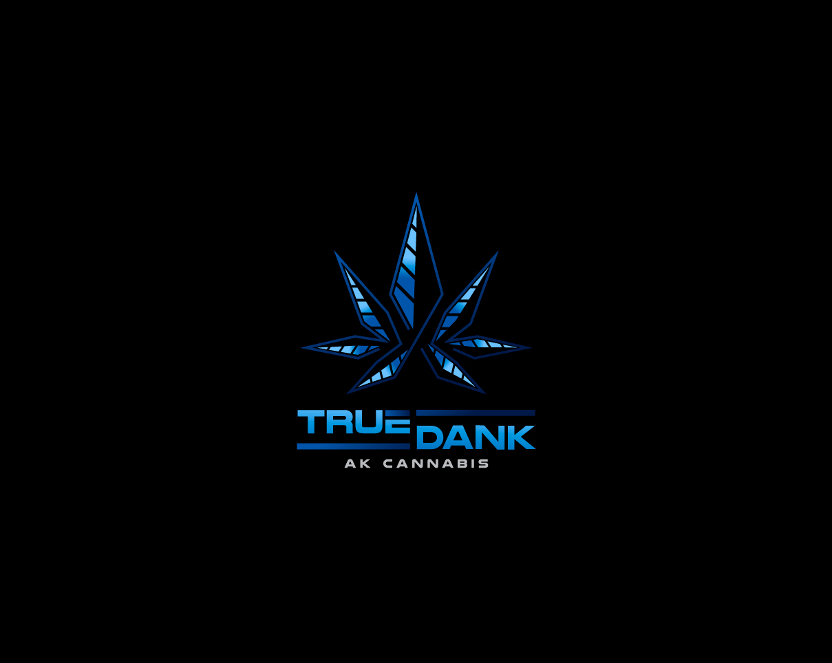
True Dank Logo and Sign - I want to use it for a sign outside of my business, like a lit up sign.
Wollen Sie auch einen Job wie diesen gewinnen?
Dieser Kunde bekam 275 Logo-Designs von 102 Designern. Dabei wurde dieses Logo-Design Design von MrBranding als Gewinner ausgewählt.
Kostenlos anmelden Design Jobs finden
-
 US$300
-
 275 Designs
-
 102 Designer
Logo-Design Kurzbeschreibung
I need a logo to go on a sign on our building for my business. I have a marijuana retail business in Alaska.
I would like the name True Dank beneath a design that resembles a “seven leaf” marijuana leaf. The leaf should not have a lot of detail, I would like three long diamond “leaf” shapes on either side, with one bigger diamond like shape in the center (total of seven leaf marijuana symbol). I am picturing the outline of the leaf being grey, and the full for each leaf split in the center lengthwise, one half black, the other half two separate shades of ice blue.
Think of a symbol where a cannabis business was trying to emulate the symbol an oil company would use. We are an Alaskan business, we want to embody energy, the frozen north, and sleek professionalism in our logo.
Zielmarkt/( -märkte)
Professionals in their 30s and 40s
Industrie/Einheitstyp
Business
Logo Text
True Dank
Logo Stile, die Sie interessieren können
Pictorial / Combination-Logo
Ein reales Objekt (Text optional)

Zu verwendende Schriftarten
Andere Schriftarten erwünscht:
- Capital letters, slightly rounded
Farben
Vom Kunden ausgewählte Farben für das Logo Design:
Sehen und fühlen
Jeder Schieber zeichnet eine der Charakteristiken der Marke des Kunden aus sowie den Stil, den euer Logo widerspiegeln sollte.
Elegant
Fett
Spielerisch
Ernst
Traditionel
Modern
Sympatisch
Professionell
Feminin
Männlich
Bunt
Konservativ
Wirtschaftlich
Gehobenes
Anforderungen
Muss haben
- The name True Dank and a sleek and professional image of a pot leaf.
Schön zu haben
- I am also toying with the idea of having AK Cannabis on the logo in addition to our name True Dank. All written text should be in capital, with the first letter a bigger capital letter than the subsequent letters in the word. For font I like something letters slightly rounded.
- For the True Dank title, I would like True to be above Dank with ice blue lines next to them, similar to the image attached. For AK Cannabis, it can be all on the same line.
- The grey outline might also look good in green. Again, think energy company or oil company meets Cannabis company.
- The background behind the emblem and name may be black or dark blue.
Sollte nicht haben
- No real can’t haves, be creative! For the marijuana leaf I am not interested in a ton of leaf detail.
