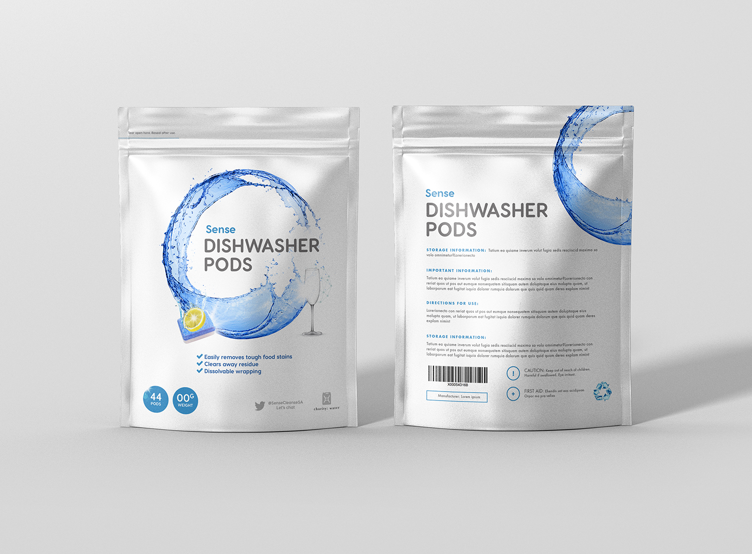
Sense Dishwasher Pods (Pack design) *
Wollen Sie auch einen Job wie diesen gewinnen?
Dieser Kunde bekam 66 Verpackungs-Designs von 17 Designern. Dabei wurde dieses Verpackungs-Design Design von Belove als Gewinner ausgewählt.
Kostenlos anmelden Design Jobs finden- Garantiert
-
 US$240
-
 66 Designs
-
 17 Designer
Verpackungs-Design Kurzbeschreibung
We require a doy pack design for a new dishwasher pod brand. It aims at competing with the top tier global brands, and hence needs to have 'big brand feel'. The product is of high quality, slightly lower priced and hence makes "Sense" for the consumer to purchase.
The design should be clean, sophisticated, modern, and appeal to the upper end consumer.
What's important, is that the consumer is habitually buying the known-brand, and hence we need to quickly and visually establish what the product is (dishwashing tablet) and also establish trust (the product will deliver). Hence we can borrow equity from category cues (see design brief)
Aktualisierungen
Monday 19 March
All documents are now up to date:
- Design brief
- Doy pack dimensions
- Packaging Text
- Reference Visuals
- Competitor Visuals
Added Monday, March 19, 2018
Please note that the project has been guaranteed
Added Monday, March 19, 2018
Update 20 March - Revised two documents:
- Reference Visuals (some added)
- Packaging Text (amended the claims)
Added Tuesday, March 20, 2018
I have updated the reference document with one or two visuals.
Added Thursday, March 22, 2018
I would like to reiterate points in the brief that have proven to be important:
- Clean white and blue design.
- "Dishwasher Pods" to be the priority text, and ideally next to a visual of a dishwasher tablet.
- "Sense" is not that important. Is is second priority text, and for simplicity sake likely a similar or same font as the other text. There can be a small brand mark next to it to indicate it being a brand
- Nice to have if there's space and not too busy: Subtle hint of chemical web or netting, a wineglass
Added Friday, March 23, 2018
All designers,
Firstly I cannot describe how happy we are, and how many incredible designs we received. We were overwhelmed with the response and all the artworks submitted. Every designer has come with his/her own unique style, creative flair and ideas. We know the time and effort that has gone into creating these packaging designs, and know that we appreciate it. So much so that although we have selected a winner, we may be in contact within the next week or two as we may purchase additional designs, or elements from you.
A big thank you!
Sense
Added Wednesday, April 4, 2018
Zielmarkt/( -märkte)
Upper LSM (mid to higher end of the market). Dishwasher penetration is low, and hence only the top end of the market has a dishwasher
Industrie/Einheitstyp
Cleaning Product
Zu verwendende Schriftarten
Farben
Vom Kunden ausgewählte Farben für das Logo Design:
Sehen und fühlen
Jeder Schieber zeichnet eine der Charakteristiken der Marke des Kunden aus sowie den Stil, den euer Logo widerspiegeln sollte.
Elegant
Fett
Spielerisch
Ernst
Traditionel
Modern
Sympatisch
Professionell
Feminin
Männlich
Bunt
Konservativ
Wirtschaftlich
Gehobenes
Anforderungen
Muss haben
- Message/Idea/Visual Hierarchy:
- Priority 1: Category / Product Type (i.e. "Dishwasher Pods"). Category most important, then the brand name. Could be joined. This must be clear, and stand out!
- Priority 2: Efficient cleaning pod/tablet which cleans thoroughly (scienctific cues, sparkles, foam, lemon/lime, etc.). Please use 3D art, rather than flat artwork. The idea that we may be well priced, but the technology is state-of-the-art. People are taking a risk buying us, so we need to comfort them that the product will work! We need to establish brand trust with our serious and professional look.
- Priority 3: Stand-out, bold, clean, modern, simple design. Simple doesn't mean "no class and style". Competitors have busy packaging with lots of colours and text.
- Lastly: We are "sensible" (in terms of cost and efficiency), "conscious", "have values". We may partner with a "Save Water" organisation. Hence the feeling of "values" and the "human touch" is a nice-to-have. We may be serious in packaging, but we care about you, your pocket, society and the environment. Hence you can contact us on twitter for instant-chat (see packagaing text).
Schön zu haben
- - A simple placeholder 'back of pack' text "Lorem ipsum". No need for excessive design, this will be worked upon in Round 2 with the winning design(er).
- - In a world where clean modern and computers dominate, there can be perfection in imperfection. There can be a personal (human) touch added. Think detailed droplets, or 3D/natural feel.
- - Dummy barcode
- - As for the colours, we are very open to ideas and the given colours in the project was only a guideline. Don't necessarily stick to them - we encourage creativity.
Sollte nicht haben
- The brand is not:
- - Cheap and cheesy and cartoonish (as most competitors). Instead we are 3D, real!
- - Busy and tiring on the eye (as the lead competitor). It can be bold, stylish, eye-catching, but not overly busy and dainty. Think of Google (infancy days) vs Yahoo (market leader days).