KiteSurf Weather App Forecast Screen re-design (1 Screen)
Wollen Sie auch einen Job wie diesen gewinnen?
Dieser Kunde bekam 37 App-Designs von 12 Designern. Dabei wurde dieses App-Design Design von iLexter als Gewinner ausgewählt.
Kostenlos anmelden Design Jobs finden- Garantiert
-
 £210
£210
-
 37 Designs
-
 12 Designer
App-Design Kurzbeschreibung
We are redesigning our application, KiteSpotter. Our main screen is the forecast screen. The forecast screen presents the forecast for multiple places for the selected day.
Intro
-----
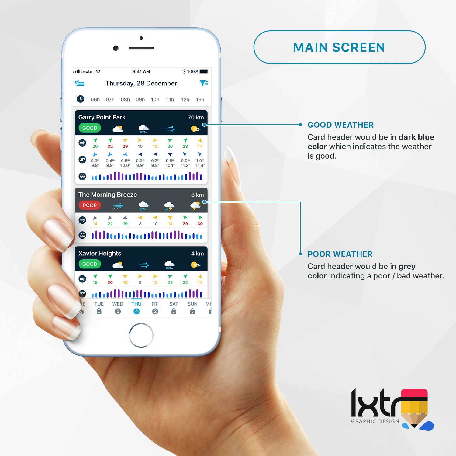
The user has a list of favorite spots that he is monitoring. Then he selects the date that he wants to get the forecast. The forecast screen presents a list of all the spots and a summary of the weather conditions. Spots are sorted by weather conditions. At the top, he gets the spot with the best weather conditions. We have an algorithm that can evaluate whether given weather conditions are good or not. When they are good we indicate that to the user.
Current Solution
------------------
Our current screen looks like the attachment named: "Current Forecast Screen.jpeg"
There is also a landscape version, which contains a bit more data: "Current Forecast Screen Lanscape.jpeg". The landscape one is a bit funny, as it is taken from an iPhone X and the app was not designed for it at the time.
The bars that you see for each hour use our algorithm to display whether the conditions are good:
- When the color is gray the conditions are not good
- When the color is yellow there are light wind conditions
- When the color is green there are good
- When the color is red the wind is very strong
- The height of the bar indicates wind strength
More Info
-----------
The detailed forecast screen is also attached so you can get a bit more context, "DetailedForecast.jpeg"
An example from an application that has a similar chart is attached, "SimilarApp.jpeg". I have circled the chart with red.
Future Solution
------------------
(See note.jpeg)
We want to create a page that contains more information and passes a better message to our users.
The elements that are important and we want to present to the user are the following:
1. Wind. (The most important)
It contains two elements: strength and direction.
1.1 Wind Strength.
Good wind strength is anything between 10-45 knots (measurement unit like km/h). The best representation with a color palette.
Gray will be the color used when the strength is not between 10-45.
The palette should start with yellow at 10 knots, then move toward green for 22knots and finally go towards red for 45 knots.
1.2 Wind Direction.
There are good wind directions that we can kite and directions that is is not possible.
Can be presented by an arrow that points in the direction the wind is blowing to. The color of the arrow will be green when the direction is good, yellow when it is average and gray when it is not good.
My thought for portrait mode is to use an arrow point for the direction and the color of the arrow to represent the strength. Solution number 2 on my notes. Then for landscape, we could use both a number and an arrow like number 4 on my notes.
2. Wave.
It contains three elements: height, period and direction. It is not displayed to all of our users only the ones that have selected the wave riding option.
2.1 Height is represented by a number. Ex. 1.2 meters or 2 foot.
2.2 Period is represented in seconds. Ex. 12 seconds.
2.3 Directions is an arrow that points to the direction the wave is coming from.
Again the solution should be like the wind. Arrow for direction and the color of the arrow for height. The palette here should be something with different blue colors.
3. Tide height. (Optional for tidal spots, as not all spots have tides)
The best way to represent that it through a graph. I would also like to see an alternative, where we have three symbols for low, mid and high tide.
4. General Weather. Rain/Snow and temperature.
This should be represented by a sun/cloud/rain symbol. If it is very cold the symbol can also contain an ice sign on the background.
---------
This is a guideline creativity will be valued. Maybe there is another way to do it that I have not thought about.
The winner of the competition will have to send us all graphics used in vector format, so we can input them to our xCode project.
Finally the person that wins the competition will be the first one to be considered for the redesign of the rest of our application.
Zielmarkt/( -märkte)
Kitesurfers
Zu verwendende Schriftarten
Farben
Der Designer kann die Farben des Designs frei wählen
Sehen und fühlen
Jeder Schieber zeichnet eine der Charakteristiken der Marke des Kunden aus sowie den Stil, den euer Logo widerspiegeln sollte.
Elegant
Fett
Spielerisch
Ernst
Traditionel
Modern
Sympatisch
Professionell
Feminin
Männlich
Bunt
Konservativ
Wirtschaftlich
Gehobenes
Anforderungen
Muss haben
- It should be minimal and clearly communicate the weather forecast to my users. It should be user friendly.
Schön zu haben
- Communicative color palettes for both wind strength, tide and waves
Sollte nicht haben
- Hard to understand UI