UI Mockup For Online Scheduling Software
Wollen Sie auch einen Job wie diesen gewinnen?
Dieser Kunde bekam 72 Web-Designs von 11 Designern. Dabei wurde dieses Web-Design Design von iLexter als Gewinner ausgewählt.
Kostenlos anmelden Design Jobs finden- Garantiert
-
 A$230
A$230
-
 72 Designs
-
 11 Designer
Web-Design Kurzbeschreibung
11.01.2018 - Brief Update:
The brief has not changed but the summary below as being added to aid designers.
- New file added "Updated 11.01.2018 - Individual Box" to clarify the sections. Specifically the primary tag section
- Improve on the current styling
- Consider changing the section layout to maximise the number of blocks displayed on screen (The sections dont not need to be stacked like the current version.
- The design is for the application running on a desktop PC with 16:9 screen aspect
- The design styling/layout should not look like the current version
- You may use the application to get an understanding of its workings at this link....https://ryanchilling.wcpdigital.com.au/
- Think outside the box....use your creative flare and show me something different to the current app (style and layout)
There are already some good submissions so closer to the deadline I will increase the budget and award $$$ to 1st and 2nd. The winner will be chosen to directly work on the remaining aspects of this application (setting page, mobile design, dashboard etc). The next design project associated to this application will be 10 time bigger than this one.
Good Luck Designers
*************************************************************
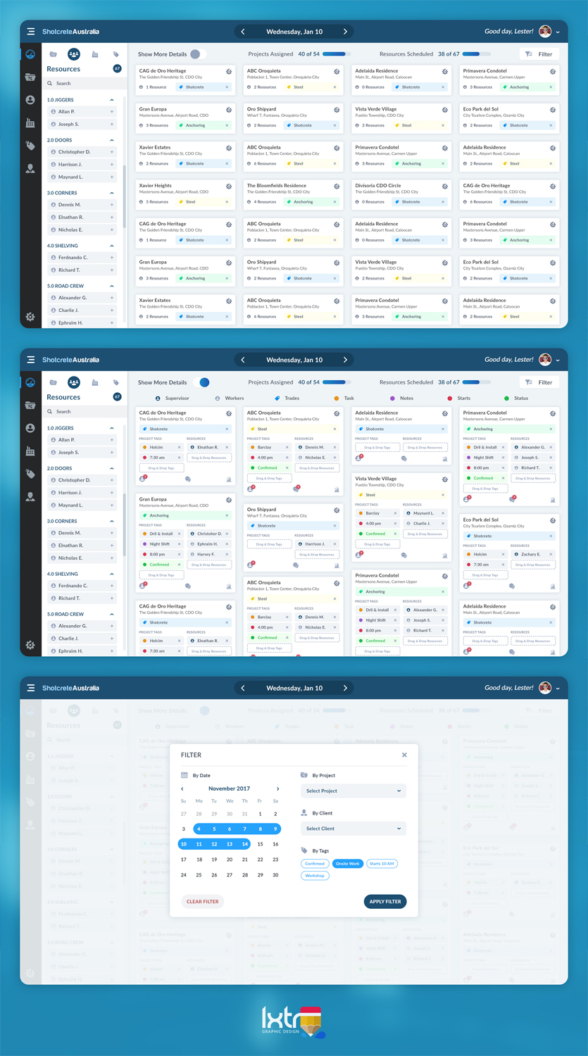
Redesign the user interface to make more efficient use of the screen real estate.
The software works by adding (Drag & Drop) Project Blocks to a Date Section. Then tags are added (Drag & Drop) to the block section below the header, and then resources are added to the block section below the tags.
Each block has 4 main sections that are stacked vertically:
1. Header - Displays Title and Address
2. Tags - Displays tags, maximum of 6 tags
3. Resources - Displays resources, maximum of 10 resources, NOTE: this section can be hidded.
4. Footer - Display basic stats (eg. 3 Resources assigned)
It is critical that as many block (20-30) as possible for a single date can be visible on screen.
The following criteria must be considered when mocking up layout:
1. Font Type, size, colour and emphasis
2. Block Colour/Shading, borders ect
3. Section Layout within the block (stacking & Alignment)
4. Mock ups to show scaled layout of blocks in both the open state and Closed State.
5. Mock up to display a minimum of 20 blocks.
6. Create a variation of your design that adds a 5th section. This will display the first tag only:
1. Header - Always Visible
2. Primary Tag - Always Visible
3. Secondary Tags - Can be hidden
4. Resources - Can be Hidden
5. Footer - Can be Hidden
Please be creative with your design and layout. I like a clean, minimalist design.
At this stage CSS file will not be required but would be benificial
Updates
Designs look the same
Zielmarkt/( -märkte)
N/A
Industrie/Einheitstyp
Software
Anzahl benötigter Seiten
1 page
Zu verwendende Schriftarten
Andere Schriftarten erwünscht:
- Designers Choice
Farben
Der Designer kann die Farben des Designs frei wählen
Sehen und fühlen
Jeder Schieber zeichnet eine der Charakteristiken der Marke des Kunden aus sowie den Stil, den euer Logo widerspiegeln sollte.
Elegant
Fett
Spielerisch
Ernst
Traditionel
Modern
Sympatisch
Professionell
Feminin
Männlich
Bunt
Konservativ
Wirtschaftlich
Gehobenes
Anforderungen
Muss haben
- Variation to current layout and style
Sollte nicht haben
- Same styling and layout as current design