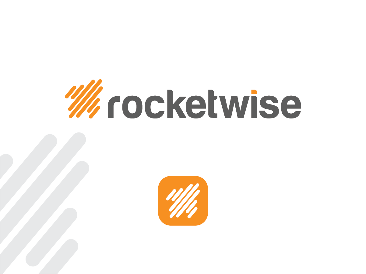
New Logo for Growing IT Services Firm

Wollen Sie auch einen Job wie diesen gewinnen?
Dieser Kunde bekam 187 Logo-Designs von 67 Designern. Dabei wurde dieses Logo-Design Design von Alice J als Gewinner ausgewählt.
Kostenlos anmelden Design Jobs finden- Garantiert
Logo-Design Kurzbeschreibung
We need a logo designed for our re-branded IT services firm called "rocketwise" (all lower case). We prefer orange/dark grays for logo, and it must be simple enough to convey well in a variety of formats: web, print, embroidery, etc. Logo (or recognizable part of the logo) must scale down to be used as an website ico or simple task bar icon.
I've attached our temporary logo for reference, but we need something much more polished.
Zielmarkt/( -märkte)
professional services firms
Industrie/Einheitstyp
It Company
Logo Text
rocketwise
Logo Stile, die Sie interessieren können
Pictorial / Combination-Logo
Ein reales Objekt (Text optional)
Abstraktes Logo
Begrifflich / symbolisch (Text optional)
Zu verwendende Schriftarten
Farben
Vom Kunden ausgewählte Farben für das Logo Design:
Sehen und fühlen
Jeder Schieber zeichnet eine der Charakteristiken der Marke des Kunden aus sowie den Stil, den euer Logo widerspiegeln sollte.
Elegant
Fett
Spielerisch
Ernst
Traditionel
Modern
Sympatisch
Professionell
Feminin
Männlich
Bunt
Konservativ
Wirtschaftlich
Gehobenes
Anforderungen
Muss haben
- Scaleable logo - a recognizable part of the logo must scale very small for use as ico on website and icon in Windows task manager tray. Also must look recognizable in single color variations - like black or white in places where color cannot be utilized. Depending on the design, may need an option for a "vertical" and "horizontal" variation. The logo I have attached is much wider than tall, so it is a "horizontal" type. Some logos lend themselves to having an image to one side of the word in a horizontal fashion, and the image can be moved to the top or bottom of the word for a more "squared off" or vertical appearance.
- Colors attached below are approximate - please use your judgement in choosing.
Schön zu haben
- I'd like to have some rocket imagery as part of the design, either tangible or suggested. Our brand is high tech, but approachable, with an emphasis on speed and consistency of service.
Sollte nicht haben
- Complex design elements that do not scale well, or translate to multiple media (like embroidery). Multitude of colors that make integration with other designs difficult.