

 Aktualisieren
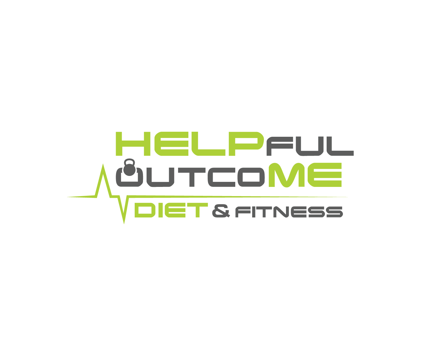
Company logo for my Fitness Brand
Wollen Sie auch einen Job wie diesen gewinnen?
Dieser Kunde bekam 94 Logo-Designs von 15 Designern. Dabei wurde dieses Logo-Design Design von Atec als Gewinner ausgewählt.
Kostenlos anmelden Design Jobs finden
- Garantiert
-
 US$150
-
 94 Designs
-
 15 Designer
Logo-Design Kurzbeschreibung
I would like this logo to stand out on HELP ME and in the middle the “fuloutco” I would like like a heart beat rhythm above it or through it just want it to be creative. Looking like something you would see on a screen at a hospital monitor. I would like the first “O” in outcoME to be a Kettlebell I attached a picture below of the type of one I want. Please really try to make it look like an “O” as much as possible. This is a Fitness brand build around heart rate monitoring. If I could have it structure like:
HELPfuloutcoME
Or even
HELPful
outcoME
I would like it to be the same font throughout the design. But HELP ME JUST BOLDER to make it noticeable. I still want people to read it and knows what it says. I don’t want it to be super long in the middle or bunched together. I would love some creativity on even using some of the letters. Looking forward to seeing the ideas thanks!
Steven
Zielmarkt/( -märkte)
People looking to loose weight. Fitness Industry
Industrie/Einheitstyp
Fitness
Logo Text
HELPfuloutcoME
Logo Stile, die Sie interessieren können
Wortmarke-Logo
Word oder namensbasiertes Logo (nur Text)


Lettermark-Logo
Kurzwort oder Buchstaben-Logo (nur Text)


Zu verwendende Schriftarten

Andere Schriftarten erwünscht:
- In the middle I want some type of heartbeat font
Farben
Vom Kunden ausgewählte Farben für das Logo Design:
Sehen und fühlen
Jeder Schieber zeichnet eine der Charakteristiken der Marke des Kunden aus sowie den Stil, den euer Logo widerspiegeln sollte.
Elegant
Fett
Spielerisch
Ernst
Traditionel
Modern
Sympatisch
Professionell
Feminin
Männlich
Bunt
Konservativ
Wirtschaftlich
Gehobenes
Anforderungen
Muss haben
- I want HELP to standout and ME
- I WANT the “fuloutco” to be in font of a heart beat pulse on a monitor
- I would like to see the first “O” in outcoME be a KETTLEBELL which I attached below.
Schön zu haben
- Catchy trendy design
- I want HELP and ME to be the same fonts and colors
- I would like the middle same font but smaller with a heart pulse above or below something creative with it.
Sollte nicht haben
- i Don’t want it to be hard too read. I want it clear to read
